> ## Documentation Index
> Fetch the complete documentation index at: https://docs.brikl.co/llms.txt
> Use this file to discover all available pages before exploring further.
# Alert 02
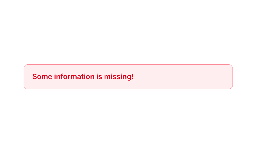
> Compact error alert bar with red background, bold text, and rounded border styling.
## Overview
Alert 02 is a simple inline alert element designed to display error or warning messages to users. It features a red-tinted background with a semi-transparent red border, bold red text, and rounded corners. It is typically used to notify users of missing or invalid information in forms or workflows, and collapses automatically when hidden to avoid taking up layout space.
## How to use
Navigate to the **Elements** category in the Brikl panel.
Find **Alert 02** and click **Copy**.
Paste it into your Bubble canvas with `Cmd + V` (Mac) or `Ctrl + V` (Windows),
or right-click on the canvas and select **Paste**.
## Requirements
| | |
| ----------- | ------------ |
| License | Free |
| Plugins | None |
| Custom code | Not required |
## Platforms
| Platform | Supported |
| -------- | --------- |
| Web | ✅ |
| Mobile | ❌ |
## License
This component is available on the free plan.