> ## Documentation Index
> Fetch the complete documentation index at: https://docs.brikl.co/llms.txt
> Use this file to discover all available pages before exploring further.
# Badge 11
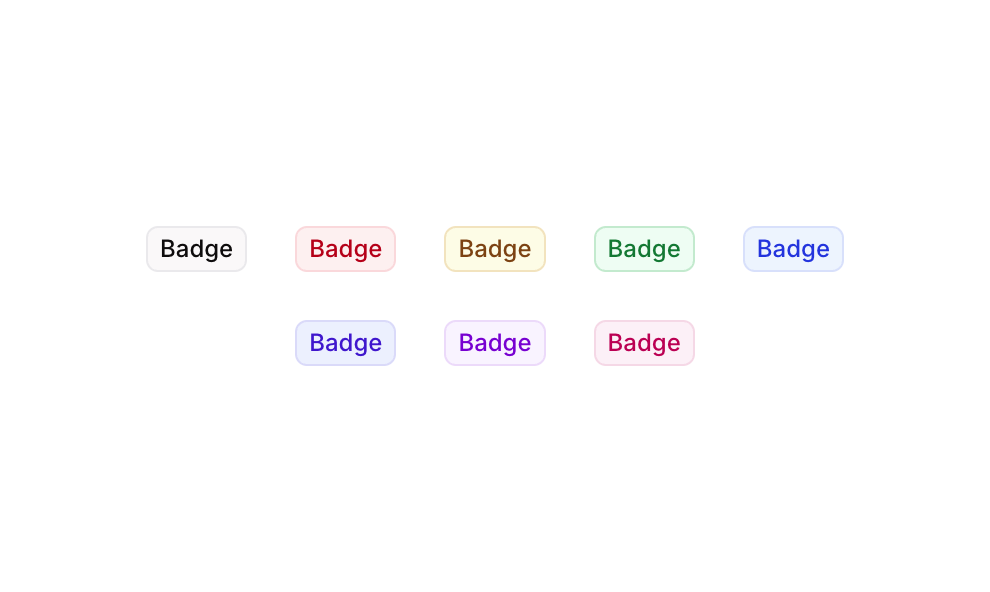
> A horizontal row of eight color-coded badge labels with rounded borders and light backgrounds.
## Overview
Badge 11 is a UI component from the Badges collection that displays eight styled text badge variants, each in a distinct color theme (Grey, Red, Yellow, Green, Blue, Palatinate Blue, Purple, and Pink). These badges are designed to visually categorize or label content using subtle background colors, matching border accents, and colored text. The component is built as a responsive row container with consistent padding and gap spacing, suitable for status indicators, tags, or category labels across web and mobile interfaces.
## How to use
Navigate to the **Elements** category in the Brikl panel.
Find **Badge 11** and click **Copy**.
Paste it into your Bubble canvas with `Cmd + V` (Mac) or `Ctrl + V` (Windows),
or right-click on the canvas and select **Paste**.
## Responsive
This component adapts to mobile screens. Font sizes and layout automatically adjust on screens smaller than Bubble's built-in mobile breakpoint.
## Requirements
| | |
| ----------- | --------------------- |
| License | Starter plan required |
| Plugins | None |
| Custom code | Not required |
## Platforms
| Platform | Supported |
| -------- | --------- |
| Web | ✅ |
| Mobile | ✅ |
## License
This component requires a **Starter** plan.