> ## Documentation Index
> Fetch the complete documentation index at: https://docs.brikl.co/llms.txt
> Use this file to discover all available pages before exploring further.
# Badge 12
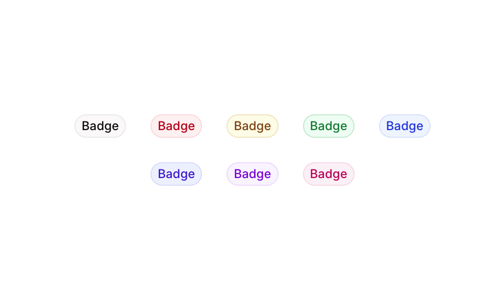
> Row of 8 colorful pill-shaped badge labels with distinct background and text color combinations.
## Overview
Badge 12 is a UI component featuring a horizontal row of eight pill-shaped badge elements, each styled in a different color theme (Grey, Red, Yellow, Green, Blue, Palatinate Blue, Purple, and Pink). It is designed to visually categorize, label, or tag content items with semantic color coding, making it ideal for status indicators, tags, or classification labels in web and mobile interfaces.
## How to use
Navigate to the **Elements** category in the Brikl panel.
Find **Badge 12** and click **Copy**.
Paste it into your Bubble canvas with `Cmd + V` (Mac) or `Ctrl + V` (Windows),
or right-click on the canvas and select **Paste**.
## Responsive
This component adapts to mobile screens. Font sizes and layout automatically adjust on screens smaller than Bubble's built-in mobile breakpoint.
## Requirements
| | |
| ----------- | --------------------- |
| License | Starter plan required |
| Plugins | None |
| Custom code | Not required |
## Platforms
| Platform | Supported |
| -------- | --------- |
| Web | ✅ |
| Mobile | ✅ |
## License
This component requires a **Starter** plan.