> ## Documentation Index
> Fetch the complete documentation index at: https://docs.brikl.co/llms.txt
> Use this file to discover all available pages before exploring further.
# Badge 18
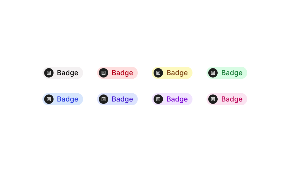
> Circular badge component with logo image and text label in five color variants arranged in a row.
## Overview
Badge 18 is a UI component from the Badges sub-type collection that displays a circular badge combining a logo image and a short text label. It comes in five color variants: Grey, Red, Yellow, Green, and Blue. Each badge uses a pill/circle-shaped container with a colored background, a rounded logo image on the left, and a colored label text on the right. It is designed for use as status indicators, tags, or category labels across both web and mobile interfaces.
## How to use
Navigate to the **Elements** category in the Brikl panel.
Find **Badge 18** and click **Copy**.
Paste it into your Bubble canvas with `Cmd + V` (Mac) or `Ctrl + V` (Windows),
or right-click on the canvas and select **Paste**.
## Responsive
This component adapts to mobile screens. Font sizes and layout automatically adjust on screens smaller than Bubble's built-in mobile breakpoint.
## Requirements
| | |
| ----------- | --------------------- |
| License | Starter plan required |
| Plugins | None |
| Custom code | Not required |
## Platforms
| Platform | Supported |
| -------- | --------- |
| Web | ✅ |
| Mobile | ✅ |
## License
This component requires a **Starter** plan.