> ## Documentation Index
> Fetch the complete documentation index at: https://docs.brikl.co/llms.txt
> Use this file to discover all available pages before exploring further.
# Breadcrumb 04
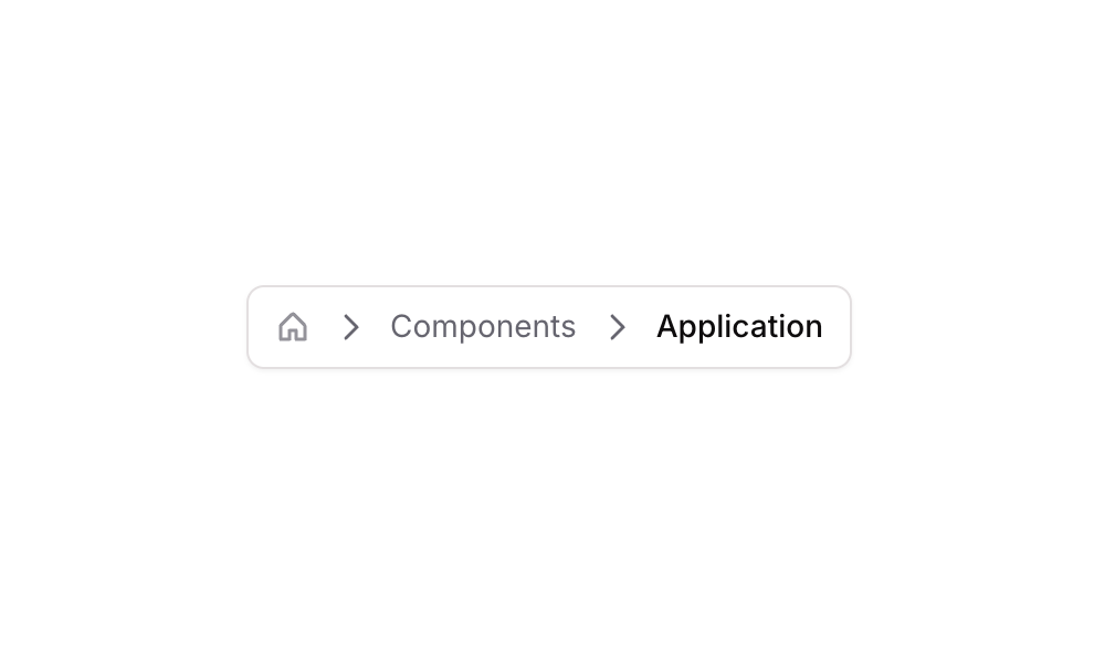
> Horizontal breadcrumb navigation with home icon, caret separators, and styled text links.
## Overview
Breadcrumb 04 is a horizontal navigation component that displays a multi-level breadcrumb trail. It includes a home icon as the root, caret-right separators, and clickable text links for intermediate and current page labels. The current page ('Breadcrumb') is styled with a darker, bolder font to indicate active state, while previous links use a muted color with hover effects that darken them on interaction.
## How to use
Navigate to the **Elements** category in the Brikl panel.
Find **Breadcrumb 04** and click **Copy**.
Paste it into your Bubble canvas with `Cmd + V` (Mac) or `Ctrl + V` (Windows),
or right-click on the canvas and select **Paste**.
## States
This component includes conditional states that automatically change its appearance.
| State | Trigger | Visual effect |
| ----------------------------- | ---------------------------------------------- | ------------------------------------------------------------------------------------------------------------------------------------- |
| Home Icon Hovered | Mouse hover over the home icon element | Icon color transitions from semi-transparent gray (rgba(113,113,123,0.7)) to near-black (rgba(11,8,9,1)) with a 200ms ease transition |
| Components Link Hovered | Mouse hover over the 'Components' link element | Font color changes from muted gray (rgba(113,113,123,1)) to near-black (rgba(11,8,9,1)) |
| Components Link Not Clickable | Link is set to not clickable | Opacity of the 'Components' link reduces to 25% |
| Breadcrumb Link Not Clickable | Link is set to not clickable | Opacity of the 'Breadcrumb' link reduces to 25% |
These states are handled natively by Bubble and require no additional setup.
They will work automatically once the component is pasted into your editor.
## Responsive
This component adapts to mobile screens. Font sizes and layout automatically adjust on screens smaller than Bubble's built-in mobile breakpoint.
## Requirements
| | |
| ----------- | --------------------- |
| License | Starter plan required |
| Plugins | None |
| Custom code | Not required |
## Platforms
| Platform | Supported |
| -------- | --------- |
| Web | ✅ |
| Mobile | ❌ |
## License
This component requires a **Starter** plan.