> ## Documentation Index
> Fetch the complete documentation index at: https://docs.brikl.co/llms.txt
> Use this file to discover all available pages before exploring further.
# Button 07
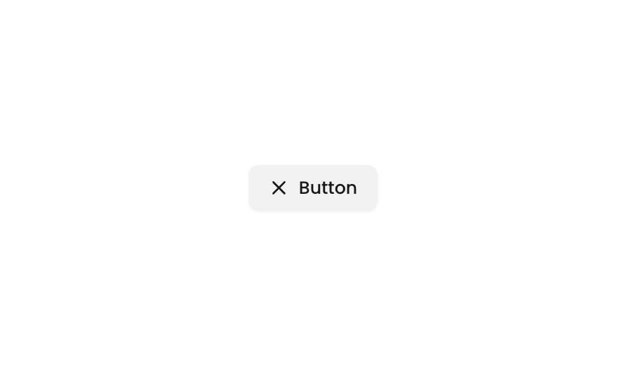
> Outlined button with label and icon, rounded corners, light background, center-aligned.
## Overview
Button 07 is a versatile outline-style button component featuring a text label paired with an icon. It supports hover and disabled states with opacity transitions, making it suitable for secondary actions in both web and mobile interfaces. The button is fully responsive with configurable padding, minimum dimensions, and fluid sizing options.
## How to use
Navigate to the **Elements** category in the Brikl panel.
Find **Button 07** and click **Copy**.
Paste it into your Bubble canvas with `Cmd + V` (Mac) or `Ctrl + V` (Windows),
or right-click on the canvas and select **Paste**.
## States
This component includes conditional states that automatically change its appearance.
| State | Trigger | Visual effect |
| ------------- | -------------------------------------------- | -------------------------------------------------------- |
| Hovered | User hovers over the button | Button opacity reduces to 80% |
| Not Clickable | Button is set to non-interactive or disabled | Button opacity reduces to 50%, indicating it is inactive |
These states are handled natively by Bubble and require no additional setup.
They will work automatically once the component is pasted into your editor.
## Responsive
This component adapts to mobile screens. Font sizes and layout automatically adjust on screens smaller than Bubble's built-in mobile breakpoint.
## Requirements
| | |
| ----------- | ------------ |
| License | Free |
| Plugins | None |
| Custom code | Not required |
## Platforms
| Platform | Supported |
| -------- | --------- |
| Web | ✅ |
| Mobile | ✅ |
## License
This component is available on the free plan.