> ## Documentation Index
> Fetch the complete documentation index at: https://docs.brikl.co/llms.txt
> Use this file to discover all available pages before exploring further.
# Popup 06
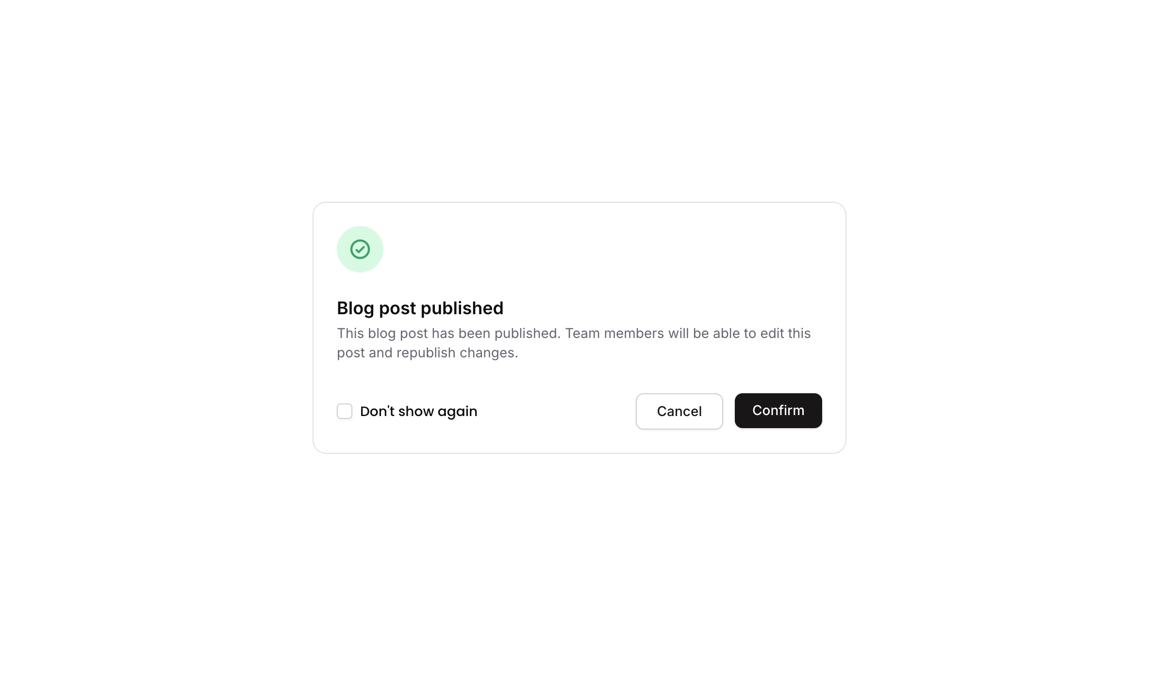
> Modal popup with icon, title, message, checkbox, cancel and confirm buttons in a clean layout.
## Overview
Popup 06 is a confirmation modal dialog that displays a success-style notification with a green check icon, a title, a descriptive message, a 'Don't show again' checkbox toggle, and two action buttons (Cancel and Confirm). It is designed to inform users of a completed action and allow them to confirm or dismiss, with an optional preference to suppress future appearances.
## How to use
Navigate to the **Elements** category in the Brikl panel.
Find **Popup 06** and click **Copy**.
Paste it into your Bubble canvas with `Cmd + V` (Mac) or `Ctrl + V` (Windows),
or right-click on the canvas and select **Paste**.
## States
This component includes conditional states that automatically change its appearance.
| State | Trigger | Visual effect |
| ----------------------- | -------------------------------------------------------- | --------------------------------------------------------------------------------- |
| Cancel Button Hovered | User hovers over the Cancel button | Cancel button background changes to rgba(245, 244, 244, 1) |
| Cancel Button Disabled | Cancel button is not clickable | Cancel button opacity reduces to 50% |
| Confirm Button Hovered | User hovers over the Confirm button | Confirm button opacity reduces to 90% |
| Confirm Button Disabled | Confirm button is not clickable | Confirm button opacity reduces to 50% |
| Checkbox Checked | custom.show\_again\_ state is false on the popup element | Checkbox icon changes to a filled checkmark with dark background (rgba(11,8,9,1)) |
| Mobile Responsive Text | Current page width is less than mobile breakpoint | Text elements reduce font size to 14px |
These states are handled natively by Bubble and require no additional setup.
They will work automatically once the component is pasted into your editor.
## Responsive
This component adapts to mobile screens. Font sizes and layout automatically adjust on screens smaller than Bubble's built-in mobile breakpoint.
## Workflows
This component includes pre-built workflows.
| Trigger | Action |
| ------------------------------------------------------------------------------------ | -------------------------------------------------------------------- |
| Cancel button (BT - Cancel) is clicked | Hides the popup element (Popup 06) |
| Checkbox (Checkbox - Don't Show Again) is clicked when custom.show\_again\_ is true | Sets custom state custom.show\_again\_ to false on the popup element |
| Checkbox (Checkbox - Don't Show Again) is clicked when custom.show\_again\_ is false | Sets custom state custom.show\_again\_ to true on the popup element |
| A separate trigger button (element bTULN) is clicked | Shows the popup element (Popup 06) |
These workflows are included when you use the **Copy with Workflows** option in the Brikl panel.
## Requirements
| | |
| ----------- | --------------------- |
| License | Starter plan required |
| Plugins | None |
| Custom code | Not required |
## Platforms
| Platform | Supported |
| -------- | --------- |
| Web | ✅ |
| Mobile | ❌ |
## License
This component requires a **Starter** plan.