> ## Documentation Index
> Fetch the complete documentation index at: https://docs.brikl.co/llms.txt
> Use this file to discover all available pages before exploring further.
# Popup 09
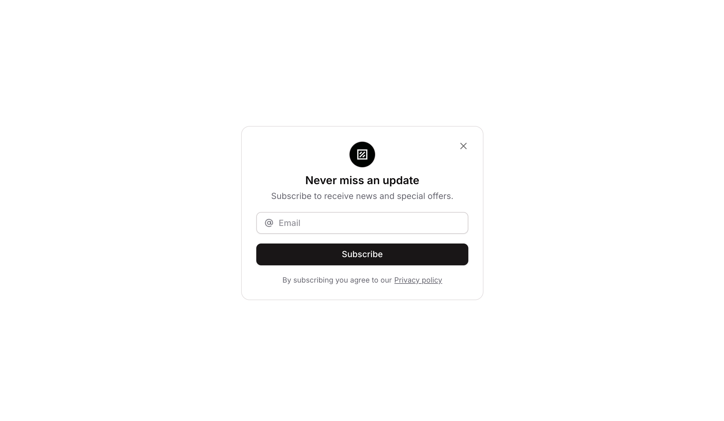
> Centered popup with logo, title, description, email input field, and subscribe button.
## Overview
Popup 09 is a newsletter subscription modal component designed for web applications. It features a branded icon, a headline ('Never miss an update'), a subtitle, an email input field with an at-sign icon, and a dark 'Subscribe' button. The popup can be shown or hidden via workflow triggers, making it suitable for capturing email leads with a clean, minimal design.
## How to use
Navigate to the **Elements** category in the Brikl panel.
Find **Popup 09** and click **Copy**.
Paste it into your Bubble canvas with `Cmd + V` (Mac) or `Ctrl + V` (Windows),
or right-click on the canvas and select **Paste**.
## States
This component includes conditional states that automatically change its appearance.
| State | Trigger | Visual effect |
| --------------- | ---------------------------------- | ----------------------------------------------------------------------------------------------------------- |
| Input Focused | Email input field receives focus | A soft box shadow (rgba(216,211,212,0.5)) appears around the input container to indicate active focus |
| Input Invalid | Email input field fails validation | Input container border turns red (rgba(251,44,54,1)) and a red-tinted box shadow appears to signal an error |
| Input Disabled | Email input field is not clickable | Input container opacity reduces to 50% to indicate a disabled state |
| Button Hovered | Subscribe button is hovered | Button opacity reduces to 90% for a subtle hover feedback |
| Button Disabled | Subscribe button is not clickable | Button opacity reduces to 50% to indicate it is inactive |
These states are handled natively by Bubble and require no additional setup.
They will work automatically once the component is pasted into your editor.
## Responsive
This component adapts to mobile screens. Font sizes and layout automatically adjust on screens smaller than Bubble's built-in mobile breakpoint.
## Workflows
This component includes pre-built workflows.
| Trigger | Action |
| ----------------------------------- | ---------------------------------- |
| Close button (bTURa) clicked | Hides the Popup 09 element (bTUPX) |
| Open/trigger button (bTUPR) clicked | Shows the Popup 09 element (bTUPX) |
These workflows are included when you use the **Copy with Workflows** option in the Brikl panel.
## Requirements
| | |
| ----------- | --------------------- |
| License | Starter plan required |
| Plugins | None |
| Custom code | Not required |
## Platforms
| Platform | Supported |
| -------- | --------- |
| Web | ✅ |
| Mobile | ❌ |
## License
This component requires a **Starter** plan.