> ## Documentation Index
> Fetch the complete documentation index at: https://docs.brikl.co/llms.txt
> Use this file to discover all available pages before exploring further.
# Switch 09
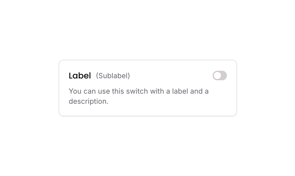
> Labeled switch with toggle, sublabel, description text, rounded pill shape, column layout.
## Overview
Switch 09 is a toggle switch component featuring a label, sublabel, and description text. It allows users to toggle between an active and inactive state. The switch visually changes its background color and thumb alignment to indicate the current state, and it uses a custom state to track whether it is on or off.
## How to use
Navigate to the **Elements** category in the Brikl panel.
Find **Switch 09** and click **Copy**.
Paste it into your Bubble canvas with `Cmd + V` (Mac) or `Ctrl + V` (Windows),
or right-click on the canvas and select **Paste**.
## States
This component includes conditional states that automatically change its appearance.
| State | Trigger | Visual effect |
| -------------- | -------------------------------------------------------------------------- | ------------------------------------------------------------------------------------------------------------------------------------------------------------ |
| Active (ON) | User clicks the switch when it is currently OFF (custom.active\_ is false) | Switch background changes to dark color rgba(27,23,24,1), thumb aligns to the right (flex-end), and the outer group border color updates to rgba(27,23,24,1) |
| Inactive (OFF) | User clicks the switch when it is currently ON (custom.active\_ is true) | Switch background reverts to grey rgba(216,211,212,1), thumb aligns to the left (flex-start), and the outer group border color reverts to default |
These states are handled natively by Bubble and require no additional setup.
They will work automatically once the component is pasted into your editor.
## Responsive
This component adapts to mobile screens. Font sizes and layout automatically adjust on screens smaller than Bubble's built-in mobile breakpoint.
## Workflows
This component includes pre-built workflows.
| Trigger | Action |
| --------------------------------------------------------- | ----------------------------------------------------------------------------------- |
| GP - Switch 09 is clicked (when custom.active\_ is false) | Sets custom state custom.active\_ to true on element bTKBV, turning the switch ON |
| GP - Switch 09 is clicked (when custom.active\_ is true) | Sets custom state custom.active\_ to false on element bTKBV, turning the switch OFF |
These workflows are included when you use the **Copy with Workflows** option in the Brikl panel.
## Requirements
| | |
| ----------- | --------------------- |
| License | Starter plan required |
| Plugins | None |
| Custom code | Not required |
## Platforms
| Platform | Supported |
| -------- | --------- |
| Web | ✅ |
| Mobile | ✅ |
## License
This component requires a **Starter** plan.