> ## Documentation Index
> Fetch the complete documentation index at: https://docs.brikl.co/llms.txt
> Use this file to discover all available pages before exploring further.
# Tabs 04
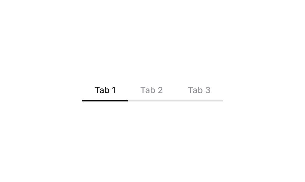
> Horizontal tab bar with three underline-style tab buttons in a row layout.
## Overview
Tabs 04 is a horizontal navigation tab component featuring three tab buttons (Tab 1, Tab 2, Tab 3) arranged in a row. It uses a custom state on the parent group to track the active tab, highlighting the selected tab with a dark bottom border and darker font color. Each tab button has hover and active states with smooth color transitions, making it suitable for switching between content sections in both web and mobile layouts.
## How to use
Navigate to the **Elements** category in the Brikl panel.
Find **Tabs 04** and click **Copy**.
Paste it into your Bubble canvas with `Cmd + V` (Mac) or `Ctrl + V` (Windows),
or right-click on the canvas and select **Paste**.
## States
This component includes conditional states that automatically change its appearance.
| State | Trigger | Visual effect |
| --------------------- | ------------------------------------------------------------------------------------------------------ | ------------------------------------------------------------------------------------------------------------------------- |
| Hover State | User hovers over any tab button | Tab label text color changes to rgba(113,113,123,1), slightly more opaque than the default muted color |
| Active/Selected State | The parent group's custom state 'tabs\_item\_' equals the tab button's own 'item\_' custom state value | Tab label font color changes to dark rgba(27,23,24,1) and a solid dark bottom border (2px) appears beneath the active tab |
These states are handled natively by Bubble and require no additional setup.
They will work automatically once the component is pasted into your editor.
## Responsive
This component adapts to mobile screens. Font sizes and layout automatically adjust on screens smaller than Bubble's built-in mobile breakpoint.
## Workflows
This component includes pre-built workflows.
| Trigger | Action |
| ------------------------------- | ------------------------------------------------------------------------------------------------------------------------------------- |
| BT - Tab 1 (Tabs 04) is clicked | Sets the parent group's custom state 'tabs\_item\_' to the value of Tab 1's 'item\_' custom state (value: 1), marking Tab 1 as active |
| BT - Tab 2 (Tabs 04) is clicked | Sets the parent group's custom state 'tabs\_item\_' to the value of Tab 2's 'item\_' custom state (value: 2), marking Tab 2 as active |
| BT - Tab 3 (Tabs 04) is clicked | Sets the parent group's custom state 'tabs\_item\_' to the value of Tab 3's 'item\_' custom state (value: 3), marking Tab 3 as active |
These workflows are included when you use the **Copy with Workflows** option in the Brikl panel.
## Requirements
| | |
| ----------- | --------------------- |
| License | Starter plan required |
| Plugins | None |
| Custom code | Not required |
## Platforms
| Platform | Supported |
| -------- | --------- |
| Web | ✅ |
| Mobile | ✅ |
## License
This component requires a **Starter** plan.