> ## Documentation Index
> Fetch the complete documentation index at: https://docs.brikl.co/llms.txt
> Use this file to discover all available pages before exploring further.
# Textarea 07
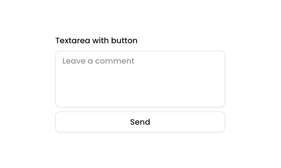
> Vertical column layout with a label, multiline textarea input, and a secondary send button.
## Overview
Textarea 07 is a comment or message input component featuring a labeled multiline text area with a 'Send' secondary button below. It is designed for user input scenarios such as leaving comments, sending messages, or submitting feedback. The component includes focus, validation error, and disabled visual states for the textarea, as well as hover and disabled states for the button.
## How to use
Navigate to the **Elements** category in the Brikl panel.
Find **Textarea 07** and click **Copy**.
Paste it into your Bubble canvas with `Cmd + V` (Mac) or `Ctrl + V` (Windows),
or right-click on the canvas and select **Paste**.
## States
This component includes conditional states that automatically change its appearance.
| State | Trigger | Visual effect |
| ----------------- | ------------------------------------- | ------------------------------------------------------------------------------------------------- |
| Focused | MultilineInput is focused by the user | Adds a soft box shadow (rgba(216,211,212,0.5)) around the textarea to indicate active focus |
| Invalid | MultilineInput fails validation | Border changes to red (rgba(251,44,54,1)) and a red-tinted box shadow appears around the textarea |
| Disabled (Input) | MultilineInput is not clickable | Textarea opacity reduces to 50%, indicating a disabled state |
| Button Hovered | Send button is hovered | Button background changes to light gray (rgba(245,244,244,1)) |
| Disabled (Button) | Send button is not clickable | Button opacity reduces to 50%, indicating a disabled state |
These states are handled natively by Bubble and require no additional setup.
They will work automatically once the component is pasted into your editor.
## Responsive
This component adapts to mobile screens. Font sizes and layout automatically adjust on screens smaller than Bubble's built-in mobile breakpoint.
## Requirements
| | |
| ----------- | --------------------- |
| License | Starter plan required |
| Plugins | None |
| Custom code | Not required |
## Platforms
| Platform | Supported |
| -------- | --------- |
| Web | ✅ |
| Mobile | ✅ |
## License
This component requires a **Starter** plan.