> ## Documentation Index
> Fetch the complete documentation index at: https://docs.brikl.co/llms.txt
> Use this file to discover all available pages before exploring further.
# Timeline 05
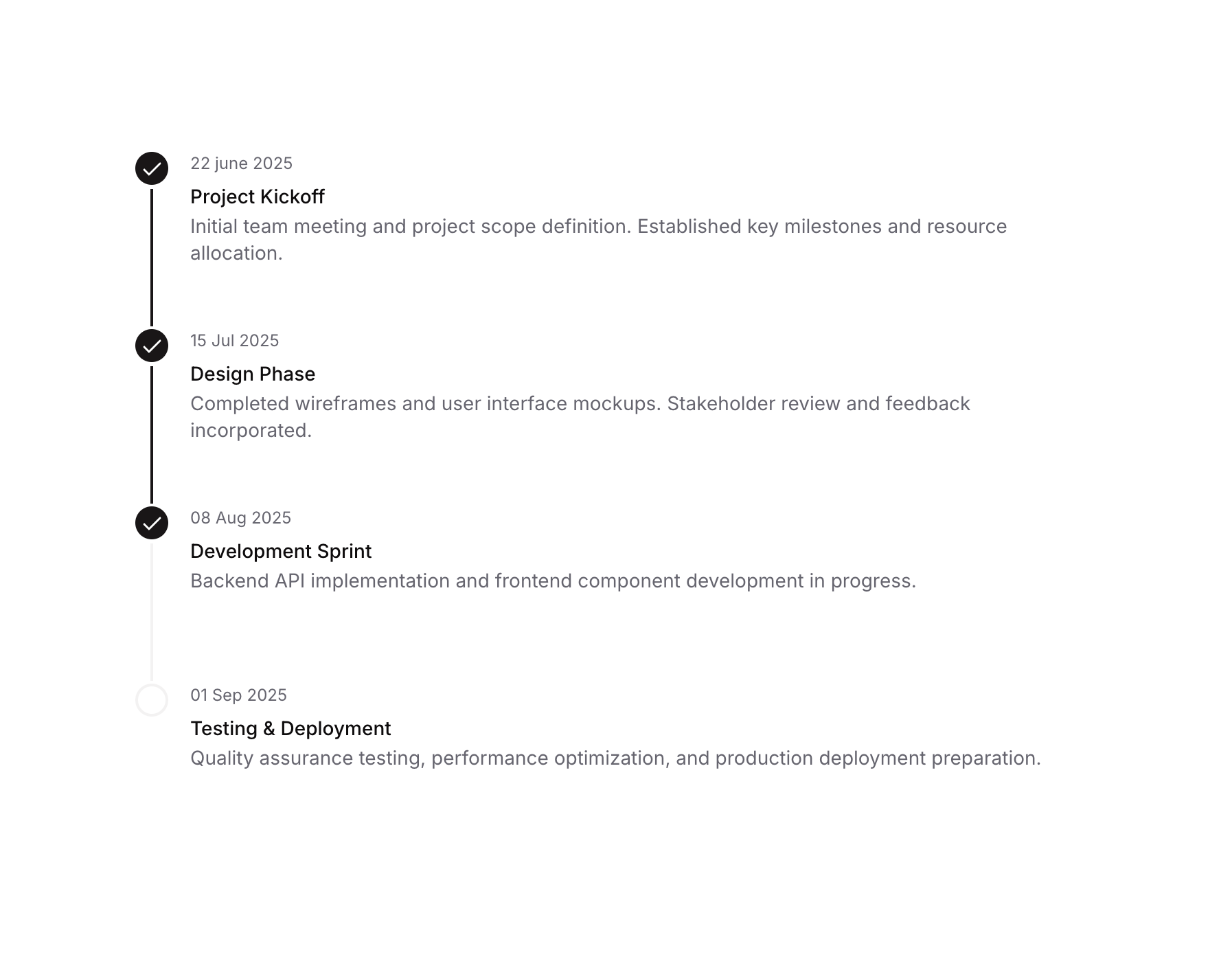
> Vertical timeline with icon indicators, separators, and title/description/date text columns.
## Overview
Timeline 05 is a vertical timeline UI component designed to display a sequence of events or project milestones. Each timeline item includes a circular icon indicator, a separator line connecting items, and a text block showing a date, title, and description. It is suitable for project progress tracking, onboarding flows, or any step-by-step process visualization.
## How to use
Navigate to the **Elements** category in the Brikl panel.
Find **Timeline 05** and click **Copy**.
Paste it into your Bubble canvas with `Cmd + V` (Mac) or `Ctrl + V` (Windows),
or right-click on the canvas and select **Paste**.
## States
This component includes conditional states that automatically change its appearance.
| State | Trigger | Visual effect |
| ------------------ | ------------------------------------------- | ---------------------------------------------------------------------------------------------- |
| Completed | Timeline item represents a finished step | Indicator circle uses dark background (rgba(27,23,24,1)) with a visible check icon |
| Pending / Upcoming | Timeline item represents an incomplete step | Separator line uses light color (rgba(245,244,244,1)) indicating the step has not been reached |
These states are handled natively by Bubble and require no additional setup.
They will work automatically once the component is pasted into your editor.
## Responsive
This component adapts to mobile screens. Font sizes and layout automatically adjust on screens smaller than Bubble's built-in mobile breakpoint.
## Requirements
| | |
| ----------- | --------------------- |
| License | Starter plan required |
| Plugins | None |
| Custom code | Not required |
## Platforms
| Platform | Supported |
| -------- | --------- |
| Web | ✅ |
| Mobile | ✅ |
## License
This component requires a **Starter** plan.