> ## Documentation Index
> Fetch the complete documentation index at: https://docs.brikl.co/llms.txt
> Use this file to discover all available pages before exploring further.
# Blog 05
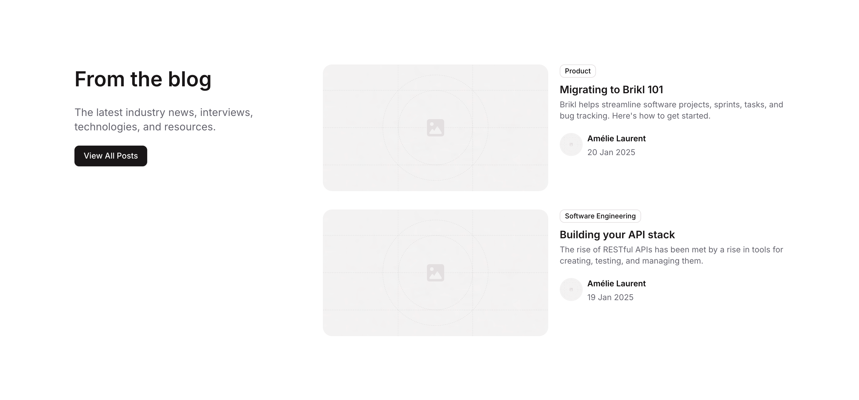
> Blog listing component with article image, badge, title, description, and author avatar row.
## Overview
Blog 05 is a marketing blog list component designed for web applications. It displays a curated list of blog articles, each featuring a thumbnail image, a category badge, an article title, a short description, and an author section with an avatar image, author name, and publication date. The layout is structured using nested groups with column and row containers, making it suitable for content-heavy marketing pages.
## How to use
Navigate to the **Marketings** category in the Brikl panel.
Find **Blog 05** and click **Copy**.
Paste it into your Bubble canvas with `Cmd + V` (Mac) or `Ctrl + V` (Windows),
or right-click on the canvas and select **Paste**.
## States
This component includes conditional states that automatically change its appearance.
| State | Trigger | Visual effect |
| ---------------------- | -------------------------------------------------- | -------------------------------------------------------------------------------------------------------------------------------- |
| Responsive Image State | Current page width is less than or equal to 1280px | The article thumbnail image adjusts its minimum width to 100% and minimum height to 300px for better display on smaller screens. |
These states are handled natively by Bubble and require no additional setup.
They will work automatically once the component is pasted into your editor.
## Responsive
This component adapts to mobile screens. Font sizes and layout automatically adjust on screens smaller than Bubble's built-in mobile breakpoint.
## Requirements
| | |
| ----------- | --------------------- |
| License | Starter plan required |
| Plugins | None |
| Custom code | Not required |
## Platforms
| Platform | Supported |
| -------- | --------- |
| Web | ✅ |
| Mobile | ❌ |
## License
This component requires a **Starter** plan.