> ## Documentation Index
> Fetch the complete documentation index at: https://docs.brikl.co/llms.txt
> Use this file to discover all available pages before exploring further.
# Contact 05
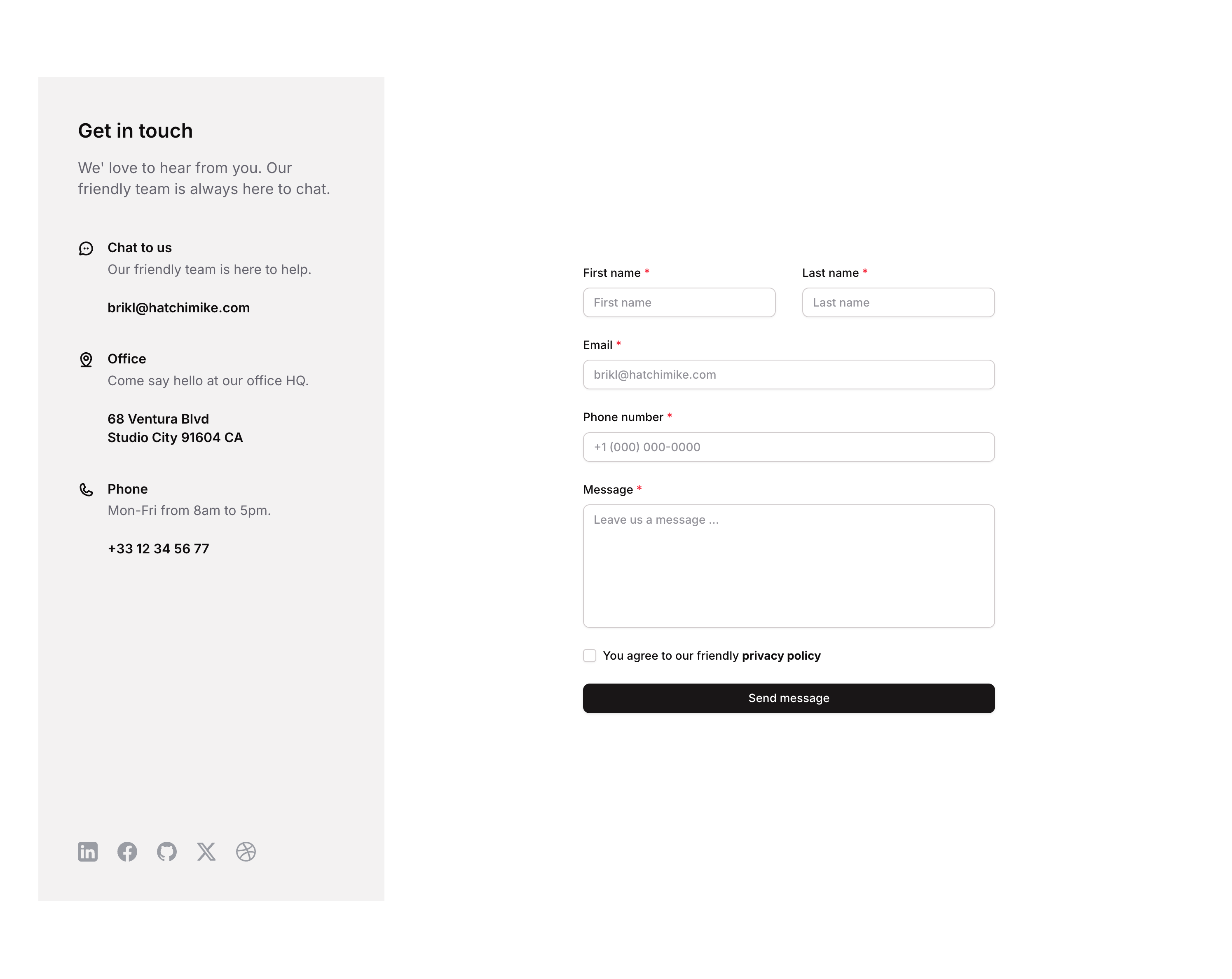
> Two-column contact form with first name, last name inputs, labels, and responsive stacking layout.
## Overview
Contact 05 is a marketing contact section component featuring a structured form layout with First Name and Last Name input fields arranged side by side. It is designed for web pages where users can submit their contact information. The component includes responsive behavior that stacks fields vertically on smaller screens (768px and below), input validation states, focus styles, and mandatory field indicators marked with a red asterisk.
## How to use
Navigate to the **Marketings** category in the Brikl panel.
Find **Contact 05** and click **Copy**.
Paste it into your Bubble canvas with `Cmd + V` (Mac) or `Ctrl + V` (Windows),
or right-click on the canvas and select **Paste**.
## States
This component includes conditional states that automatically change its appearance.
| State | Trigger | Visual effect |
| ------------------------- | ---------------------------------------------------- | ----------------------------------------------------------------------------------------------------------------------------------------------- |
| Input Focused | User focuses on First Name or Last Name input field | Input shows a soft colored box shadow (rgba(216,211,212,0.5)) with spread of 3 to indicate active focus |
| Input Invalid | Input field fails validation (isnt\_valid condition) | Border turns red (rgba(251,44,54,1)) and a red-tinted box shadow appears around the input |
| Input Disabled | Input is not clickable (isnt\_clickable condition) | Input opacity reduces to 50% to visually indicate a disabled state |
| Responsive Stacked Layout | Page width is less than or equal to 768px | First Name and Last Name groups switch to 100% min-width, stacking vertically; content group row gap changes to 64px; form max-width is cleared |
These states are handled natively by Bubble and require no additional setup.
They will work automatically once the component is pasted into your editor.
## Responsive
This component adapts to mobile screens. Font sizes and layout automatically adjust on screens smaller than Bubble's built-in mobile breakpoint.
## Requirements
| | |
| ----------- | --------------------- |
| License | Starter plan required |
| Plugins | None |
| Custom code | Not required |
## Platforms
| Platform | Supported |
| -------- | --------- |
| Web | ✅ |
| Mobile | ❌ |
## License
This component requires a **Starter** plan.