> ## Documentation Index
> Fetch the complete documentation index at: https://docs.brikl.co/llms.txt
> Use this file to discover all available pages before exploring further.
# Features 06
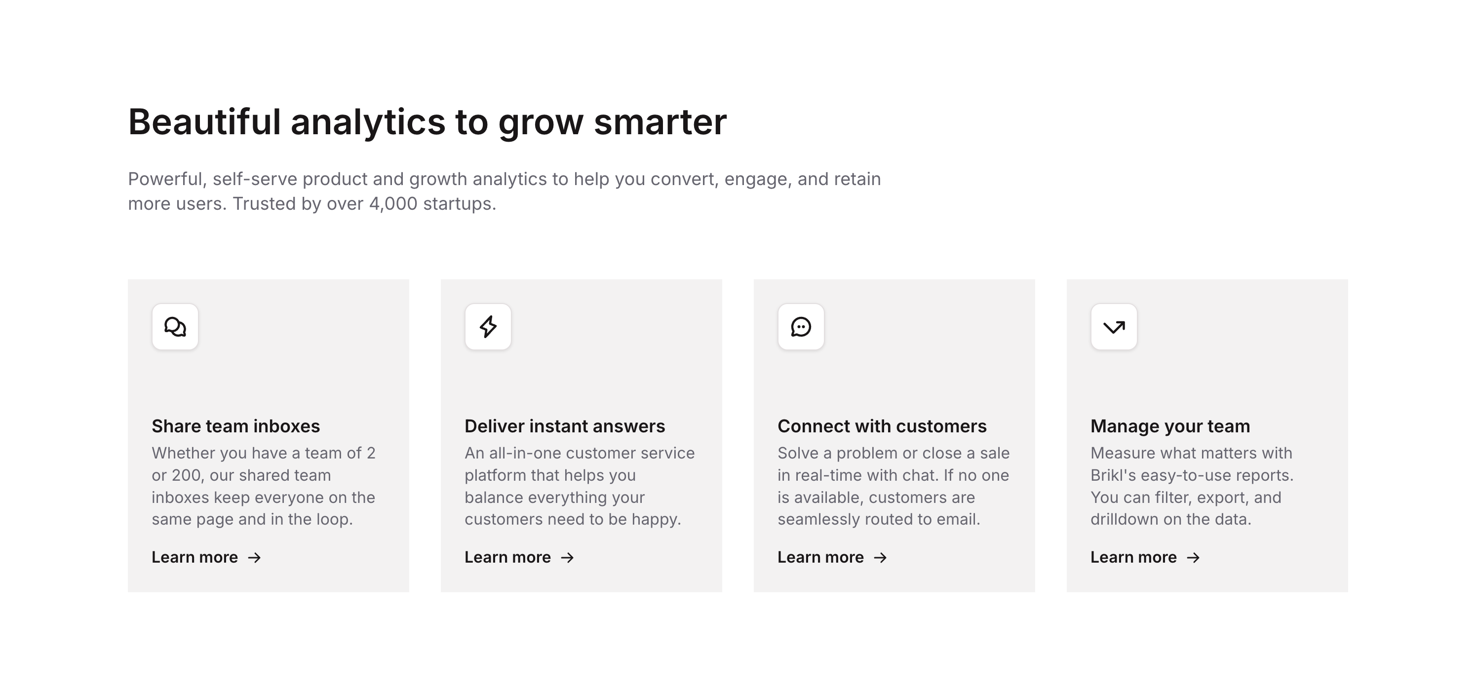
> Feature section with icon cards, titles, descriptions, and 'Learn more' CTAs in column layout.
## Overview
Features 06 is a marketing component that showcases a list of product features with a header section containing a title and subtitle, followed by individual feature cards. Each card includes an icon, feature title, description text, and a 'Learn more' button with an arrow icon, designed to highlight key product capabilities in a clean, structured layout.
## How to use
Navigate to the **Marketings** category in the Brikl panel.
Find **Features 06** and click **Copy**.
Paste it into your Bubble canvas with `Cmd + V` (Mac) or `Ctrl + V` (Windows), or right-click on the canvas and select **Paste**.
## States
This component includes conditional states that automatically change its appearance.
| State | Trigger | Visual effect |
| -------------------------- | ----------------------------------------------- | ----------------------------------------------------------------------------------- |
| Mobile/Tablet Layout | Current Page Width less than or equal to 1024px | Header and feature item groups expand to 100% minimum width for full-width stacking |
| Small Screen Title | Current Page Width less than or equal to 768px | Header title font size reduces from 36px to 30px |
| Learn More Button Hover | Button is hovered | Underline appears and font color changes to rgba(15,15,15,1) |
| Learn More Button Disabled | Button is not clickable | Button opacity reduces to 50% |
These states are handled natively by Bubble and require no additional setup. They will work automatically once the component is pasted into your editor.
## Responsive
This component adapts to mobile screens. Font sizes and layout automatically adjust on screens smaller than Bubble's built-in mobile breakpoint.
## Requirements
| | |
| ----------- | --------------------- |
| License | Starter plan required |
| Plugins | None |
| Custom code | Not required |
## Platforms
| Platform | Supported |
| -------- | --------- |
| Web | ✅ |
| Mobile | ❌ |
## License
This component requires a **Starter** plan.