> ## Documentation Index
> Fetch the complete documentation index at: https://docs.brikl.co/llms.txt
> Use this file to discover all available pages before exploring further.
# Flowbase
Beginner Level : Simple templates for new users with little to no Bubble experience.
 ## Overview
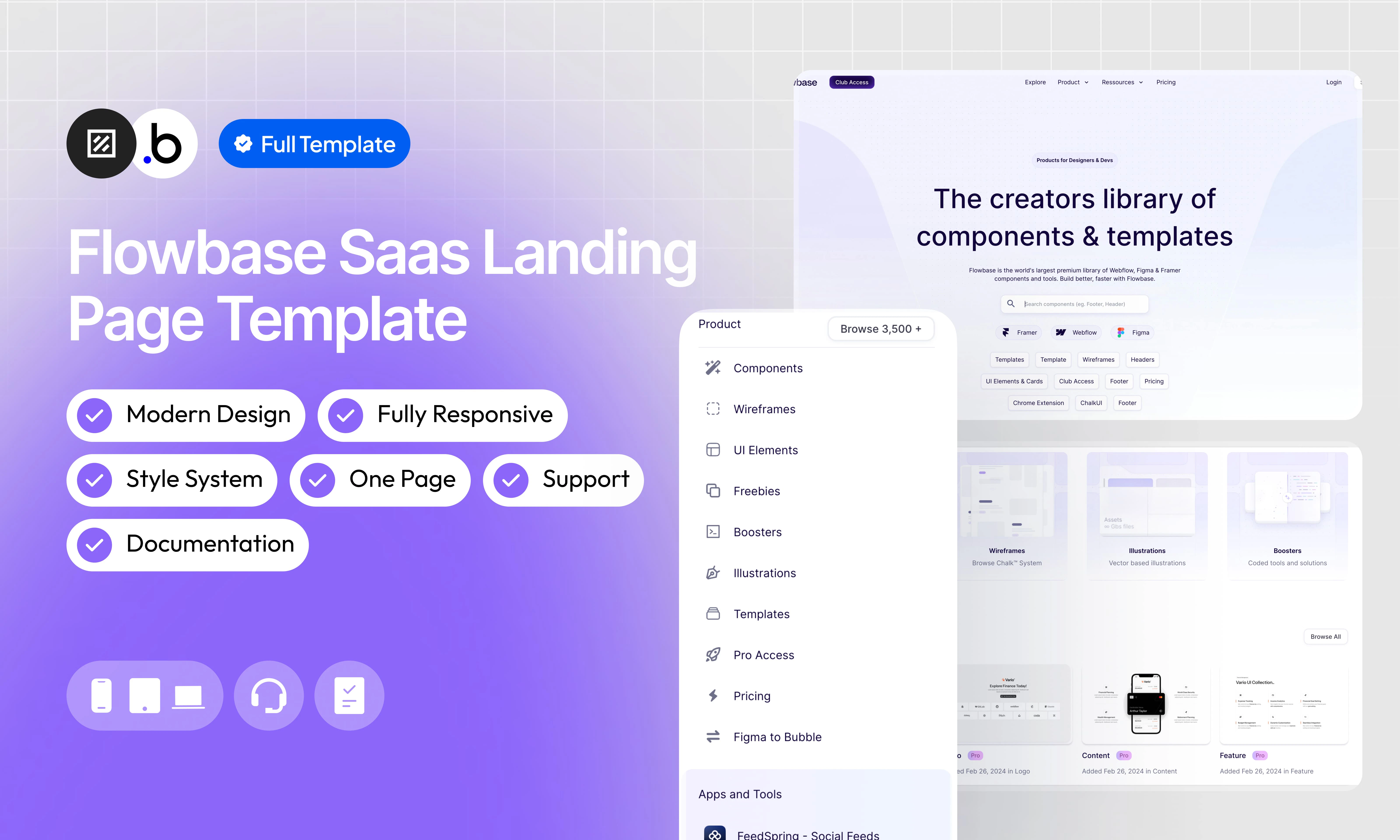
Our SaaS Landing Page template is a fully static, single-page template that reproduces the layout and design of a modern SaaS product marketplace. It requires no database setup and is ready to customize out of the box.
The page is structured into clearly defined sections that scroll from top to bottom:
Navbar : A top navigation bar with a logo, navigation links, and Login / Sign Up action buttons.
Hero Section : A large above-the-fold section featuring a bold headline, a descriptive subheadline, a search bar, platform filter tags (Framer, Webflow, Figma), and a set of category shortcut tags.
Category Cards : A row of four visual cards presenting the main content categories available on the platform (Components, Wireframes, Illustrations, Boosters), each with a description and browse link.
Recent Components : A grid displaying the latest components added to the platform, each with a thumbnail, title, badge, and date.
Promotional Banner : A full-width banner section highlighting a featured product or partner, with a headline, description, and CTA button.
Trending Section : A grid showcasing the most popular components, with thumbnails, titles, badges, and recent activity dates.
Premium Templates : A grid of premium template cards displaying the template name, price, and platform tag.
Dark Promotional Banner : A high-contrast dark section promoting an external tool or integration, with a headline and CTA.
Illustrations Section : A grid of recent illustration assets available on the platform.
CTA Section : A centered call-to-action block with a headline, subheadline, and a primary action button to encourage sign-up or exploration.
Blog Section : A row of three recent blog post cards, each with a cover image, title, and short description.
Footer : A multi-column footer containing navigation links organized by category, social media icons, and legal mentions.
## Functionalities
The template is designed to adapt seamlessly to all screen sizes and devices, ensuring a consistent and optimized experience on desktop, tablet, and mobile.
This template is entirely static. There is no database configuration needed, making setup straightforward and the template easy to maintain and deploy.
A top navigation bar with a logo on the left, navigation links in the center, and Login / Sign Up buttons on the right. Collapses into a mobile-friendly menu on smaller screens.
A full-width above-the-fold section with a headline, subheadline, a search bar, platform logos (Framer, Webflow, Figma), and a row of category shortcut tags to help users navigate quickly.
A row of four visual cards presenting the main content categories of the platform, each with a thumbnail, title, short description, and a browse link.
A labeled grid section displaying the most recently added components, each presented as a card with a preview thumbnail, title, badge, and publication date.
A full-width banner section used to highlight a featured product, partner, or key message. Includes a headline, description text, and a CTA button.
A grid showcasing trending components, following the same card format as the Recent Components section.
A curated grid of premium template cards, each displaying a preview image, template name, price, and platform tag.
A high-contrast dark full-width section promoting an integration or external tool, with a bold headline and a CTA button.
A grid of recent illustration assets, presented as visual cards with preview thumbnails.
A centered call-to-action block with a headline, a supporting subheadline, and a primary action button encouraging visitors to sign up or explore the platform.
A row of three blog post cards, each with a cover image, article title, and a brief description to drive traffic to editorial content.
A multi-column footer with navigation links organized by category, social media icons, and legal mentions including copyright information.
A clean and contemporary interface built with strong visual hierarchy, generous spacing, and consistent typographic choices to maximize readability and engagement.
A clearly organized workflow architecture using logical grouping and visual categorization to improve readability, scalability, and long-term maintainability.
## Pages
The main and only page of the template. It contains all sections of the landing page in order: Navbar, Hero, Category Cards, Recent Components, Promotional Banner, Trending Section, Premium Templates, Dark Promotional Banner, Illustrations, CTA Section, Blog Section, and Footer.
## Workflows
This structure uses folders and colors to organize workflows clearly, improve readability, and ensure consistent logic management across the application.
In Bubble, workflows define how an application behaves. They are triggered by events and run actions that manage data, navigation, and user interactions.
### Folders
Folders are structured by functional category, with each folder grouping workflows related to a specific domain of the application. This approach ensures that every type of logic has its dedicated space, making the overall workflow architecture clearer, more organized, and easier to maintain.
This folder contains workflows responsible for creating, updating, deleting, and managing data within the application. It centralizes all logic that interacts directly with the database to ensure structured and consistent data handling.
This folder groups workflows that control page transitions, redirects, and user journeys. It defines how users move through the application and ensures a clear and predictable flow.
This folder includes workflows that depend on external plugins or third party integrations. It isolates plugin related logic to keep the core application structure clean and organized.
This folder contains workflows that affect the user interface, such as showing or hiding elements, triggering animations, or dynamically updating what the user sees. It manages front end behavior without altering stored data.
This folder groups workflows that manage temporary front end data stored in custom states. It is used to control dynamic interactions and interface logic without impacting the database.
Custom states are variables that you can save on any element on the page, including the page itself. They let you store data temporarily that is reset when the page is reloaded. This is useful when you need your app to remember some information that you don’t need to store permanently in the database.
This folder includes workflows dedicated to sending automated or transactional emails. It centralizes communication logic to ensure consistency and easier maintenance.
This folder contains workflows that handle external API calls and data exchanges with outside services. It organizes integration logic and keeps external communication clearly separated from internal processes.
### Colors
Colors are used as visual indicators to distinguish workflow types and intentions. Each color corresponds to a specific category of action, allowing quick recognition of the workflow’s purpose and improving readability across the entire logic structure.
Blue is used for workflows involving navigation, such as redirects to other pages or links.
Green indicates workflows involving the database, such as creating or updating data in the database or the registration/connection system.
Red indicates workflows that have an impact on deleting data or resetting values.
Orange is reserved for visual elements, such as showing or disappearing pop-ups, floating groups, and other such interactive elements.
This color is reserved for elements related to APIs and Plugins.
The Cyan color indicates specific interactions triggered by custom events or custom states.
Brown is use for email send
## Plugins
An overview of the external plugins integrated into the application to extend its native capabilities and enhance specific features or functionalities.
You might need to install these plugins when using the template.
### Iconify
Free
Unofficial Iconify plugin. Add any Icon from [http://iconify.design](http://iconify.design) to your application, change its color, flip it, rotate it, resize it — full customization with minimal setup.
### **Zoom on Hover**
Free
This plugin adds a zoom effect to elements when users hover over them.
## Refund Policy
This policy defines the conditions under which refunds may be requested for our products. It distinguishes between templates distributed through the Bubble Marketplace and the Brikl Chrome Extension, specifying the applicable deadlines, eligibility requirements, and usage-related limitations for each.
## Support
Your satisfaction is our priority. Do not hesitate to contact us if you have any questions or problems.
[support@brikl.co](mailto:support@brikl.co)
[https://www.brikl.co/](https://www.brikl.co/)
## Overview
Our SaaS Landing Page template is a fully static, single-page template that reproduces the layout and design of a modern SaaS product marketplace. It requires no database setup and is ready to customize out of the box.
The page is structured into clearly defined sections that scroll from top to bottom:
Navbar : A top navigation bar with a logo, navigation links, and Login / Sign Up action buttons.
Hero Section : A large above-the-fold section featuring a bold headline, a descriptive subheadline, a search bar, platform filter tags (Framer, Webflow, Figma), and a set of category shortcut tags.
Category Cards : A row of four visual cards presenting the main content categories available on the platform (Components, Wireframes, Illustrations, Boosters), each with a description and browse link.
Recent Components : A grid displaying the latest components added to the platform, each with a thumbnail, title, badge, and date.
Promotional Banner : A full-width banner section highlighting a featured product or partner, with a headline, description, and CTA button.
Trending Section : A grid showcasing the most popular components, with thumbnails, titles, badges, and recent activity dates.
Premium Templates : A grid of premium template cards displaying the template name, price, and platform tag.
Dark Promotional Banner : A high-contrast dark section promoting an external tool or integration, with a headline and CTA.
Illustrations Section : A grid of recent illustration assets available on the platform.
CTA Section : A centered call-to-action block with a headline, subheadline, and a primary action button to encourage sign-up or exploration.
Blog Section : A row of three recent blog post cards, each with a cover image, title, and short description.
Footer : A multi-column footer containing navigation links organized by category, social media icons, and legal mentions.
## Functionalities
The template is designed to adapt seamlessly to all screen sizes and devices, ensuring a consistent and optimized experience on desktop, tablet, and mobile.
This template is entirely static. There is no database configuration needed, making setup straightforward and the template easy to maintain and deploy.
A top navigation bar with a logo on the left, navigation links in the center, and Login / Sign Up buttons on the right. Collapses into a mobile-friendly menu on smaller screens.
A full-width above-the-fold section with a headline, subheadline, a search bar, platform logos (Framer, Webflow, Figma), and a row of category shortcut tags to help users navigate quickly.
A row of four visual cards presenting the main content categories of the platform, each with a thumbnail, title, short description, and a browse link.
A labeled grid section displaying the most recently added components, each presented as a card with a preview thumbnail, title, badge, and publication date.
A full-width banner section used to highlight a featured product, partner, or key message. Includes a headline, description text, and a CTA button.
A grid showcasing trending components, following the same card format as the Recent Components section.
A curated grid of premium template cards, each displaying a preview image, template name, price, and platform tag.
A high-contrast dark full-width section promoting an integration or external tool, with a bold headline and a CTA button.
A grid of recent illustration assets, presented as visual cards with preview thumbnails.
A centered call-to-action block with a headline, a supporting subheadline, and a primary action button encouraging visitors to sign up or explore the platform.
A row of three blog post cards, each with a cover image, article title, and a brief description to drive traffic to editorial content.
A multi-column footer with navigation links organized by category, social media icons, and legal mentions including copyright information.
A clean and contemporary interface built with strong visual hierarchy, generous spacing, and consistent typographic choices to maximize readability and engagement.
A clearly organized workflow architecture using logical grouping and visual categorization to improve readability, scalability, and long-term maintainability.
## Pages
The main and only page of the template. It contains all sections of the landing page in order: Navbar, Hero, Category Cards, Recent Components, Promotional Banner, Trending Section, Premium Templates, Dark Promotional Banner, Illustrations, CTA Section, Blog Section, and Footer.
## Workflows
This structure uses folders and colors to organize workflows clearly, improve readability, and ensure consistent logic management across the application.
In Bubble, workflows define how an application behaves. They are triggered by events and run actions that manage data, navigation, and user interactions.
### Folders
Folders are structured by functional category, with each folder grouping workflows related to a specific domain of the application. This approach ensures that every type of logic has its dedicated space, making the overall workflow architecture clearer, more organized, and easier to maintain.
This folder contains workflows responsible for creating, updating, deleting, and managing data within the application. It centralizes all logic that interacts directly with the database to ensure structured and consistent data handling.
This folder groups workflows that control page transitions, redirects, and user journeys. It defines how users move through the application and ensures a clear and predictable flow.
This folder includes workflows that depend on external plugins or third party integrations. It isolates plugin related logic to keep the core application structure clean and organized.
This folder contains workflows that affect the user interface, such as showing or hiding elements, triggering animations, or dynamically updating what the user sees. It manages front end behavior without altering stored data.
This folder groups workflows that manage temporary front end data stored in custom states. It is used to control dynamic interactions and interface logic without impacting the database.
Custom states are variables that you can save on any element on the page, including the page itself. They let you store data temporarily that is reset when the page is reloaded. This is useful when you need your app to remember some information that you don’t need to store permanently in the database.
This folder includes workflows dedicated to sending automated or transactional emails. It centralizes communication logic to ensure consistency and easier maintenance.
This folder contains workflows that handle external API calls and data exchanges with outside services. It organizes integration logic and keeps external communication clearly separated from internal processes.
### Colors
Colors are used as visual indicators to distinguish workflow types and intentions. Each color corresponds to a specific category of action, allowing quick recognition of the workflow’s purpose and improving readability across the entire logic structure.
Blue is used for workflows involving navigation, such as redirects to other pages or links.
Green indicates workflows involving the database, such as creating or updating data in the database or the registration/connection system.
Red indicates workflows that have an impact on deleting data or resetting values.
Orange is reserved for visual elements, such as showing or disappearing pop-ups, floating groups, and other such interactive elements.
This color is reserved for elements related to APIs and Plugins.
The Cyan color indicates specific interactions triggered by custom events or custom states.
Brown is use for email send
## Plugins
An overview of the external plugins integrated into the application to extend its native capabilities and enhance specific features or functionalities.
You might need to install these plugins when using the template.
### Iconify
Free
Unofficial Iconify plugin. Add any Icon from [http://iconify.design](http://iconify.design) to your application, change its color, flip it, rotate it, resize it — full customization with minimal setup.
### **Zoom on Hover**
Free
This plugin adds a zoom effect to elements when users hover over them.
## Refund Policy
This policy defines the conditions under which refunds may be requested for our products. It distinguishes between templates distributed through the Bubble Marketplace and the Brikl Chrome Extension, specifying the applicable deadlines, eligibility requirements, and usage-related limitations for each.
## Support
Your satisfaction is our priority. Do not hesitate to contact us if you have any questions or problems.
[support@brikl.co](mailto:support@brikl.co)
[https://www.brikl.co/](https://www.brikl.co/)