> ## Documentation Index
> Fetch the complete documentation index at: https://docs.brikl.co/llms.txt
> Use this file to discover all available pages before exploring further.
# Herova
Beginner Level : Simple templates for new users with little to no Bubble experience.
 ## Overview
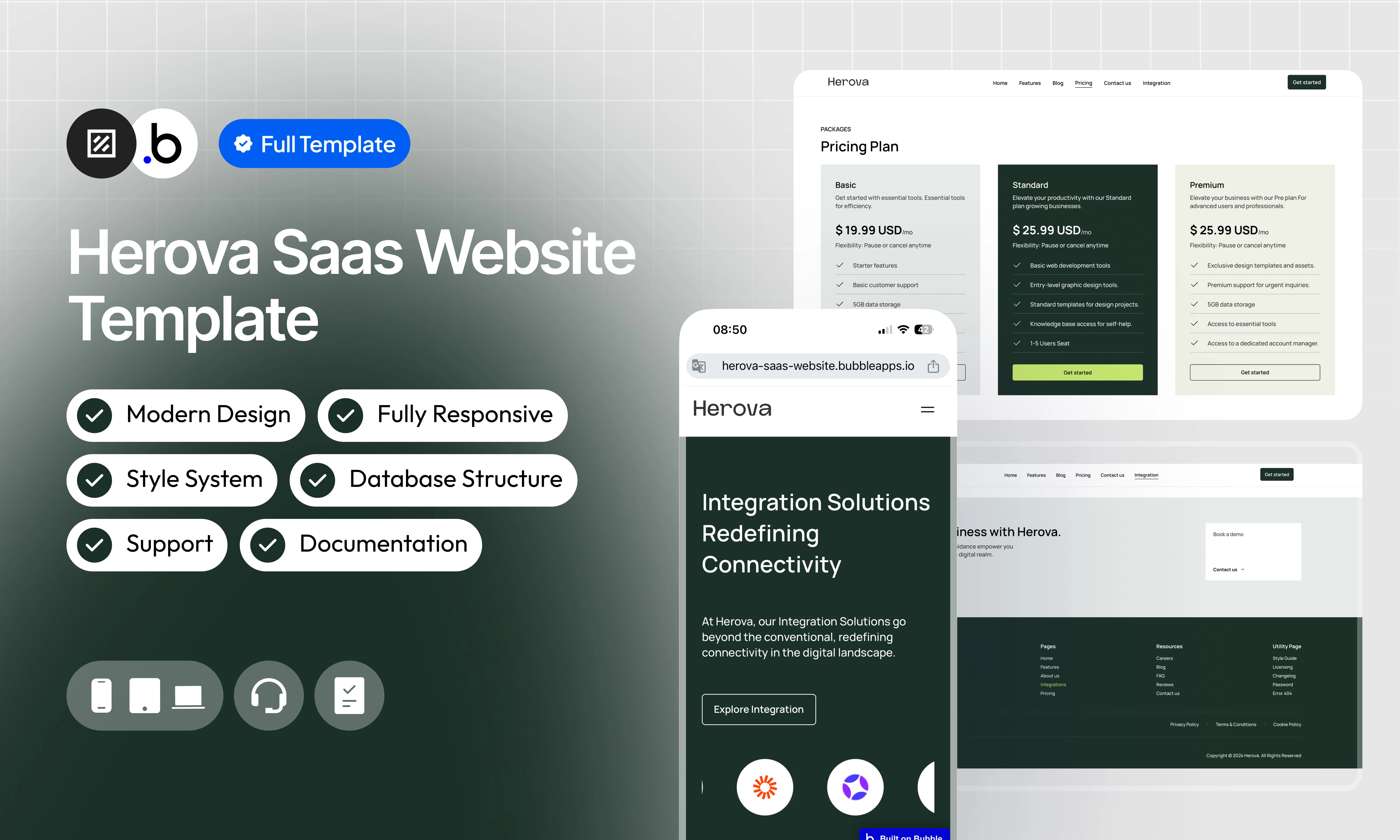
Herova SaaS Website Template is the ideal solution for SaaS companies looking for a website that is elegant, powerful and easy to manage. With a modern and fully responsive design, this template fits perfectly to mobile screens, tablets and computers, offering an optimal user experience.
## Functionalities
Enjoy a fully adaptive design, offering a smooth and optimized experience on all devices (computers, tablets and smartphones).
A contemporary, clean and professional design designed to enhance your brand image and offer intuitive navigation.
Customize every aspect of the template easily, without coding skills, to adapt it to your specific needs.
Create, edit and publish articles to share your news, improve your SEO and engage your audience.
Post job offers, manage applications and present your career opportunities in a clear and professional way.
Manage your blog posts and job postings via an intuitive admin interface, simplifying updates and content management.
## Pages
Home page presenting your SaaS with an overview of features, customer testimonials, pricing plans and a CTA to request a demo.
Presents your company’s history, mission and values, as well as the team behind your SaaS.
Interface dedicated to administrators to easily manage blog posts and job offers.
Page detailing a blog post with title, content, author, date of publication and social sharing.
Page listing blog posts in grid form, with a preview of the title, summary and link to read the full article.
Presentation of career opportunities with a list of open positions and a CTA to apply for.
Contact page with a form to send messages and essential information (address, email, phone).
Section dedicated to frequently asked questions with clear answers.
Detail of the main features of SaaS, illustrated by clear descriptions and icons.
List of applications and services compatible with your SaaS, with an attractive visual presentation.
Page detailing a specific position with description, tasks, requirements and a button to apply.
Secure page to access the administration interface via a password.
Presents the different pricing plans with their associated features and a sign up button.
Displays testimonials from satisfied users to strengthen the credibility of your SaaS.
Totally personalized error page
## Reusable Elements
A collection of shared components built to be used across multiple pages, helping maintain design consistency while making updates and scaling more efficient.
A reusable element creates an element that contains other elements, like a group, that can be used in more than one place. This is useful when reusing the same elements often. Using reusable elements keeps the app smaller and makes it easier to edit.
Component listing blog posts with title, summary and link to full reading.
CTA inviting visitors to request a demo of the product to discover its functionalities.
Dynamic list of the most common questions/answers, organized for easy reading.
Footer with essential links (legal notices, contact, social networks, etc.).
Header with logo, main navigation and call to action button.
Presents the applications compatible with your SaaS, facilitating their discovery and connection.
Confirmation window to delete a blog post safely.
Confirmation window to remove a job offer from the platform.
Displays the features included in each rate plan as a list.
Component presenting the different offers, their prices and a registration button.
Section dedicated to customer reviews with citation, name and role to build trust.
## Workflows
This structure uses folders and colors to organize workflows clearly, improve readability, and ensure consistent logic management across the application.
In Bubble, workflows define how an application behaves. They are triggered by events and run actions that manage data, navigation, and user interactions.
### Folders
Folders are structured by functional category, with each folder grouping workflows related to a specific domain of the application. This approach ensures that every type of logic has its dedicated space, making the overall workflow architecture clearer, more organized, and easier to maintain.
This folder contains workflows responsible for creating, updating, deleting, and managing data within the application. It centralizes all logic that interacts directly with the database to ensure structured and consistent data handling.
This folder groups workflows that control page transitions, redirects, and user journeys. It defines how users move through the application and ensures a clear and predictable flow.
This folder includes workflows that depend on external plugins or third party integrations. It isolates plugin related logic to keep the core application structure clean and organized.
This folder contains workflows that affect the user interface, such as showing or hiding elements, triggering animations, or dynamically updating what the user sees. It manages front end behavior without altering stored data.
This folder groups workflows that manage temporary front end data stored in custom states. It is used to control dynamic interactions and interface logic without impacting the database.
Custom states are variables that you can save on any element on the page, including the page itself. They let you store data temporarily that is reset when the page is reloaded. This is useful when you need your app to remember some information that you don’t need to store permanently in the database.
This folder includes workflows dedicated to sending automated or transactional emails. It centralizes communication logic to ensure consistency and easier maintenance.
This folder contains workflows that handle external API calls and data exchanges with outside services. It organizes integration logic and keeps external communication clearly separated from internal processes.
### Colors
Colors are used as visual indicators to distinguish workflow types and intentions. Each color corresponds to a specific category of action, allowing quick recognition of the workflow’s purpose and improving readability across the entire logic structure.
Blue is used for workflows involving navigation, such as redirects to other pages or links.
Green indicates workflows involving the database, such as creating or updating data in the database or the registration/connection system.
Red indicates workflows that have an impact on deleting data or resetting values.
Orange is reserved for visual elements, such as showing or disappearing pop-ups, floating groups, and other such interactive elements.
This color is reserved for elements related to APIs and Plugins.
The Cyan color indicates specific interactions triggered by custom events or custom states.
Brown is use for email send
## Datatypes
The database consists of different **data types** that you as the developer plan and set up. Data types are like containers that hold specific types of information and each data type is made up of **fields** where that information is stored.
### Blog
(Description)
| Field Name | Type | Note |
| ---------- | ------- | ------------------------------------------------------------------------------- |
| category | `text` | Article category to organize the content. |
| content | `text` | Main content of the article, including full text with images and formatting. |
| subtitle | `text` | Subtitle of the article providing a concise summary or supplement to the title. |
| thumbnail | `image` | Preview image used to illustrate the blog page article. |
| title | `text` | Main article title, displayed on the blog page and detailed article. |
### Jobs
(Description)
| Field Name | Type | Note |
| -------------------------- | ------------------------ | ------------------------------------------------------------- |
| educational\_qualification | `text` | Level of education required for the position. |
| experience | `number` | Years of experience required or recommended for the position. |
| location | `text` | location of the position |
| max\_salary | `number` | Maximum salary proposed for the position. |
| min\_salary | `number` | Proposed minimum wage for the position. |
| overview | `text` | Brief job and company introduction. |
| requirements | `text` | Skills and qualifications required for the position. |
| responsibilities | `text` | List of missions and tasks to be performed. |
| title | `text` | Job title |
| type | `Job Type (Option Sets)` | Type of contract (Option Sets). |
| working\_days | `number` | Working days. |
### Password
(Description)
| Field Name | Type | Note |
| ---------- | ---- | ---------------------------------------------------------------- |
| password | text | Secure password required to access the administration interface. |
## Option Sets
This section covers option sets, used to store a static list of options in a database-like structure
Option sets let you set up different types of static options in a database-like structure, but without using the database. This is useful to store information like days of the week, marital status, colors, states, countries and other data that you want to load quickly and that’s rarely updated.
### Dashboard Admin
Option set defining the navigation items available in the admin dashboard sidebar, each associated with a display label and an icon.
| Attributes | Type | Note |
| ---------- | ------ | ----------------------------------------------------------------------------------- |
| Display | `text` | Label displayed in the sidebar navigation for each admin menu item. |
| Icon | `text` | Icon name (Iconify format) associated with the menu item for visual identification. |
* Home
* Create Article
* Articles
* Create Job
* Jobs
### FAQ
Option set storing the frequently asked questions and their answers, displayed statically on the FAQ page without requiring a database call.
| Attributes | Type | Note |
| ---------- | ------ | ------------------------------------------------------------------------------ |
| Display | `text` | The question text displayed to the user on the FAQ page. |
| Answer | `text` | The answer corresponding to the question, shown when the FAQ item is expanded. |
* How do I get started with Herova?
* Is there a self-help knowledge base available?
* How is my data secured on Herova?
* What integrations does Herova support?
* Can I collaborate with my team on Herova?
* Is there a knowledge base available for self-help?
### Job Type
Option set defining the available contract types for a job posting, used to categorize and filter job offers.
| Attributes | Type | Note |
| ---------- | ---- | ------------------------------------------------------------------------------ |
| Display | text | Label of the contract type displayed in the job details and job creation form. |
* Full-Time
* Part-Time
* Apprenticeship
* Traineeship
* Internship
## Plugins
An overview of the external plugins integrated into the application to extend its native capabilities and enhance specific features or functionalities.
You might need to install these plugins when using the template.
### Classify
Free
Classify brings the power of CSS to Bubble.\
This tiny plugins allow editors to add CSS classes to any elements on theirs pages.
### Rich Text Editor
Free
Enable your users to write rich, formatted text in an input. Compatible with text elements and email
### Iconify
Free
Unofficial Iconify plugin. Add any Icon from [http://iconify.design](http://iconify.design) to you application, change it's color\*, flip it, rotate it\*, resize it, just do what you want.
## Refund Policy
This policy defines the conditions under which refunds may be requested for our products. It distinguishes between templates distributed through the Bubble Marketplace and the Brikl Chrome Extension, specifying the applicable deadlines, eligibility requirements, and usage-related limitations for each.
## Support
Your satisfaction is our priority. Do not hesitate to contact us if you have any questions or problems.
[support@brikl.co](mailto:support@brikl.co)
[https://www.brikl.co/](https://www.brikl.co/)
## Overview
Herova SaaS Website Template is the ideal solution for SaaS companies looking for a website that is elegant, powerful and easy to manage. With a modern and fully responsive design, this template fits perfectly to mobile screens, tablets and computers, offering an optimal user experience.
## Functionalities
Enjoy a fully adaptive design, offering a smooth and optimized experience on all devices (computers, tablets and smartphones).
A contemporary, clean and professional design designed to enhance your brand image and offer intuitive navigation.
Customize every aspect of the template easily, without coding skills, to adapt it to your specific needs.
Create, edit and publish articles to share your news, improve your SEO and engage your audience.
Post job offers, manage applications and present your career opportunities in a clear and professional way.
Manage your blog posts and job postings via an intuitive admin interface, simplifying updates and content management.
## Pages
Home page presenting your SaaS with an overview of features, customer testimonials, pricing plans and a CTA to request a demo.
Presents your company’s history, mission and values, as well as the team behind your SaaS.
Interface dedicated to administrators to easily manage blog posts and job offers.
Page detailing a blog post with title, content, author, date of publication and social sharing.
Page listing blog posts in grid form, with a preview of the title, summary and link to read the full article.
Presentation of career opportunities with a list of open positions and a CTA to apply for.
Contact page with a form to send messages and essential information (address, email, phone).
Section dedicated to frequently asked questions with clear answers.
Detail of the main features of SaaS, illustrated by clear descriptions and icons.
List of applications and services compatible with your SaaS, with an attractive visual presentation.
Page detailing a specific position with description, tasks, requirements and a button to apply.
Secure page to access the administration interface via a password.
Presents the different pricing plans with their associated features and a sign up button.
Displays testimonials from satisfied users to strengthen the credibility of your SaaS.
Totally personalized error page
## Reusable Elements
A collection of shared components built to be used across multiple pages, helping maintain design consistency while making updates and scaling more efficient.
A reusable element creates an element that contains other elements, like a group, that can be used in more than one place. This is useful when reusing the same elements often. Using reusable elements keeps the app smaller and makes it easier to edit.
Component listing blog posts with title, summary and link to full reading.
CTA inviting visitors to request a demo of the product to discover its functionalities.
Dynamic list of the most common questions/answers, organized for easy reading.
Footer with essential links (legal notices, contact, social networks, etc.).
Header with logo, main navigation and call to action button.
Presents the applications compatible with your SaaS, facilitating their discovery and connection.
Confirmation window to delete a blog post safely.
Confirmation window to remove a job offer from the platform.
Displays the features included in each rate plan as a list.
Component presenting the different offers, their prices and a registration button.
Section dedicated to customer reviews with citation, name and role to build trust.
## Workflows
This structure uses folders and colors to organize workflows clearly, improve readability, and ensure consistent logic management across the application.
In Bubble, workflows define how an application behaves. They are triggered by events and run actions that manage data, navigation, and user interactions.
### Folders
Folders are structured by functional category, with each folder grouping workflows related to a specific domain of the application. This approach ensures that every type of logic has its dedicated space, making the overall workflow architecture clearer, more organized, and easier to maintain.
This folder contains workflows responsible for creating, updating, deleting, and managing data within the application. It centralizes all logic that interacts directly with the database to ensure structured and consistent data handling.
This folder groups workflows that control page transitions, redirects, and user journeys. It defines how users move through the application and ensures a clear and predictable flow.
This folder includes workflows that depend on external plugins or third party integrations. It isolates plugin related logic to keep the core application structure clean and organized.
This folder contains workflows that affect the user interface, such as showing or hiding elements, triggering animations, or dynamically updating what the user sees. It manages front end behavior without altering stored data.
This folder groups workflows that manage temporary front end data stored in custom states. It is used to control dynamic interactions and interface logic without impacting the database.
Custom states are variables that you can save on any element on the page, including the page itself. They let you store data temporarily that is reset when the page is reloaded. This is useful when you need your app to remember some information that you don’t need to store permanently in the database.
This folder includes workflows dedicated to sending automated or transactional emails. It centralizes communication logic to ensure consistency and easier maintenance.
This folder contains workflows that handle external API calls and data exchanges with outside services. It organizes integration logic and keeps external communication clearly separated from internal processes.
### Colors
Colors are used as visual indicators to distinguish workflow types and intentions. Each color corresponds to a specific category of action, allowing quick recognition of the workflow’s purpose and improving readability across the entire logic structure.
Blue is used for workflows involving navigation, such as redirects to other pages or links.
Green indicates workflows involving the database, such as creating or updating data in the database or the registration/connection system.
Red indicates workflows that have an impact on deleting data or resetting values.
Orange is reserved for visual elements, such as showing or disappearing pop-ups, floating groups, and other such interactive elements.
This color is reserved for elements related to APIs and Plugins.
The Cyan color indicates specific interactions triggered by custom events or custom states.
Brown is use for email send
## Datatypes
The database consists of different **data types** that you as the developer plan and set up. Data types are like containers that hold specific types of information and each data type is made up of **fields** where that information is stored.
### Blog
(Description)
| Field Name | Type | Note |
| ---------- | ------- | ------------------------------------------------------------------------------- |
| category | `text` | Article category to organize the content. |
| content | `text` | Main content of the article, including full text with images and formatting. |
| subtitle | `text` | Subtitle of the article providing a concise summary or supplement to the title. |
| thumbnail | `image` | Preview image used to illustrate the blog page article. |
| title | `text` | Main article title, displayed on the blog page and detailed article. |
### Jobs
(Description)
| Field Name | Type | Note |
| -------------------------- | ------------------------ | ------------------------------------------------------------- |
| educational\_qualification | `text` | Level of education required for the position. |
| experience | `number` | Years of experience required or recommended for the position. |
| location | `text` | location of the position |
| max\_salary | `number` | Maximum salary proposed for the position. |
| min\_salary | `number` | Proposed minimum wage for the position. |
| overview | `text` | Brief job and company introduction. |
| requirements | `text` | Skills and qualifications required for the position. |
| responsibilities | `text` | List of missions and tasks to be performed. |
| title | `text` | Job title |
| type | `Job Type (Option Sets)` | Type of contract (Option Sets). |
| working\_days | `number` | Working days. |
### Password
(Description)
| Field Name | Type | Note |
| ---------- | ---- | ---------------------------------------------------------------- |
| password | text | Secure password required to access the administration interface. |
## Option Sets
This section covers option sets, used to store a static list of options in a database-like structure
Option sets let you set up different types of static options in a database-like structure, but without using the database. This is useful to store information like days of the week, marital status, colors, states, countries and other data that you want to load quickly and that’s rarely updated.
### Dashboard Admin
Option set defining the navigation items available in the admin dashboard sidebar, each associated with a display label and an icon.
| Attributes | Type | Note |
| ---------- | ------ | ----------------------------------------------------------------------------------- |
| Display | `text` | Label displayed in the sidebar navigation for each admin menu item. |
| Icon | `text` | Icon name (Iconify format) associated with the menu item for visual identification. |
* Home
* Create Article
* Articles
* Create Job
* Jobs
### FAQ
Option set storing the frequently asked questions and their answers, displayed statically on the FAQ page without requiring a database call.
| Attributes | Type | Note |
| ---------- | ------ | ------------------------------------------------------------------------------ |
| Display | `text` | The question text displayed to the user on the FAQ page. |
| Answer | `text` | The answer corresponding to the question, shown when the FAQ item is expanded. |
* How do I get started with Herova?
* Is there a self-help knowledge base available?
* How is my data secured on Herova?
* What integrations does Herova support?
* Can I collaborate with my team on Herova?
* Is there a knowledge base available for self-help?
### Job Type
Option set defining the available contract types for a job posting, used to categorize and filter job offers.
| Attributes | Type | Note |
| ---------- | ---- | ------------------------------------------------------------------------------ |
| Display | text | Label of the contract type displayed in the job details and job creation form. |
* Full-Time
* Part-Time
* Apprenticeship
* Traineeship
* Internship
## Plugins
An overview of the external plugins integrated into the application to extend its native capabilities and enhance specific features or functionalities.
You might need to install these plugins when using the template.
### Classify
Free
Classify brings the power of CSS to Bubble.\
This tiny plugins allow editors to add CSS classes to any elements on theirs pages.
### Rich Text Editor
Free
Enable your users to write rich, formatted text in an input. Compatible with text elements and email
### Iconify
Free
Unofficial Iconify plugin. Add any Icon from [http://iconify.design](http://iconify.design) to you application, change it's color\*, flip it, rotate it\*, resize it, just do what you want.
## Refund Policy
This policy defines the conditions under which refunds may be requested for our products. It distinguishes between templates distributed through the Bubble Marketplace and the Brikl Chrome Extension, specifying the applicable deadlines, eligibility requirements, and usage-related limitations for each.
## Support
Your satisfaction is our priority. Do not hesitate to contact us if you have any questions or problems.
[support@brikl.co](mailto:support@brikl.co)
[https://www.brikl.co/](https://www.brikl.co/)