Overview
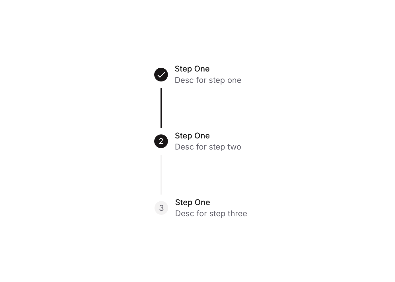
Stepper 11 is a multi-step progress indicator component designed for guiding users through sequential steps. It displays up to three steps, each with a numbered circle (or a checkmark icon when completed), a connecting line between steps, and optional title and description labels. The active and completed states are visually distinguished through background color changes, making it easy for users to track their progress in forms, onboarding flows, or wizards.
How to use
Open the Brikl panel
Navigate to the Elements category in the Brikl panel.
Copy the component
Find Stepper 11 and click Copy.
Paste into your editor
Paste it into your Bubble canvas with Cmd + V (Mac) or Ctrl + V (Windows),
or right-click on the canvas and select Paste.
States
This component includes conditional states that automatically change its appearance.
| State | Trigger | Visual effect |
|---|
| Step Active | Custom state ‘step_’ on the parent group equals the step number | The step circle background changes to dark (rgba(27,23,24,1)) and the step number text turns white |
| Step Completed | Custom state ‘step_’ on the parent group is greater than the step number | The step circle background turns dark, the number text is hidden, and a white checkmark icon becomes visible |
| Connecting Line Active | Custom state ‘step_’ is greater than the associated step number | The shape connector line changes from light grey (rgba(245,244,244,1)) to dark (rgba(27,23,24,1)) |
| Labels Hidden on Mobile | Current page width is less than or equal to the built-in mobile breakpoint | The title and description label group for each step is hidden to save space on small screens |
These states are handled natively by Bubble and require no additional setup.
They will work automatically once the component is pasted into your editor.
Responsive
This component adapts to mobile screens. Font sizes and layout automatically adjust on screens smaller than Bubble’s built-in mobile breakpoint.
Workflows
This component includes pre-built workflows.
| Trigger | Action |
|---|
| BT - Step 01 - Stepper 11 is clicked | Sets the custom state ‘step_’ on the parent group (bTQCw) to value 1 |
| BT - Step 02 - Stepper 11 is clicked | Sets the custom state ‘step_’ on the parent group (bTQCw) to value 2 |
| BT - Step 03 - Stepper 11 is clicked | Sets the custom state ‘step_’ on the parent group (bTQCw) to value 3 |
These workflows are included when you use the Copy with Workflows option in the Brikl panel.
Requirements
| |
|---|
| License | Starter plan required |
| Plugins | None |
| Custom code | Not required |
| Platform | Supported |
|---|
| Web | ✅ |
| Mobile | ✅ |
License
This component requires a Starter plan.