Overview
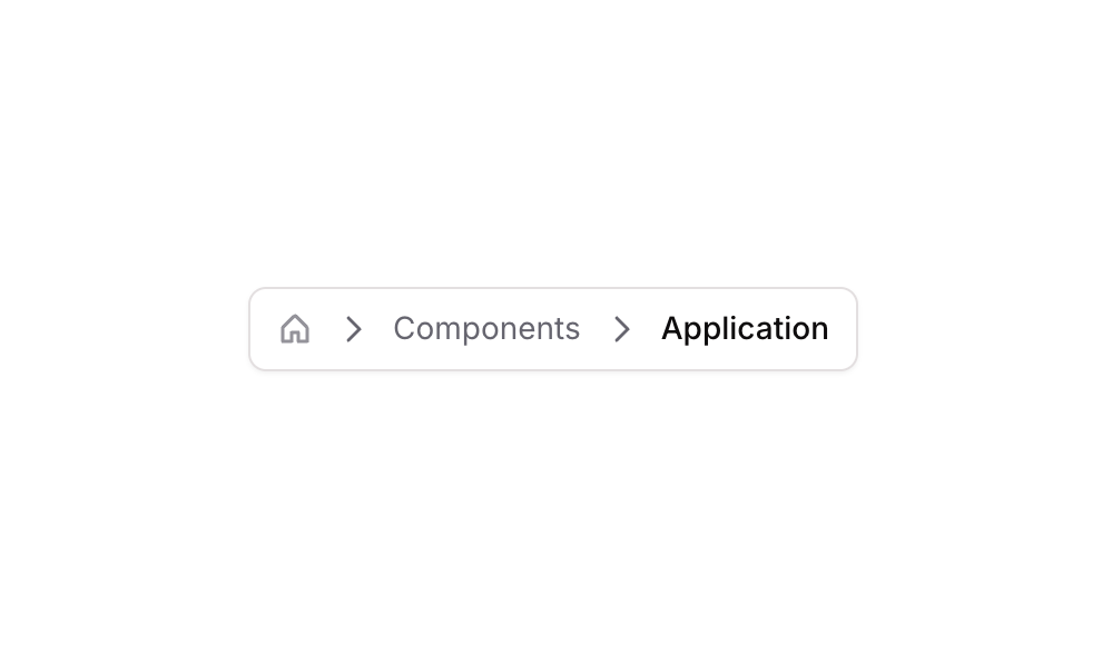
Breadcrumb 04 is a horizontal navigation component that displays a multi-level breadcrumb trail. It includes a home icon as the root, caret-right separators, and clickable text links for intermediate and current page labels. The current page (‘Breadcrumb’) is styled with a darker, bolder font to indicate active state, while previous links use a muted color with hover effects that darken them on interaction.
How to use
Open the Brikl panel
Navigate to the Elements category in the Brikl panel.
Copy the component
Find Breadcrumb 04 and click Copy.
Paste into your editor
Paste it into your Bubble canvas with Cmd + V (Mac) or Ctrl + V (Windows),
or right-click on the canvas and select Paste.
States
This component includes conditional states that automatically change its appearance.
| State | Trigger | Visual effect |
|---|
| Home Icon Hovered | Mouse hover over the home icon element | Icon color transitions from semi-transparent gray (rgba(113,113,123,0.7)) to near-black (rgba(11,8,9,1)) with a 200ms ease transition |
| Components Link Hovered | Mouse hover over the ‘Components’ link element | Font color changes from muted gray (rgba(113,113,123,1)) to near-black (rgba(11,8,9,1)) |
| Components Link Not Clickable | Link is set to not clickable | Opacity of the ‘Components’ link reduces to 25% |
| Breadcrumb Link Not Clickable | Link is set to not clickable | Opacity of the ‘Breadcrumb’ link reduces to 25% |
These states are handled natively by Bubble and require no additional setup.
They will work automatically once the component is pasted into your editor.
Responsive
This component adapts to mobile screens. Font sizes and layout automatically adjust on screens smaller than Bubble’s built-in mobile breakpoint.
Requirements
| |
|---|
| License | Starter plan required |
| Plugins | None |
| Custom code | Not required |
| Platform | Supported |
|---|
| Web | ✅ |
| Mobile | ❌ |
License
This component requires a Starter plan.