Overview
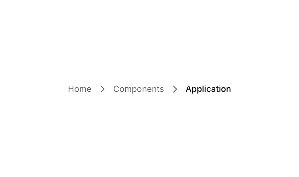
Breadcrumb 01 is a horizontal navigation component that displays a three-level page hierarchy (Home > Components > Breadcrumb). It uses Link elements separated by caret-right icons to help users understand their current location within the application and navigate back to parent pages. The final item is styled differently to indicate the current active page.
How to use
Open the Brikl panel
Navigate to the Elements category in the Brikl panel.
Copy the component
Find Breadcrumb 01 and click Copy.
Paste into your editor
Paste it into your Bubble canvas with Cmd + V (Mac) or Ctrl + V (Windows),
or right-click on the canvas and select Paste.
States
This component includes conditional states that automatically change its appearance.
| State | Trigger | Visual effect |
|---|
| Not Clickable | Element is marked as not clickable | Link opacity reduces to 25%, making it appear dimmed and inactive |
| Hovered (Home) | User hovers over the Home link | Font color changes to dark rgba(11, 8, 9, 1) |
| Hovered (Components) | User hovers over the Components link | Font color changes to dark rgba(11, 8, 9, 1) |
These states are handled natively by Bubble and require no additional setup.
They will work automatically once the component is pasted into your editor.
Responsive
This component adapts to mobile screens. Font sizes and layout automatically adjust on screens smaller than Bubble’s built-in mobile breakpoint.
Requirements
| |
|---|
| License | Starter plan required |
| Plugins | None |
| Custom code | Not required |
| Platform | Supported |
|---|
| Web | ✅ |
| Mobile | ❌ |
License
This component requires a Starter plan.