Overview
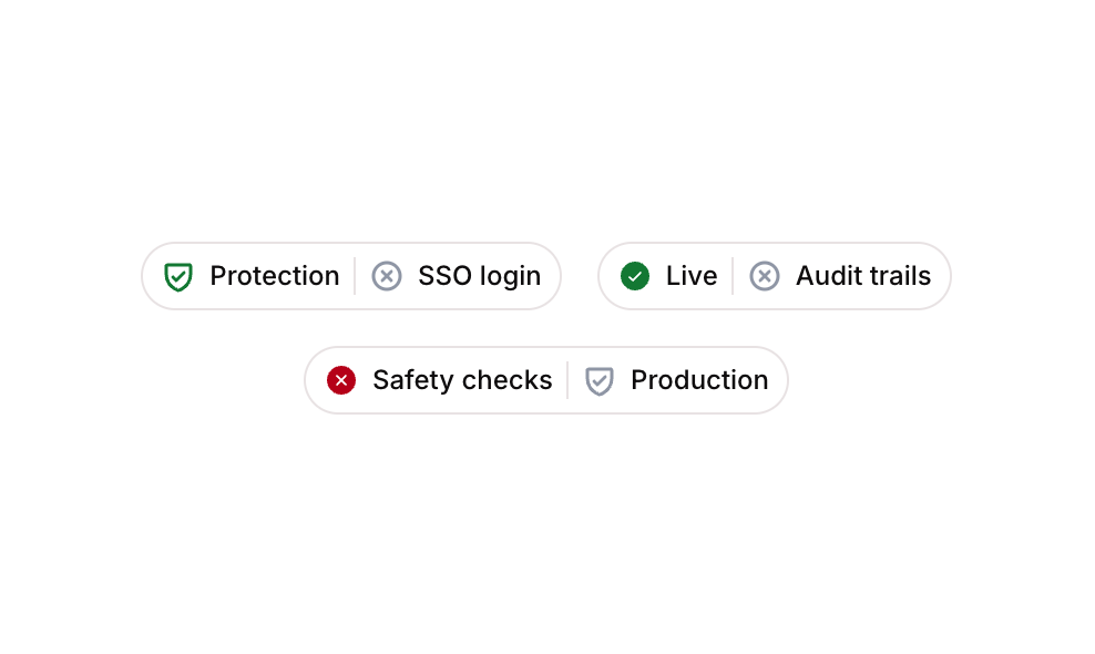
Badge 20 is a status badge component from the Badges sub-type collection. It displays multiple pill-shaped badges, each containing a leading status icon, a descriptive label, and a dismissible close icon. The badges are designed to communicate feature or status states such as ‘Protection’, ‘Live’, and ‘Safety checks’, making them ideal for dashboards, feature lists, or permission indicators.
How to use
Open the Brikl panel
Navigate to the Elements category in the Brikl panel.
Copy the component
Find Badge 20 and click Copy.
Paste into your editor
Paste it into your Bubble canvas with Cmd + V (Mac) or Ctrl + V (Windows),
or right-click on the canvas and select Paste.
States
This component includes conditional states that automatically change its appearance.
| State | Trigger | Visual effect |
|---|
| Active / Success | Default render for active or enabled status | Green shield-check or check-circle icon is displayed alongside the badge label |
| Error / Inactive | Status indicates a failed or inactive condition | Red x-circle icon is displayed alongside the badge label |
| Dismissible | Close icon (x-circle) is present in each badge | A grey x-circle icon appears on the right side of the badge to allow removal |
These states are handled natively by Bubble and require no additional setup.
They will work automatically once the component is pasted into your editor.
Responsive
This component adapts to mobile screens. Font sizes and layout automatically adjust on screens smaller than Bubble’s built-in mobile breakpoint.
Requirements
| |
|---|
| License | Starter plan required |
| Plugins | None |
| Custom code | Not required |
| Platform | Supported |
|---|
| Web | ✅ |
| Mobile | ✅ |
License
This component requires a Starter plan.