Overview
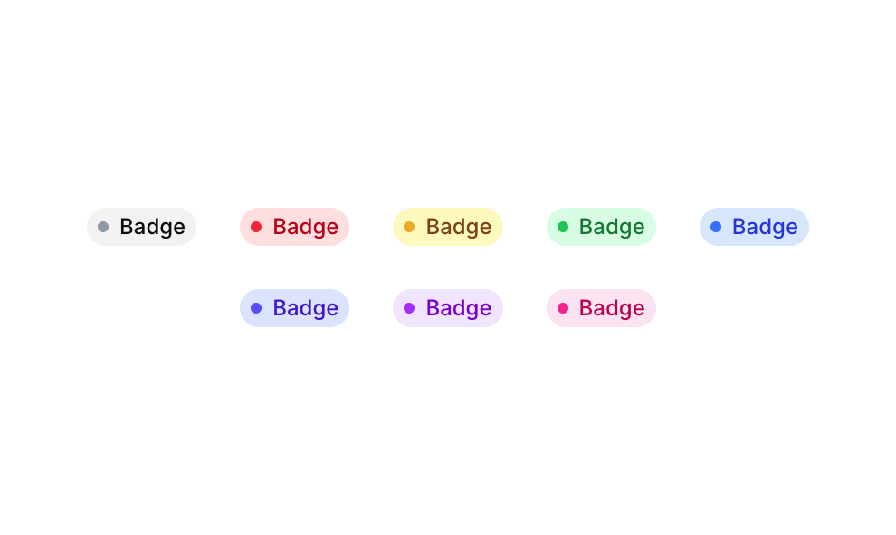
Badge 16 is a UI component from the Badges sub-type collection that displays small status badge pills in five color variants: Grey, Red, Yellow, Green, and Blue. Each badge consists of a colored circular dot indicator paired with a text label, styled with matching background and text colors. These badges are typically used to communicate status, category, or classification at a glance in dashboards, tables, or list views.
How to use
Open the Brikl panel
Navigate to the Elements category in the Brikl panel.
Copy the component
Find Badge 16 and click Copy.
Paste into your editor
Paste it into your Bubble canvas with Cmd + V (Mac) or Ctrl + V (Windows),
or right-click on the canvas and select Paste.
Responsive
This component adapts to mobile screens. Font sizes and layout automatically adjust on screens smaller than Bubble’s built-in mobile breakpoint.
Requirements
| |
|---|
| License | Starter plan required |
| Plugins | None |
| Custom code | Not required |
| Platform | Supported |
|---|
| Web | ✅ |
| Mobile | ✅ |
License
This component requires a Starter plan.