Overview
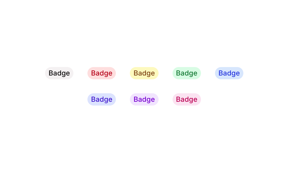
Badge 14 is a UI component from the Badges sub-type collection that displays eight pre-styled pill-shaped text badges, each in a distinct color variant: Grey, Red, Yellow, Green, Blue, Palatinate Blue, Purple, and Pink. It is designed to be used for status indicators, labels, tags, or category markers within an application. Each badge features a soft background color, a matching font color, rounded corners, and no border, creating a clean and modern look suitable for dashboards, lists, or card components.
How to use
Open the Brikl panel
Navigate to the Elements category in the Brikl panel.
Copy the component
Find Badge 14 and click Copy.
Paste into your editor
Paste it into your Bubble canvas with Cmd + V (Mac) or Ctrl + V (Windows),
or right-click on the canvas and select Paste.
Responsive
This component adapts to mobile screens. Font sizes and layout automatically adjust on screens smaller than Bubble’s built-in mobile breakpoint.
Requirements
| |
|---|
| License | Starter plan required |
| Plugins | None |
| Custom code | Not required |
| Platform | Supported |
|---|
| Web | ✅ |
| Mobile | ✅ |
License
This component requires a Starter plan.