Overview
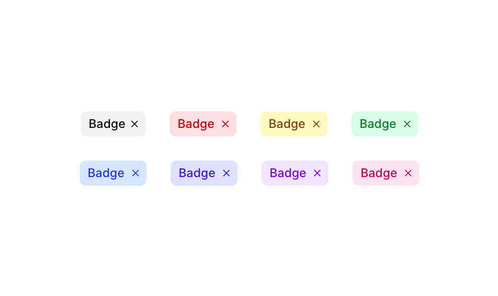
Badge 06 is a UI component featuring a set of removable badge/tag elements in multiple color variants (grey, red, and yellow). Each badge contains a text label and an ‘X’ icon button to dismiss or remove the badge. It is designed for use in tagging, filtering, or labeling scenarios where users need to visually identify and optionally remove categorized items.
How to use
Open the Brikl panel
Navigate to the Elements category in the Brikl panel.
Copy the component
Find Badge 06 and click Copy.
Paste into your editor
Paste it into your Bubble canvas with Cmd + V (Mac) or Ctrl + V (Windows),
or right-click on the canvas and select Paste.
States
This component includes conditional states that automatically change its appearance.
| State | Trigger | Visual effect |
|---|
| Hovered - Grey Remove Button | User hovers over the grey badge’s remove button | Background color changes to rgba(106,114,130,0.2) |
| Disabled - Grey Remove Button | Grey remove button is not clickable | Opacity reduces to 50% |
| Hovered - Red Remove Button | User hovers over the red badge’s remove button | Background color changes to rgba(231,0,11,0.2) |
| Disabled - Red Remove Button | Red remove button is not clickable | Opacity reduces to 50% |
| Hovered - Yellow Remove Button | User hovers over the yellow badge’s remove button | Background color changes to rgba(208,135,0,0.2) |
| Disabled - Yellow Remove Button | Yellow remove button is not clickable | Opacity reduces to 50% |
These states are handled natively by Bubble and require no additional setup.
They will work automatically once the component is pasted into your editor.
Responsive
This component adapts to mobile screens. Font sizes and layout automatically adjust on screens smaller than Bubble’s built-in mobile breakpoint.
Requirements
| |
|---|
| License | Starter plan required |
| Plugins | None |
| Custom code | Not required |
| Platform | Supported |
|---|
| Web | ✅ |
| Mobile | ✅ |
License
This component requires a Starter plan.