Overview
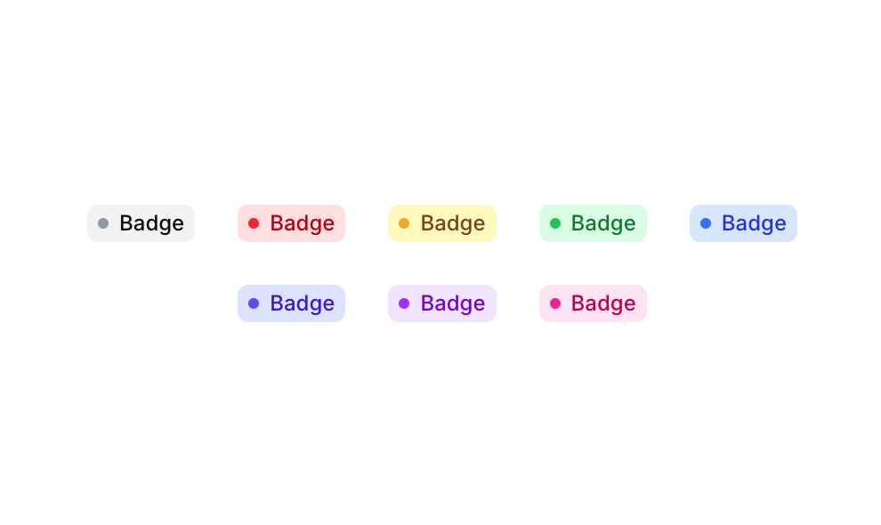
Badge 15 is a UI component from the Badges sub-type collection that displays small status or category badges, each consisting of a circular dot indicator paired with a text label. It comes in five color variants: Grey, Red, Yellow, Green, and Blue, making it suitable for indicating statuses, categories, or tags within an application interface.
How to use
Open the Brikl panel
Navigate to the Elements category in the Brikl panel.
Copy the component
Find Badge 15 and click Copy.
Paste into your editor
Paste it into your Bubble canvas with Cmd + V (Mac) or Ctrl + V (Windows),
or right-click on the canvas and select Paste.
Responsive
This component adapts to mobile screens. Font sizes and layout automatically adjust on screens smaller than Bubble’s built-in mobile breakpoint.
Requirements
| |
|---|
| License | Starter plan required |
| Plugins | None |
| Custom code | Not required |
| Platform | Supported |
|---|
| Web | ✅ |
| Mobile | ✅ |
License
This component requires a Starter plan.