Overview
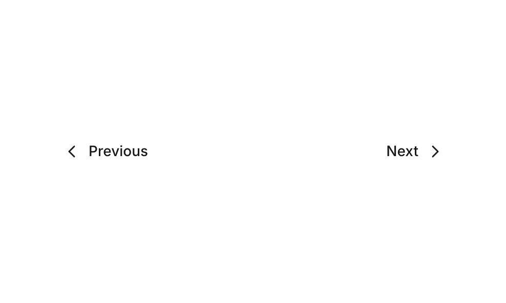
Pagination 02 is a simple navigation component featuring two buttons — ‘Previous’ and ‘Next’ — arranged in a horizontal row with space-between alignment. It is designed to allow users to navigate between pages of content. The Previous button uses a left caret icon and the Next button uses a right caret icon, both styled with a clean, minimal appearance using the Inter font and a neutral color palette.How to use
1
Open the Brikl panel
Navigate to the Elements category in the Brikl panel.
2
Copy the component
Find Pagination 02 and click Copy.
3
Paste into your editor
Paste it into your Bubble canvas with
Cmd + V (Mac) or Ctrl + V (Windows),
or right-click on the canvas and select Paste.States
This component includes conditional states that automatically change its appearance.These states are handled natively by Bubble and require no additional setup.
They will work automatically once the component is pasted into your editor.
Responsive
This component adapts to mobile screens. Font sizes and layout automatically adjust on screens smaller than Bubble’s built-in mobile breakpoint.Requirements
Platforms
License
This component is available on the free plan.