Overview
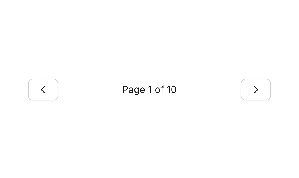
Pagination 03 is a navigation component designed to help users move between pages of content. It features a Previous button with a left caret icon, a centered page indicator text (e.g., ‘Page 1 of 10’), and a Next button with a right caret icon. The layout is a horizontal row with space-between alignment, making it suitable for both web and mobile interfaces.How to use
1
Open the Brikl panel
Navigate to the Elements category in the Brikl panel.
2
Copy the component
Find Pagination 03 and click Copy.
3
Paste into your editor
Paste it into your Bubble canvas with
Cmd + V (Mac) or Ctrl + V (Windows),
or right-click on the canvas and select Paste.States
This component includes conditional states that automatically change its appearance.These states are handled natively by Bubble and require no additional setup.
They will work automatically once the component is pasted into your editor.
Responsive
This component adapts to mobile screens. Font sizes and layout automatically adjust on screens smaller than Bubble’s built-in mobile breakpoint.Requirements
Platforms
License
This component requires a Starter plan.