Overview
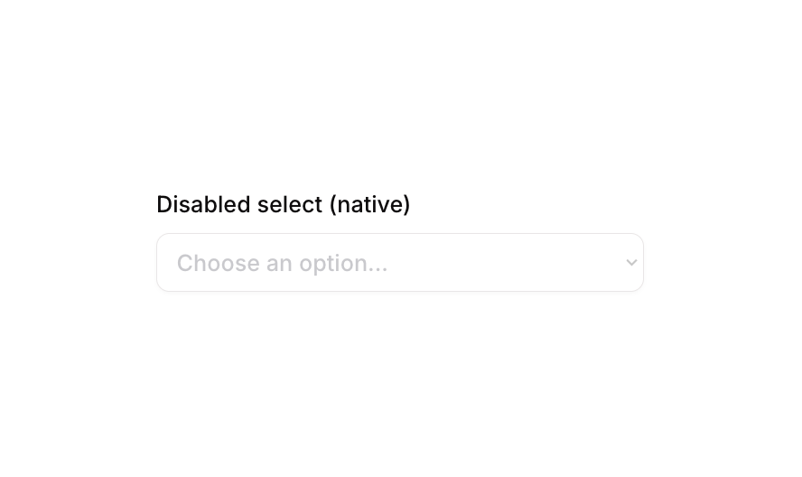
Select 04 is a disabled native dropdown (select) component for web applications. It displays a labeled dropdown input in a visually inactive state, preventing user interaction. It is useful for forms where certain fields should be read-only or conditionally disabled based on app logic. The component includes conditional states for focus, validation errors, and non-clickable scenarios.How to use
1
Open the Brikl panel
Navigate to the Elements category in the Brikl panel.
2
Copy the component
Find Select 04 and click Copy.
3
Paste into your editor
Paste it into your Bubble canvas with
Cmd + V (Mac) or Ctrl + V (Windows),
or right-click on the canvas and select Paste.States
This component includes conditional states that automatically change its appearance.These states are handled natively by Bubble and require no additional setup.
They will work automatically once the component is pasted into your editor.
Responsive
This component adapts to mobile screens. Font sizes and layout automatically adjust on screens smaller than Bubble’s built-in mobile breakpoint.Requirements
Platforms
License
This component is available on the free plan.