Overview
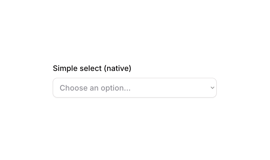
Select 01 is a simple native dropdown (select) component for web applications. It presents a labeled dropdown input that allows users to choose one option from a predefined list. It includes built-in visual states for focus, validation errors, and disabled interactions, making it suitable for forms requiring straightforward single-value selection.How to use
1
Open the Brikl panel
Navigate to the Elements category in the Brikl panel.
2
Copy the component
Find Select 01 and click Copy.
3
Paste into your editor
Paste it into your Bubble canvas with
Cmd + V (Mac) or Ctrl + V (Windows),
or right-click on the canvas and select Paste.States
This component includes conditional states that automatically change its appearance.These states are handled natively by Bubble and require no additional setup.
They will work automatically once the component is pasted into your editor.
Responsive
This component adapts to mobile screens. Font sizes and layout automatically adjust on screens smaller than Bubble’s built-in mobile breakpoint.Requirements
Platforms
License
This component is available on the free plan.