Overview
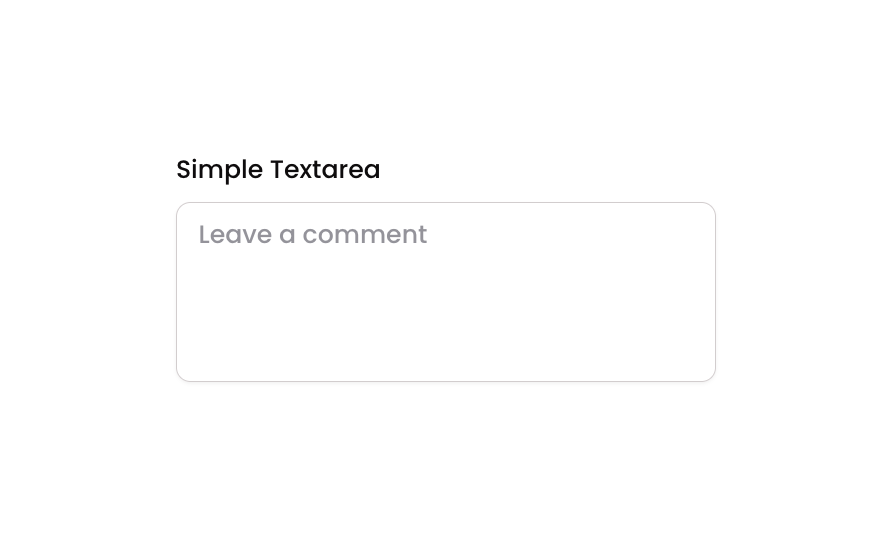
Textarea 01 is a simple multiline text input component designed for collecting user comments or longer-form text. It includes a label (‘Simple Textarea’), a placeholder-enabled input field with rounded borders and subtle shadow styling, and supports focused, invalid, and disabled visual states for clear user feedback.How to use
1
Open the Brikl panel
Navigate to the Elements category in the Brikl panel.
2
Copy the component
Find Textarea 01 and click Copy.
3
Paste into your editor
Paste it into your Bubble canvas with
Cmd + V (Mac) or Ctrl + V (Windows),
or right-click on the canvas and select Paste.States
This component includes conditional states that automatically change its appearance.These states are handled natively by Bubble and require no additional setup.
They will work automatically once the component is pasted into your editor.
Responsive
This component adapts to mobile screens. Font sizes and layout automatically adjust on screens smaller than Bubble’s built-in mobile breakpoint.Requirements
Platforms
License
This component is available on the free plan.