Overview
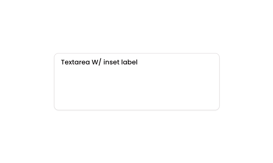
Textarea 10 is a multi-line text input component featuring an inset label positioned above the input field, housed inside a styled group container. It includes a character limit of 180 characters, smooth transition effects, and conditional visual states for focus, validation error, and disabled interactions. Designed for forms requiring labeled text areas with clear user feedback.How to use
1
Open the Brikl panel
Navigate to the Elements category in the Brikl panel.
2
Copy the component
Find Textarea 10 and click Copy.
3
Paste into your editor
Paste it into your Bubble canvas with
Cmd + V (Mac) or Ctrl + V (Windows),
or right-click on the canvas and select Paste.States
This component includes conditional states that automatically change its appearance.These states are handled natively by Bubble and require no additional setup.
They will work automatically once the component is pasted into your editor.
Responsive
This component adapts to mobile screens. Font sizes and layout automatically adjust on screens smaller than Bubble’s built-in mobile breakpoint.Requirements
Platforms
License
This component requires a Starter plan.