Overview
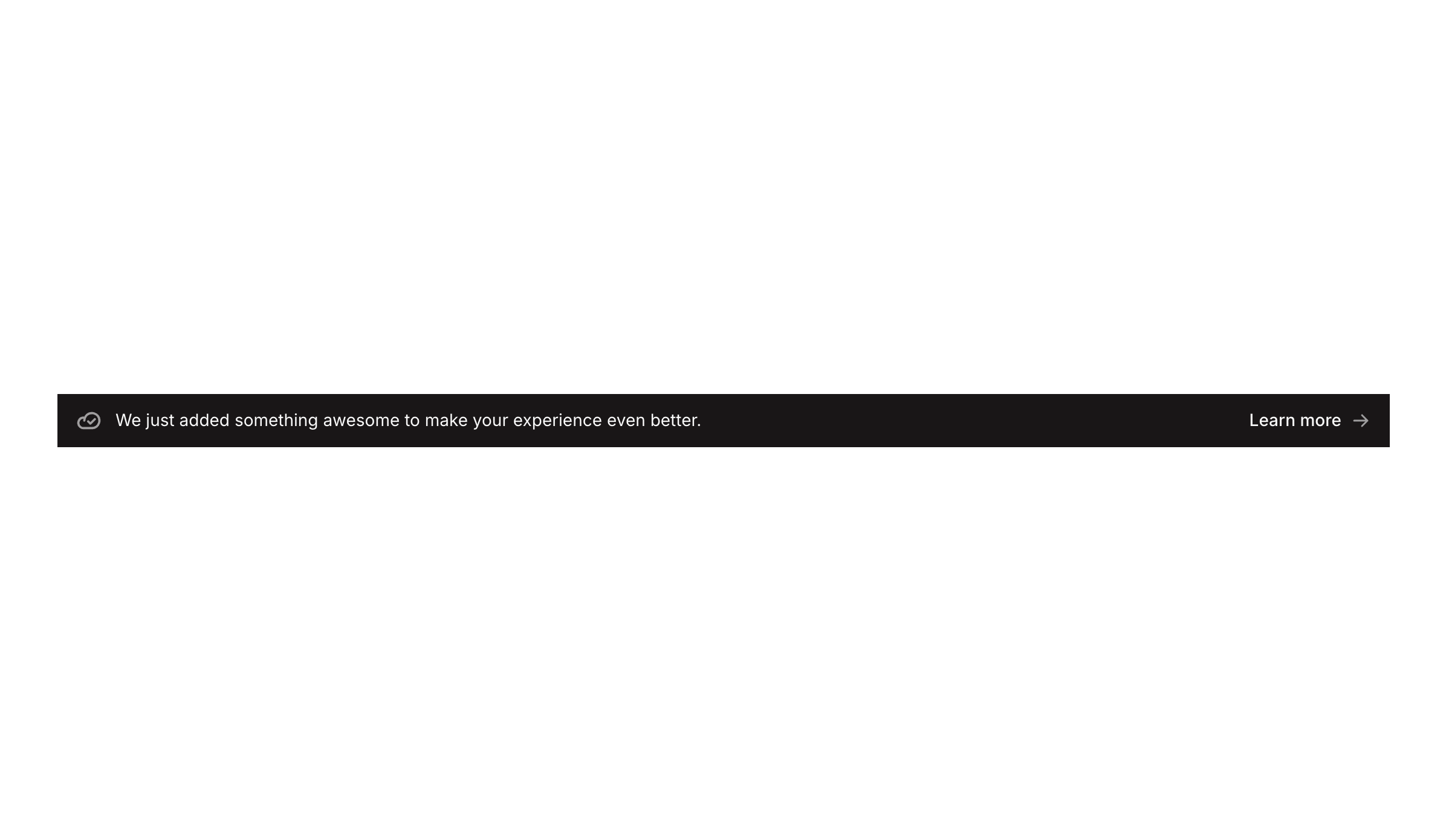
Banner 04 is a notification/announcement banner component designed to inform users about new features or updates. It features a cloud-check icon alongside descriptive text on the left, and a ‘Learn more’ link with an arrow icon on the right. The dark-themed bar spans the full width and adapts its layout for mobile screens, making it suitable for top-of-page announcements or promotional messages.
How to use
Open the Brikl panel
Navigate to the Marketings category in the Brikl panel.
Copy the component
Find Banner 04 and click Copy.
Paste into your editor
Paste it into your Bubble canvas with Cmd + V (Mac) or Ctrl + V (Windows), or right-click on the canvas and select Paste.
States
This component includes conditional states that automatically change its appearance.
| State | Trigger | Visual effect |
|---|
| Mobile/Narrow Layout | Page width is less than or equal to 769px | The icon & title group expands to 100% width and the link group gains a left margin of 32px to adjust spacing for smaller screens |
| Link Disabled State | The ‘Learn more’ link element is not clickable | The link element reduces to 25% opacity, visually indicating it is inactive or disabled |
These states are handled natively by Bubble and require no additional setup. They will work automatically once the component is pasted into your editor.
Responsive
This component adapts to mobile screens. Font sizes and layout automatically adjust on screens smaller than Bubble’s built-in mobile breakpoint.
Requirements
| |
|---|
| License | Starter plan required |
| Plugins | None |
| Custom code | Not required |
| Platform | Supported |
|---|
| Web | ✅ |
| Mobile | ❌ |
License
This component requires a Starter plan.