Overview
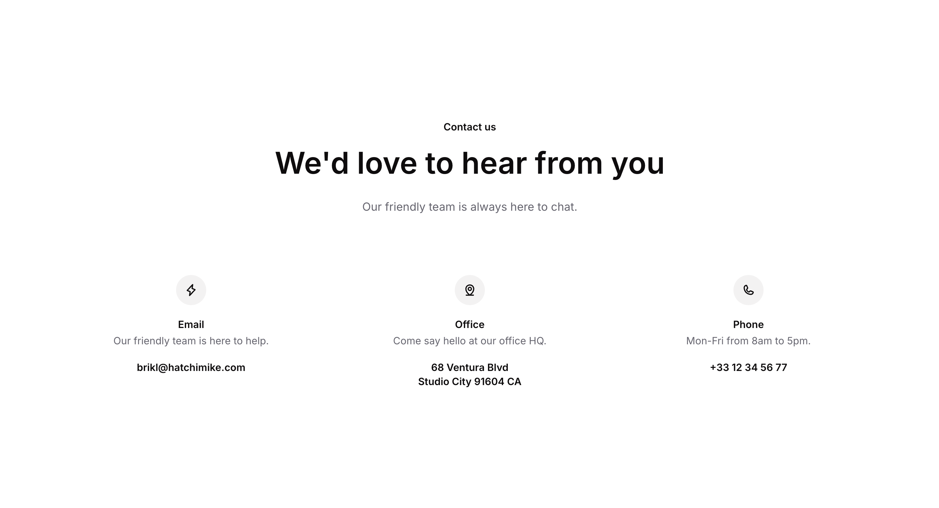
Contact 01 is a marketing contact section component that displays a centered header with a title, subtitle, and description, followed by informational cards for different contact methods (email, phone). Each card includes an icon, a title, a short description, and a clickable link. It is designed for landing pages or website contact sections to help users quickly find ways to reach out.
How to use
Open the Brikl panel
Navigate to the Marketings category in the Brikl panel.
Copy the component
Find Contact 01 and click Copy.
Paste into your editor
Paste it into your Bubble canvas with Cmd + V (Mac) or Ctrl + V (Windows),
or right-click on the canvas and select Paste.
States
This component includes conditional states that automatically change its appearance.
| State | Trigger | Visual effect |
|---|
| Mobile font size | Page width is less than 768px | Heading font size reduces from 48px to 36px for better readability on smaller screens |
| Link hovered (clickable) | User hovers over a clickable link element | Underline appears on the link text with an ease transition of 200ms |
| Link disabled | Link element is not clickable | Link opacity reduces to 25%, indicating a disabled state |
These states are handled natively by Bubble and require no additional setup.
They will work automatically once the component is pasted into your editor.
Responsive
This component adapts to mobile screens. Font sizes and layout automatically adjust on screens smaller than Bubble’s built-in mobile breakpoint.
Requirements
| |
|---|
| License | Free |
| Plugins | None |
| Custom code | Not required |
| Platform | Supported |
|---|
| Web | ✅ |
| Mobile | ❌ |
License
This component is available on the free plan.