Overview
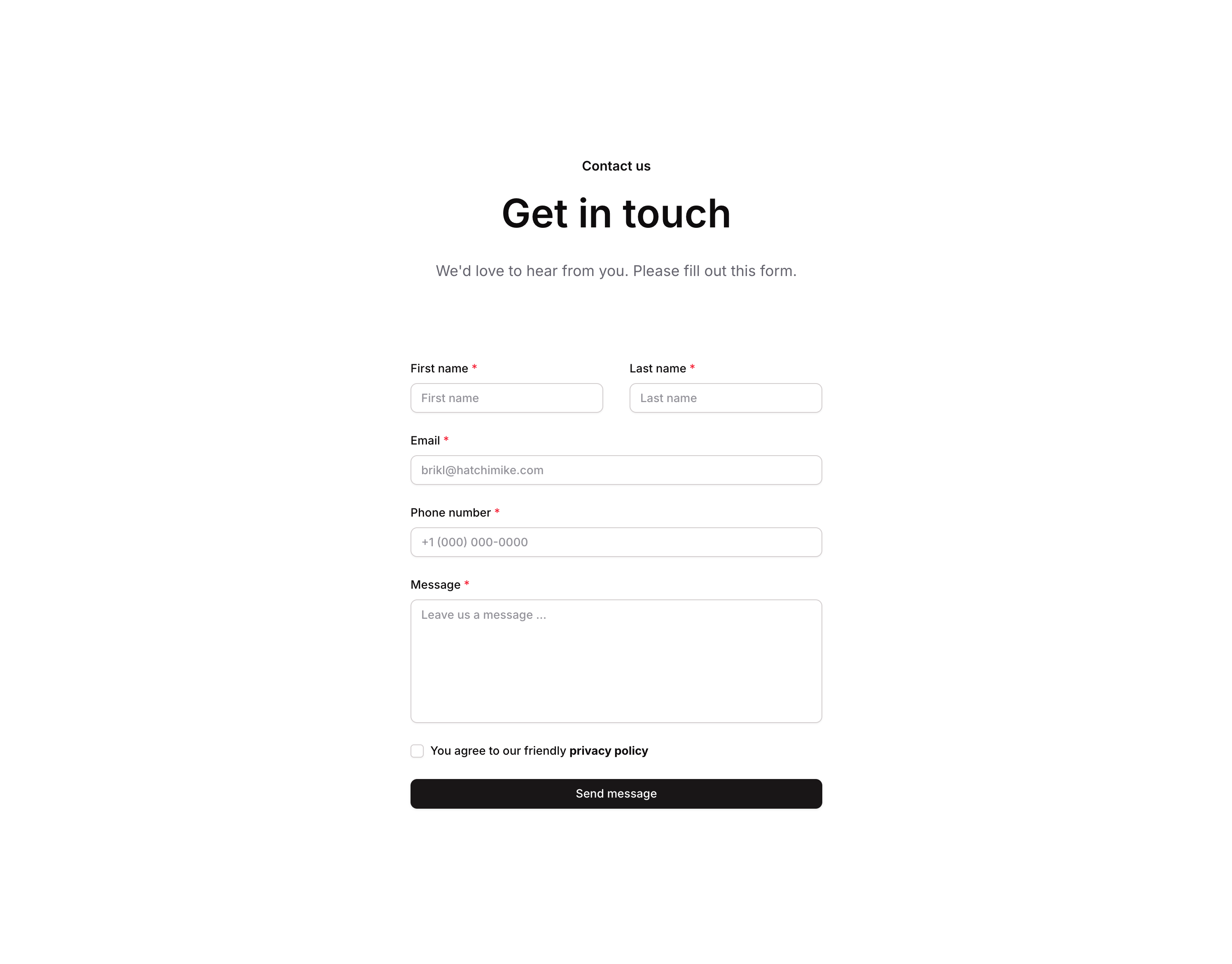
Contact 03 is a marketing contact section component designed for web pages. It features a header area with a title, subtitle, and description, followed by a structured contact form including first name, last name, and other input fields, along with a privacy policy checkbox. It is responsive and adapts its layout for smaller screen widths.
How to use
Open the Brikl panel
Navigate to the Marketings category in the Brikl panel.
Copy the component
Find Contact 03 and click Copy.
Paste into your editor
Paste it into your Bubble canvas with Cmd + V (Mac) or Ctrl + V (Windows),
or right-click on the canvas and select Paste.
States
This component includes conditional states that automatically change its appearance.
| State | Trigger | Visual effect |
|---|
| Mobile/Narrow Layout | Page width is less than or equal to 768px | Content group adjusts row gap, form inputs expand to full width, and heading font size reduces to 36px |
| Input Focused | User focuses on a text input field | Input field displays a soft box shadow to indicate active focus |
| Input Invalid | Input field fails validation | Input border turns red and a red-tinted box shadow appears around the field |
| Input Disabled | Input field is not clickable | Input field opacity reduces to 50% |
| Privacy Policy Checkbox Toggled On | Checkbox is clicked when custom state ‘terms_’ is false | Custom state ‘terms_’ is set to true |
| Privacy Policy Checkbox Toggled Off | Checkbox is clicked when custom state ‘terms_’ is true | Custom state ‘terms_’ is set to false |
These states are handled natively by Bubble and require no additional setup.
They will work automatically once the component is pasted into your editor.
Responsive
This component adapts to mobile screens. Font sizes and layout automatically adjust on screens smaller than Bubble’s built-in mobile breakpoint.
Requirements
| |
|---|
| License | Starter plan required |
| Plugins | None |
| Custom code | Not required |
| Platform | Supported |
|---|
| Web | ✅ |
| Mobile | ❌ |
License
This component requires a Starter plan.