Beginner Level : Simple templates for new users with little to no Bubble experience.
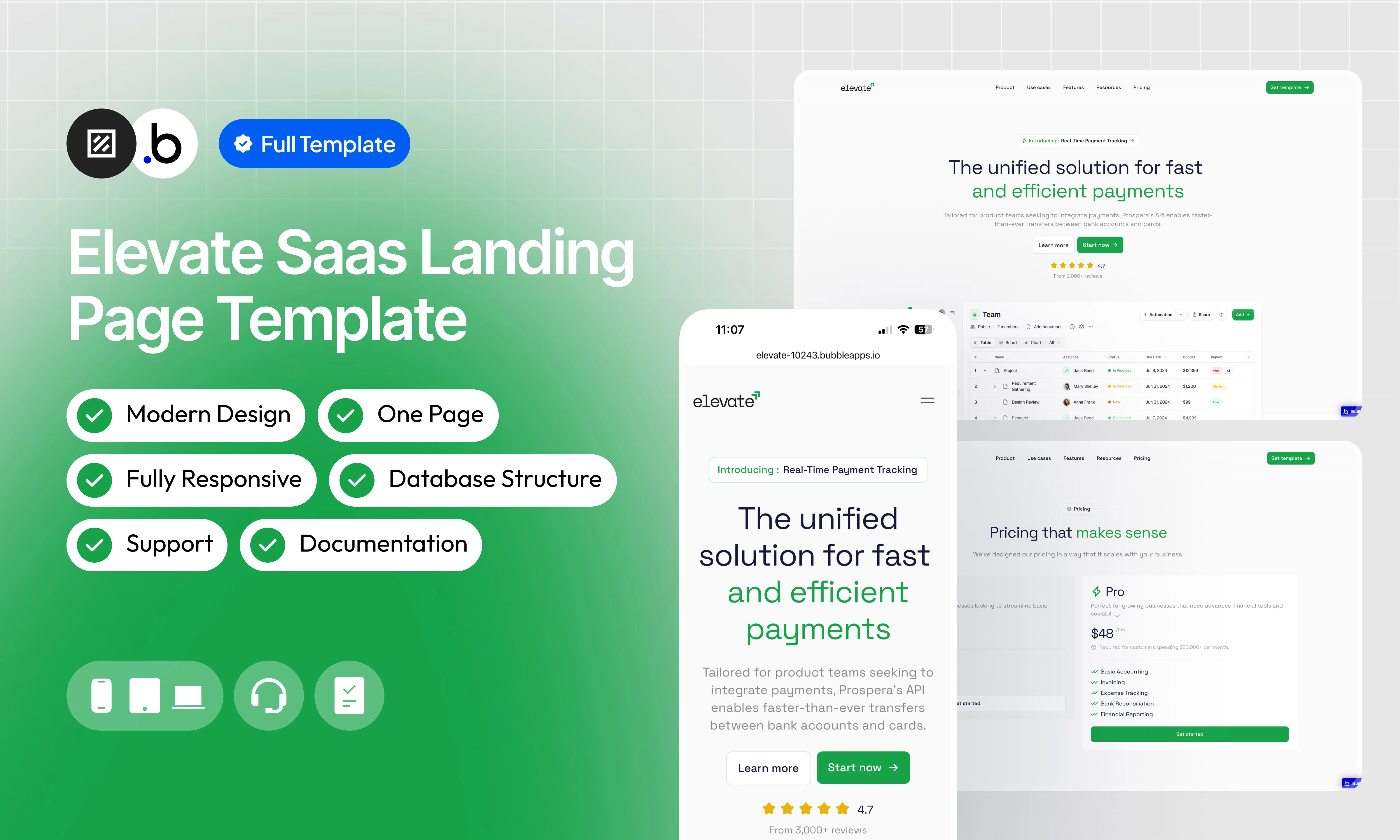
Overview
Elevate is a fully static, single-page SaaS landing page template designed for payment and fintech products. It reproduces the layout and design of a modern, conversion-optimized SaaS product page. No database setup is required — the template is ready to customize out of the box. The page is structured into clearly defined sections that scroll from top to bottom: Navbar : A top navigation bar with a logo on the left, navigation links (Product, Use Cases, Team, Resources, Pricing) in the center, and a “Get started” CTA button on the right. Hero Section : A bold above-the-fold section with a main headline, a descriptive subheadline, a primary CTA button, and a product UI mockup showcasing a payments dashboard. Social proof logos (Frontporch, Layers, LightSwap, Payments) are displayed below. Features Section : A two-column layout highlighting key product features — Effortless Card Transfers, Transfer to Card, Instant Deposit, and API Transfers — each accompanied by a UI preview mockup and a short description. Value Proposition Section : A four-pillar section emphasizing Speed, Protection, Automation, and Design-to-Scale, reinforcing the product’s core benefits. Social Proof / Testimonials : A dedicated section presenting customer logos and short testimonials to build trust, with references to real-world integrations and use cases. API Section : A developer-focused section titled “The powerful payments API built for product teams,” highlighting API capabilities alongside a code preview and integration logos. Complete Solution Section : A section positioning Elevate as a complete payment solution, highlighting Quick and Protected properties with partner logos and integration icons. Documentation Section : A section titled “Well-crafted documentation that turns users into customers,” featuring documentation UI previews for both non-developers and developers. Blog / Resources Section : A two-column section with resource cards to drive engagement and knowledge transfer around payment best practices. Pricing Section : A two-tier pricing section with a Free “Start” plan and a paid “Pro” plan at $40, each with a clear list of included features. FAQ Section : A collapsible accordion section titled “You asked, we answered,” addressing common questions from potential customers. Final CTA Section : A full-width closing call-to-action block with a headline and a “Get started” button to drive conversions, followed by a short dashboard preview. Footer : A multi-column footer with navigation links organized by category, logo, and legal mentions.Functionalities
Fully Responsive
Fully Responsive
The template is designed to adapt seamlessly to all screen sizes and devices, ensuring a consistent and optimized experience on desktop, tablet, and mobile.
No Database Required
No Database Required
This template is entirely static. There is no database configuration needed, making setup straightforward and the template easy to maintain and deploy.
Navbar
Navbar
Hero Section
Hero Section
A large above-the-fold section with a bold headline, a descriptive subheadline, a primary CTA button with star ratings, and a product UI dashboard mockup. Social proof logos are displayed below the mockup.
Features Section
Features Section
A multi-column section showcasing the core product features with illustrated UI mockups, short titles, and descriptive paragraphs. Covers card transfers, transfer-to-card flows, instant deposits, and API transfers.
Value Proposition Section
Value Proposition Section
A four-pillar section presenting the product’s key benefits: Speed, Protection, Automation, and Design-to-Scale. Each pillar includes a short label and a one-liner description.
Social Proof / Testimonials
Social Proof / Testimonials
API Section
API Section
A developer-focused section highlighting the payment API’s capabilities for product teams, with integration logos, feature bullet points, and a link to the documentation.
Complete Solution Section
Complete Solution Section
A section positioning the product as a full payments solution, with integration logos, partner icons, and two key benefit highlights (Quick and Protected).
Documentation Section
Documentation Section
A section showcasing the product’s documentation quality as a selling point, with UI previews targeted at both non-developers and developers. Includes two cards — “Starting right from the start” and “For your developer developers.”
Blog / Resources Section
Blog / Resources Section
A two-column resource section with cards linking to articles or guides on payment best practices, onboarding, and advanced usage.
Pricing Section
Pricing Section
A two-tier pricing layout featuring a Free “Start” plan and a paid “Pro” plan at $40/month. Each plan includes a list of included features and a CTA button.
FAQ Section
FAQ Section
An accordion-based FAQ section titled “You asked, we answered,” powered by an Option Set. Questions and answers are stored as static options and rendered dynamically via a repeating group.
Final CTA Section
Final CTA Section
A full-width closing call-to-action block with a bold headline, a “Get started” button, and a brief product dashboard preview to encourage sign-up at the bottom of the page.
Footer
Footer
Modern Design
Modern Design
A clean, contemporary interface built with strong visual hierarchy, generous white space, a green accent color palette, and consistent typographic choices to maximize readability and conversion.
Workflow Structure
Workflow Structure
A clearly organized workflow architecture using logical grouping and visual categorization to improve readability, scalability, and long-term maintainability.
Pages
index
index
The main and only page of the template. It contains all sections of the landing page in order: Navbar, Hero, Social Proof Logos, Features, Value Proposition, Testimonials, API Section, Complete Solution, Documentation, Blog/Resources, Pricing, FAQ, Final CTA, and Footer.
Reusable Elements
A collection of shared components built to be used across multiple pages, helping maintain design consistency while making updates and scaling more efficient.A reusable element creates an element that contains other elements, like a group, that can be used in more than one place. This is useful when reusing the same elements often. Using reusable elements keeps the app smaller and makes it easier to edit.
Header
Header
The top navigation bar, built as a reusable element and shared across pages. It contains the logo, navigation links (Product, Use Cases, Team, Resources, Pricing), and the “Get started” CTA button. Using a reusable element ensures that any update to the header is automatically reflected everywhere it is used.
Footer
Footer
Workflows
This structure uses folders and colors to organize workflows clearly, improve readability, and ensure consistent logic management across the application.In Bubble, workflows define how an application behaves. They are triggered by events and run actions that manage data, navigation, and user interactions.
Folders
Folders are structured by functional category, with each folder grouping workflows related to a specific domain of the application. This approach ensures that every type of logic has its dedicated space, making the overall workflow architecture clearer, more organized, and easier to maintain.Database
Database
This folder contains workflows responsible for creating, updating, deleting, and managing data within the application. It centralizes all logic that interacts directly with the database to ensure structured and consistent data handling.
Navigation
Navigation
Plugins
Plugins
This folder includes workflows that depend on external plugins or third party integrations. It isolates plugin related logic to keep the core application structure clean and organized.
Visuals
Visuals
This folder contains workflows that affect the user interface, such as showing or hiding elements, triggering animations, or dynamically updating what the user sees. It manages front end behavior without altering stored data.
Custom States
Custom States
This folder groups workflows that manage temporary front end data stored in custom states. It is used to control dynamic interactions and interface logic without impacting the database.
Custom states are variables that you can save on any element on the page, including the page itself. They let you store data temporarily that is reset when the page is reloaded. This is useful when you need your app to remember some information that you don’t need to store permanently in the database.
Emails
Emails
This folder includes workflows dedicated to sending automated or transactional emails. It centralizes communication logic to ensure consistency and easier maintenance.
APIs
APIs
This folder contains workflows that handle external API calls and data exchanges with outside services. It organizes integration logic and keeps external communication clearly separated from internal processes.
Colors
Colors are used as visual indicators to distinguish workflow types and intentions. Each color corresponds to a specific category of action, allowing quick recognition of the workflow’s purpose and improving readability across the entire logic structure.Blue
Blue
Blue is used for workflows involving navigation, such as redirects to other pages or links.
Green
Green
Green indicates workflows involving the database, such as creating or updating data in the database or the registration/connection system.
Red
Red
Red indicates workflows that have an impact on deleting data or resetting values.
Orange
Orange
Orange is reserved for visual elements, such as showing or disappearing pop-ups, floating groups, and other such interactive elements.
Purple
Purple
This color is reserved for elements related to APIs and Plugins.
Cyan
Cyan
The Cyan color indicates specific interactions triggered by custom events or custom states.
Brown
Brown
Brown is use for email send
Option Sets
This section covers option sets, used to store a static list of options in a database-like structureOption sets let you set up different types of static options in a database-like structure, but without using the database. This is useful to store information like days of the week, marital status, colors, states, countries and other data that you want to load quickly and that’s rarely updated.
FAQ
Groups the frequently asked questions displayed to visitors in the “You asked, we answered” section. Each option pairs a question with its corresponding answer.| Attributes | Type | Note |
|---|---|---|
| Display | text | Text of the question displayed in the FAQ section |
| Answer | text | Text of the answer associated with the question |
- What is included in the free trial?
- What payment methods do you accept?
- Is my financial data secure?
- Do you offer customer support?
- Are there any discounts available?
Plugins
An overview of the external plugins integrated into the application to extend its native capabilities and enhance specific features or functionalities.Iconify
FreeIconify
Unofficial Iconify plugin. Add any Icon from http://iconify.design to your application, change its color, flip it, rotate it, resize it — full customization with minimal setup.
Animated Rating Stars
FreeAnimated Rating Stars
A five-star rating element that animates on click and displays a mood indicator based on the selected rating. Supports autobinding and exposes the selected rating via a custom state. The mood face can be hidden from the plugin settings.
Refund Policy
Refund Policy
This policy defines the conditions under which refunds may be requested for our products. It distinguishes between templates distributed through the Bubble Marketplace and the Brikl Chrome Extension, specifying the applicable deadlines, eligibility requirements, and usage-related limitations for each.