Beginner Level : Simple templates for new users with little to no Bubble experience.
Overview
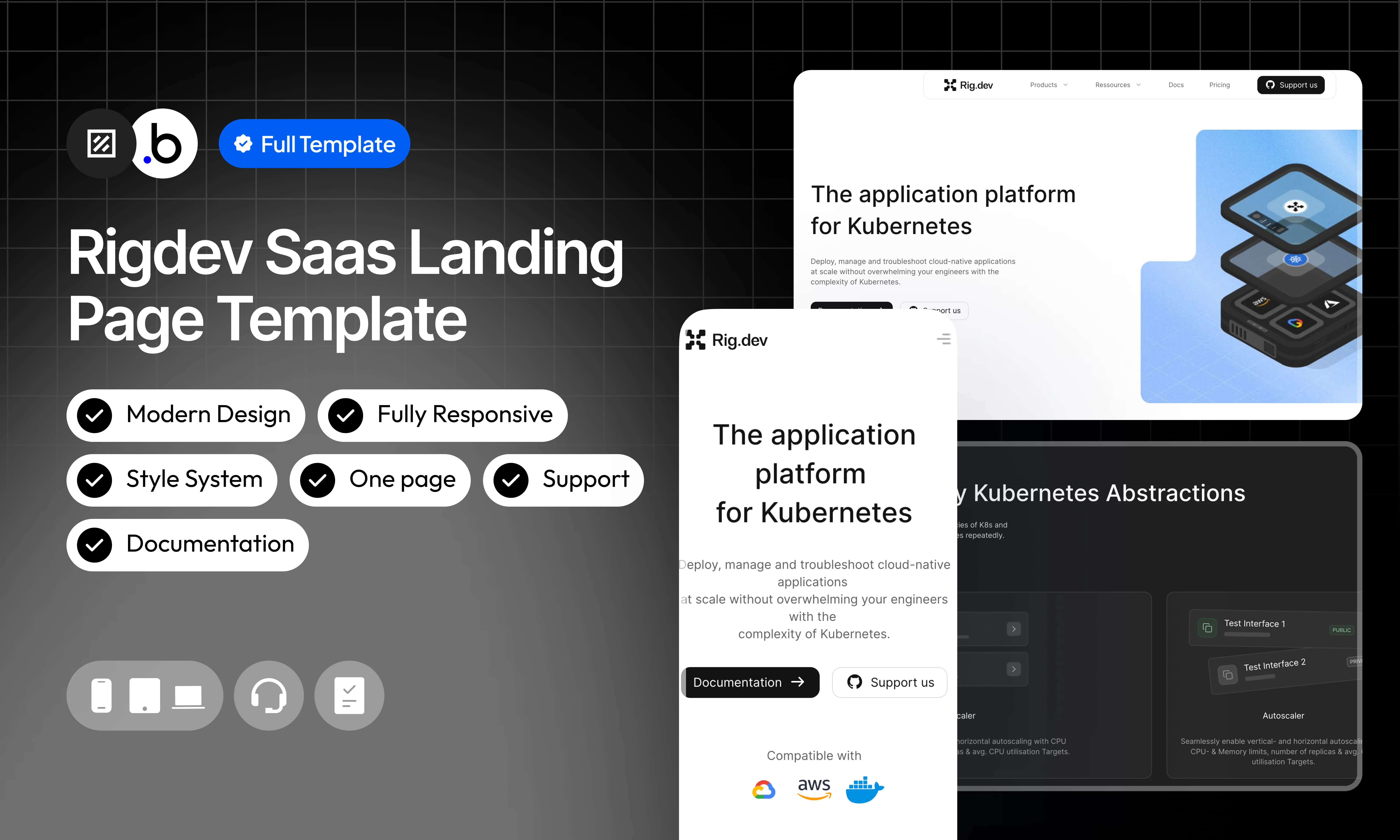
Rigdev is a fully static, single-page SaaS landing page template designed for developer tools and Kubernetes infrastructure products. It reproduces the layout and design of a modern, conversion-optimized developer-focused product page. No database setup is required — the template is ready to customize out of the box. The page is structured into clearly defined sections that scroll from top to bottom: Navbar : A top navigation bar with a logo on the left, navigation links (Product, Resources, Docs, Pricing) in the center, and a “Support us” CTA button on the right. Hero Section : A bold above-the-fold section with a main headline (“The application platform for Kubernetes”), a descriptive subheadline, two CTA buttons (Documentation and Support Us), and a 3D isometric product illustration. Compatibility logos (AWS and others) are displayed below the CTAs. Problem Statement Section : A centered section titled “Don’t let the complexity of Kubernetes leak into your engineering team,” featuring three illustrated cards highlighting core product pillars: Abstract Away K8s Primitives, Proactively Troubleshoot, and Developer Tools. Developer-Friendly Abstractions Section : A dark-themed section titled “Developer-Friendly Kubernetes Abstractions” with a label “Convention over Configuration,” showcasing UI mockups of the product’s interface. Covers Autoscaler and Environment Variables and Config Files features. Deployment Engine Section : A dark-themed section titled “Flexible and scalable Deployment Engine” with a “Deployment” label, presenting three feature cards: Builds, Rollouts & Rollbacks, and Integrations, each with a UI preview. Troubleshooting Section : A dark-themed section titled “Troubleshooting made simple” with a “Developers” label, highlighting four feature cards: Cluster Insights, Instances, Logging, and Health Checks, each with a dedicated icon. Team Benefits Section : A light section titled “A platform to benefit the entire team,” with a tab system (Product Teams, DevOps/Platform Teams, Engineering Leaders) presenting three benefit cards per persona: Straight from code to production, Troubleshoot blazingly fast, and Unmatched Developer Experience. Final CTA Section : A two-column closing call-to-action block offering two paths: “Schedule a call” and “Try it out yourself,” each with its own button. Community Section : A dark-themed section titled “Join our Community” with links to Discord and GitHub, alongside a product illustration. Footer : A minimal footer with the Rigdev logo, social media icons, a newsletter subscription input, and legal mentions.Functionalities
Fully Responsive
Fully Responsive
The template is designed to adapt seamlessly to all screen sizes and devices, ensuring a consistent and optimized experience on desktop, tablet, and mobile.
No Database Required
No Database Required
This template is entirely static. There is no database configuration needed, making setup straightforward and the template easy to maintain and deploy.
Navbar
Navbar
Hero Section
Hero Section
A large above-the-fold section with a bold headline, a descriptive subheadline, two CTA buttons (Documentation and Support Us), and a 3D isometric product illustration. Compatibility logos (AWS and others) are displayed below to reinforce credibility.
Problem Statement Section
Problem Statement Section
A centered section with a strong framing headline that highlights the core pain point. Includes three illustrated cards presenting the product’s main value pillars: Abstract Away K8s Primitives, Proactively Troubleshoot, and Developer Tools.
Developer-Friendly Abstractions Section
Developer-Friendly Abstractions Section
A dark-themed section presenting key Kubernetes abstractions offered by the product. Includes UI mockups of the interface for Autoscaler (horizontal and vertical), Environment Variables, and Config Files. Features a link to explore the documentation.
Deployment Engine Section
Deployment Engine Section
A dark-themed section highlighting the deployment capabilities of the platform. Presents three feature cards with UI previews: Builds (immutable deployments), Rollouts & Rollbacks, and Integrations with existing cloud tools.
Troubleshooting Section
Troubleshooting Section
A dark-themed section showcasing the platform’s developer tooling for diagnosing and managing infrastructure. Includes four icon-based feature cards: Cluster Insights, Instances, Logging, and Health Checks.
Team Benefits Section
Team Benefits Section
A light-themed section presenting the product’s value across three audience personas via a tab system: Product Teams, DevOps/Platform Teams, and Engineering Leaders. Each tab displays three benefit cards with short descriptions.
Final CTA Section
Final CTA Section
A two-column closing section offering two distinct conversion paths: scheduling a call with the team, or trying the product directly. Each column includes a short description and a dedicated CTA button.
Community Section
Community Section
A dark-themed section encouraging users to join the Rigdev community. Includes links to Discord and GitHub, alongside a product illustration to reinforce the brand identity.
Footer
Footer
Modern Design
Modern Design
A clean, contemporary interface built with a strong dark/light contrast, a blue and teal accent color palette, 3D isometric illustrations, and consistent typographic choices to convey technical credibility and maximize conversion.
Pages
index
index
The main and only page of the template. It contains all sections of the landing page in order: Navbar, Hero, Problem Statement, Developer-Friendly Abstractions, Deployment Engine, Troubleshooting, Team Benefits, Final CTA, Community, and Footer.
Workflows
This structure uses folders and colors to organize workflows clearly, improve readability, and ensure consistent logic management across the application.In Bubble, workflows define how an application behaves. They are triggered by events and run actions that manage data, navigation, and user interactions.
Folders
Folders are structured by functional category, with each folder grouping workflows related to a specific domain of the application. This approach ensures that every type of logic has its dedicated space, making the overall workflow architecture clearer, more organized, and easier to maintain.Database
Database
This folder contains workflows responsible for creating, updating, deleting, and managing data within the application. It centralizes all logic that interacts directly with the database to ensure structured and consistent data handling.
Navigation
Navigation
Plugins
Plugins
This folder includes workflows that depend on external plugins or third party integrations. It isolates plugin related logic to keep the core application structure clean and organized.
Visuals
Visuals
This folder contains workflows that affect the user interface, such as showing or hiding elements, triggering animations, or dynamically updating what the user sees. It manages front end behavior without altering stored data.
Custom States
Custom States
This folder groups workflows that manage temporary front end data stored in custom states. It is used to control dynamic interactions and interface logic without impacting the database.
Custom states are variables that you can save on any element on the page, including the page itself. They let you store data temporarily that is reset when the page is reloaded. This is useful when you need your app to remember some information that you don’t need to store permanently in the database.
Emails
Emails
This folder includes workflows dedicated to sending automated or transactional emails. It centralizes communication logic to ensure consistency and easier maintenance.
APIs
APIs
This folder contains workflows that handle external API calls and data exchanges with outside services. It organizes integration logic and keeps external communication clearly separated from internal processes.
Colors
Colors are used as visual indicators to distinguish workflow types and intentions. Each color corresponds to a specific category of action, allowing quick recognition of the workflow’s purpose and improving readability across the entire logic structure.Blue
Blue
Blue is used for workflows involving navigation, such as redirects to other pages or links.
Green
Green
Green indicates workflows involving the database, such as creating or updating data in the database or the registration/connection system.
Red
Red
Red indicates workflows that have an impact on deleting data or resetting values.
Orange
Orange
Orange is reserved for visual elements, such as showing or disappearing pop-ups, floating groups, and other such interactive elements.
Purple
Purple
This color is reserved for elements related to APIs and Plugins.
Cyan
Cyan
The Cyan color indicates specific interactions triggered by custom events or custom states.
Brown
Brown
Brown is use for email send
Option Sets
This section covers option sets, used to store a static list of options in a database-like structureOption sets let you set up different types of static options in a database-like structure, but without using the database. This is useful to store information like days of the week, marital status, colors, states, countries and other data that you want to load quickly and that’s rarely updated.
Benefits Tabs
Groups the three audience personas displayed in the “A platform to benefit the entire team” section. Each option corresponds to a tab that filters the benefit cards shown to the visitor.| Attributes | Type | Note |
|---|---|---|
| Display | text | Label displayed on the tab in the team benefits section |
- Product Teams
- DevOps/Platform Teams
- Engineering Leaders
Plugins
An overview of the external plugins integrated into the application to extend its native capabilities and enhance specific features or functionalities.Iconify
FreeIconify
Unofficial Iconify plugin. Add any Icon from http://iconify.design to your application, change its color, flip it, rotate it, resize it — full customization with minimal setup.
Refund Policy
Refund Policy
This policy defines the conditions under which refunds may be requested for our products. It distinguishes between templates distributed through the Bubble Marketplace and the Brikl Chrome Extension, specifying the applicable deadlines, eligibility requirements, and usage-related limitations for each.