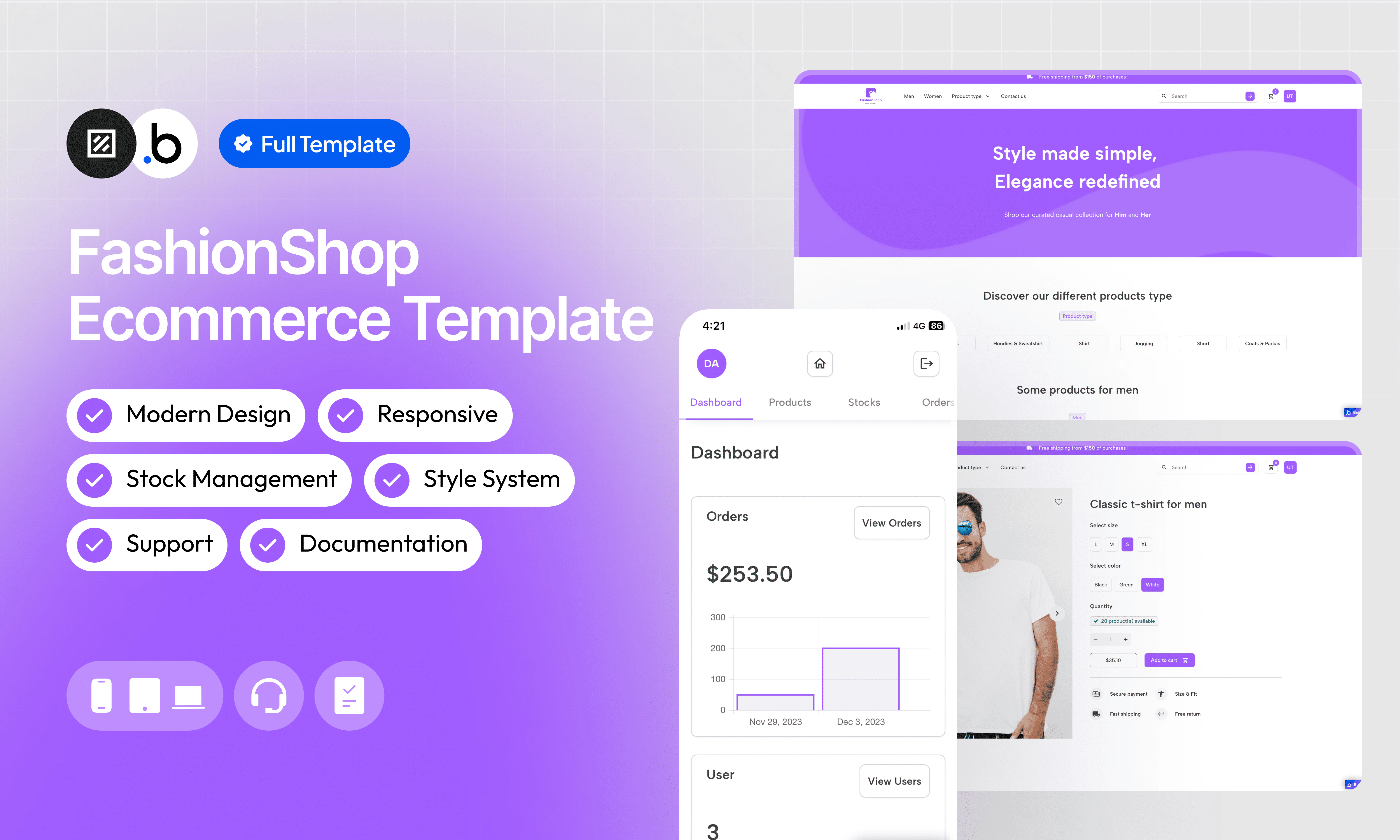
FashionShop is a complete, ready-to-use e-commerce template for clothing. It covers the entire customer journey, from sign-up with email verification through product browsing, cart management, checkout, and order tracking — all the way to platform administration. Focus on your catalog rather than building infrastructure from scratch.The template includes dedicated dashboards for customers and administrators, an automatic inventory update system on each purchase, a fully responsive design that adapts to all screen sizes, and a predefined style system to accelerate customization. It also comes with full documentation and reactive support to help you get up and running fast.
Set up a robust enrollment system with email verification to ensure the security and validity of accounts.
Intuitive Admin Dashboard
Manage your store with ease with an intuitive admin dashboard. Control products, orders, and track performance at a glance.
Predefined Style System
Save time in design with a predefined style system. Harmonize the look of your shop effortlessly.
Automatic Inventory Update
Simplify inventory management with an automatic update on each purchase. Avoid out-of-stock situations and ensure a smooth shopping experience.
Simple New Product Integration
Quickly add new products to your catalog without difficulty. Grow your store without worrying about technical complexities.
Clean and Totally Responsive Design
Enjoy an exceptional user experience, whether for customers browsing your store or administrators managing the backend. FashionShop adapts to all screens, ensuring smooth operation on all devices.
Full Documentation
Access detailed documentation that covers all the platform’s features, making it easy to get started and use.
Reactive Support
Get responsive and professional technical support to quickly resolve all your questions and concerns.
This section explains how to unlock the template’s features. The restriction is intentionally in place to prevent users from adding or modifying data in the preview version. This ensures that no sensitive or inappropriate content can be displayed to other people viewing the template in the Bubble Marketplace.
In order to access all the features of this template, you will need to purchase it and follow the following steps.
1
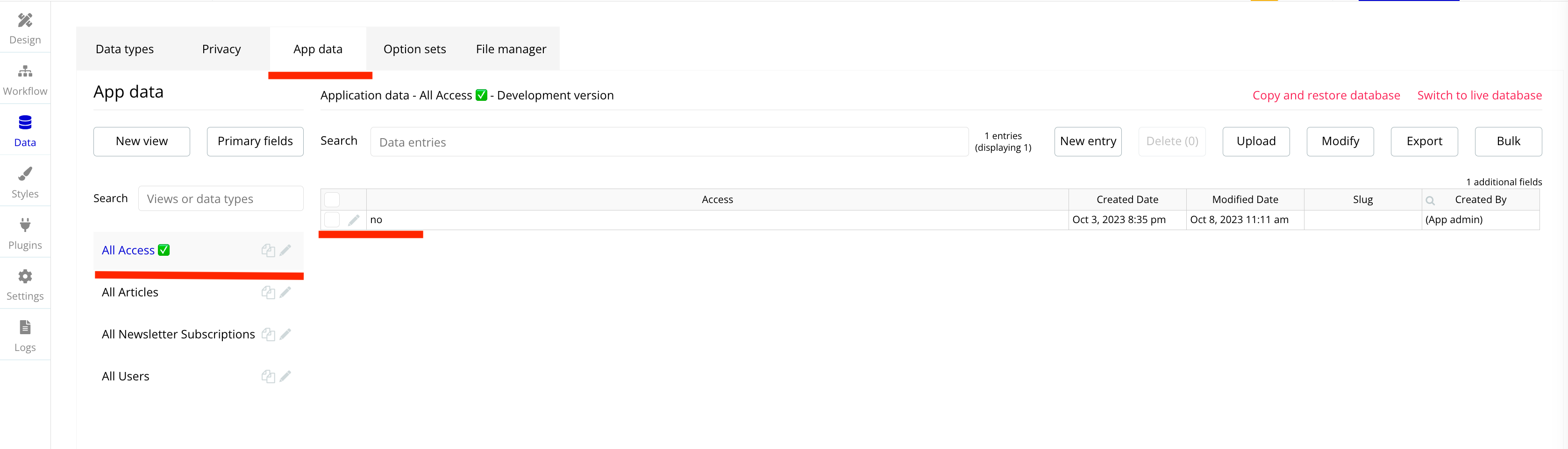
Go to App Data —> Click on the Data Type Access ✅ —> To modify the value of the Access Field you must click on the pencil.
2
Change the value of the Access Field to YES —> Don’t forget to save your change by clicking on the SAVE button.
3
You now have access to all the features of the template. All workflows that were limited are marked with this icon ✅ .
4
You can go to the workflows folders and click on "Access ✅" to see all the workflows who are limited. You can delete them when you purchase your template.
A collection of shared components built to be used across multiple pages, helping maintain design consistency while making updates and scaling more efficient.
A reusable element creates an element that contains other elements, like a group, that can be used in more than one place. This is useful when reusing the same elements often. Using reusable elements keeps the app smaller and makes it easier to edit.
Header
The header is a reusable element present on all pages of the platform. It includes the store logo, navigation links by product type, search input to find products by name, and buttons to log in or register. A mobile menu icon appears depending on screen size and contains all the same elements.
Footer
FAQ
The FAQ is a reusable element positioned on certain pages such as the Checkout, so that customers can quickly find answers to their most common questions without leaving the page.
Popup Access
The Popup Access informs users who preview the template that some features are limited until the template is purchased.
This structure uses folders and colors to organize workflows clearly, improve readability, and ensure consistent logic management across the application.
In Bubble, workflows define how an application behaves. They are triggered by events and run actions that manage data, navigation, and user interactions.
Folders are structured by functional category, with each folder grouping workflows related to a specific domain of the application. This approach ensures that every type of logic has its dedicated space, making the overall workflow architecture clearer, more organized, and easier to maintain.
Database
This folder contains workflows responsible for creating, updating, deleting, and managing data within the application. It centralizes all logic that interacts directly with the database to ensure structured and consistent data handling.
Navigation
This folder groups workflows that control page transitions, redirects, and user journeys. It defines how users move through the application and ensures a clear and predictable flow.
Plugins
This folder includes workflows that depend on external plugins or third party integrations. It isolates plugin related logic to keep the core application structure clean and organized.
Visuals
This folder contains workflows that affect the user interface, such as showing or hiding elements, triggering animations, or dynamically updating what the user sees. It manages front end behavior without altering stored data.
Custom States
This folder groups workflows that manage temporary front end data stored in custom states. It is used to control dynamic interactions and interface logic without impacting the database.
Custom states are variables that you can save on any element on the page, including the page itself. They let you store data temporarily that is reset when the page is reloaded. This is useful when you need your app to remember some information that you don’t need to store permanently in the database.
Emails
This folder includes workflows dedicated to sending automated or transactional emails. It centralizes communication logic to ensure consistency and easier maintenance.
APIs
This folder contains workflows that handle external API calls and data exchanges with outside services. It organizes integration logic and keeps external communication clearly separated from internal processes.
Colors are used as visual indicators to distinguish workflow types and intentions. Each color corresponds to a specific category of action, allowing quick recognition of the workflow’s purpose and improving readability across the entire logic structure.
Blue
Blue is used for workflows involving navigation, such as redirects to other pages or links.
Green
Green indicates workflows involving the database, such as creating or updating data in the database or the registration/connection system.
Red
Red indicates workflows that have an impact on deleting data or resetting values.
Orange
Orange is reserved for visual elements, such as showing or disappearing pop-ups, floating groups, and other such interactive elements.
Purple
This color is reserved for elements related to APIs and Plugins.
Cyan
The Cyan color indicates specific interactions triggered by custom events or custom states.
The database consists of different data types that you as the developer plan and set up. Data types are like containers that hold specific types of information and each data type is made up of fields where that information is stored.
This section covers option sets, used to store a static list of options in a database-like structure
Option sets let you set up different types of static options in a database-like structure, but without using the database. This is useful to store information like days of the week, marital status, colors, states, countries and other data that you want to load quickly and that’s rarely updated.
An overview of the external plugins integrated into the application to extend its native capabilities and enhance specific features or functionalities.
You might need to install these plugins when using the template.
Add animated star rating input with configurable size, colors, and default value. Supports static and interactive modes, user interaction events, responsive layout, and rating reset actions.
Toggle password visibility in Bubble input fields using a reveal/hide icon. Supports icon size, color, position, default visibility state, multiple inputs, and dynamic control with minimal setup.
This policy defines the conditions under which refunds may be requested for our products. It distinguishes between templates distributed through the Bubble Marketplace and the Brikl Chrome Extension, specifying the applicable deadlines, eligibility requirements, and usage-related limitations for each.