Overview
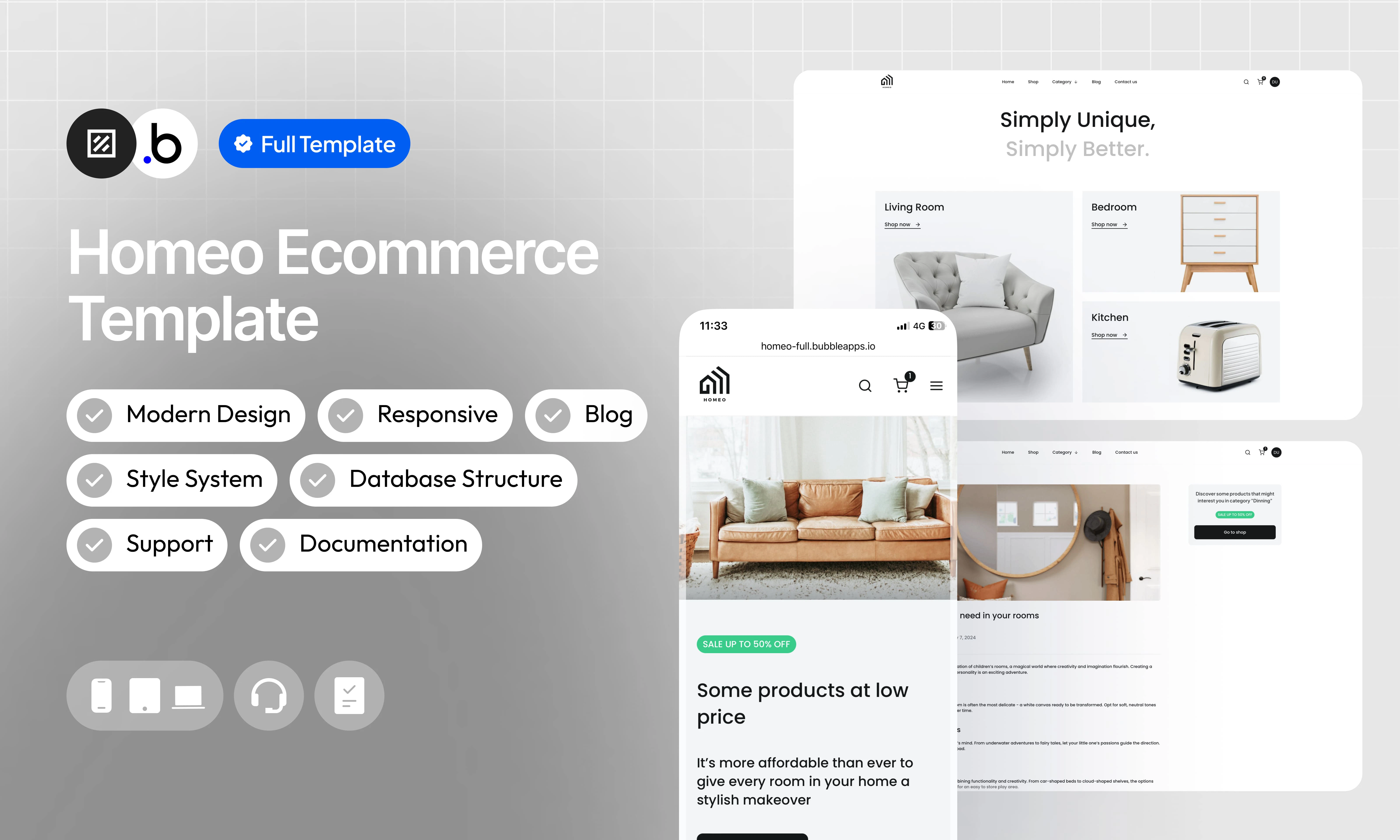
Check out our e-commerce template for home furniture – a modern solution to launch your own online store. Fully responsive, this template offers dynamic content and a style system to simplify customization. With blog integration, customer account verification and dedicated support, it’s the perfect tool to create an exceptional shopping experience.Functionalities
Dynamic Content
Dynamic Content
Intuitive Admin Dashboard
Intuitive Admin Dashboard
Predefined Style System
Predefined Style System
Automatic Inventory Update
Automatic Inventory Update
Blog Integration
Blog Integration
Documentation
Documentation
Fully Responsive
Fully Responsive
Dedicated Support
Dedicated Support
Verification Customer Account
Verification Customer Account
Allow Access
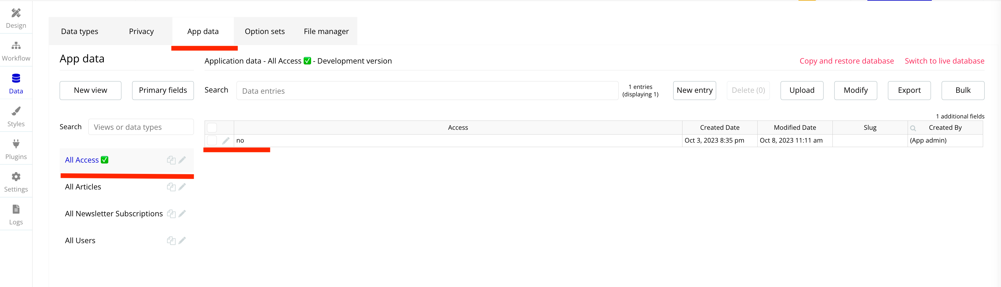
This section explains how to unlock the template’s features. The restriction is intentionally in place to prevent users from adding or modifying data in the preview version. This ensures that no sensitive or inappropriate content can be displayed to other people viewing the template in the Bubble Marketplace.Go to App Data —> Click on the Data Type Access ✅ —> To modify the value of the Access Field you must click on the pencil.
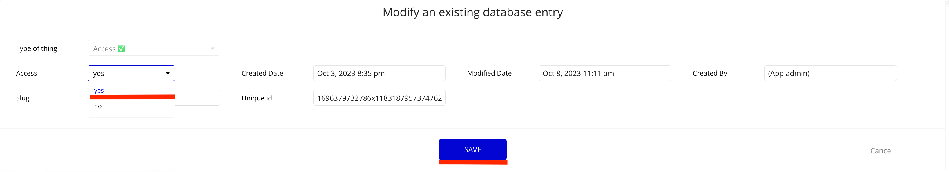
Change the value of the Access Field to YES —> Don’t forget to save your change by clicking on the SAVE button.
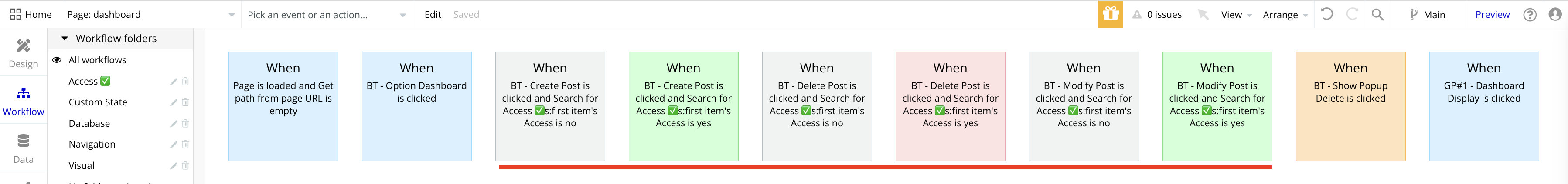
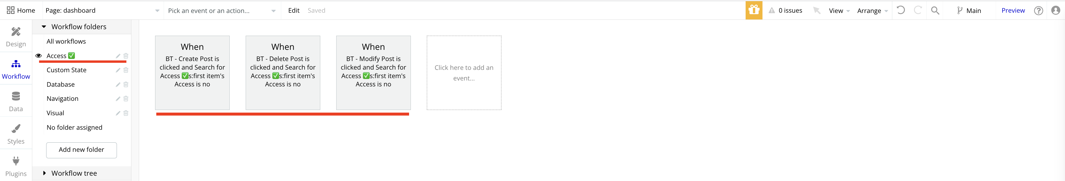
You now have access to all the features of the template. All workflows that were limited are marked with this icon ✅ .
Pages
index
index
cart
cart
checkout
checkout
blog_page
blog_page
article_page
article_page
contact_us
contact_us
dashboard_admin
dashboard_admin
dashboard_client
dashboard_client
login
login
product_page
product_page
shop_page
shop_page
sign_up
sign_up
verification
verification
reset_pw
reset_pw
404
404
Reusable Elements
A collection of shared components built to be used across multiple pages, helping maintain design consistency while making updates and scaling more efficient.Header
Header
Footer
Footer
FAQ
FAQ
Popup Access
Popup Access
Popup Credentials
Popup Credentials
Workflows
This structure uses folders and colors to organize workflows clearly, improve readability, and ensure consistent logic management across the application.Folders
Folders are structured by functional category, with each folder grouping workflows related to a specific domain of the application. This approach ensures that every type of logic has its dedicated space, making the overall workflow architecture clearer, more organized, and easier to maintain.Database
Database
Navigation
Navigation
Plugins
Plugins
Visuals
Visuals
Custom States
Custom States
Emails
Emails
APIs
APIs
Colors
Colors are used as visual indicators to distinguish workflow types and intentions. Each color corresponds to a specific category of action, allowing quick recognition of the workflow’s purpose and improving readability across the entire logic structure.Blue
Blue
Green
Green
Red
Red
Orange
Orange
Purple
Purple
Cyan
Cyan
Brown
Brown
Datatypes
The database consists of different data types that you as the developer plan and set up. Data types are like containers that hold specific types of information and each data type is made up of fields where that information is stored.Access ✅
| Field Name | Type | Note |
|---|---|---|
| Access ✅ | yes/no | Whether or not certain features of the template are accessible |
User
| Field Name | Type | Note |
|---|---|---|
| First Name | text | Contains the user’s first name |
| Last Name | text | Contains the user’s last name |
| Phone | number | Contains the user’s phone number |
| Blog Liked | List of Blog | List of Article liked by the user |
| Blog Viewed | List of Blog | List of Article Viewed by the user |
| Account Type | Account Type (Option Sets) | Contains the user’s account type |
| Verification Code | text | Contains the verification code received by the user |
| Verified | yes/no | Indicates whether the user’s account has been verified or not |
| Expiration Code | date | Contains the verification period |
| Wishlist | List of Products | Contains products saved as favorites by the user |
Shipping Address
| Field Name | Type | Note |
|---|---|---|
| Shipping Country | text | Contains the user’s country of shipping |
| Shipping Street Address | text | Contains the user’s shipping street |
| Shipping City | text | Contains the user’s shipping city |
| Shipping Postal Code | text | Contains the user’s shipping postal code |
| Shipping First Name | text | Contains the first name of the user who receives the delivery |
| Shipping Last Name | text | Contains the last name of the user receiving the delivery |
| Shipping Phone | number | Contains the phone number of the user receiving the delivery |
Billing Address
| Field Name | Type | Note |
|---|---|---|
| Billing Country | text | Contains the country of the user’s billing address |
| Billing Street Address | text | Contains the billing address street |
| Billing City | text | Contains the city of the user’s billing address |
| Billing Postal Code | text | Contains the postal code of the user’s billing address |
| Billing First Name | text | Contains the first name of the user who receives the invoice |
| Billing Last Name | text | Contains the last name of the user who receives the invoice |
Product
| Field Name | Type | Note |
|---|---|---|
| Product Name | text | Contains the name of the product |
| Category | Category (Option Sets) | Contains the type of product |
| Price | number | Contains the initial price of the product |
| Description | text | Contains the full product description |
| Images | List of Images | Contains all images of the product |
| Measure | text | Contains the measure of the product |
| Published | yes/no | Indicates if the product has been published and is visible to customers |
| Discount | number | Contains the discount applied on the price |
| Quantity | number | Contains the product’s quantity |
| Quantity Updated | number | Contains the quantity selected by the user and allows us to subtract it from the quantity of the product |
Blog
| Field Name | Type | Note |
|---|---|---|
| Article | text | Contains the main content of the Article |
| Category | Category (Option Sets) | Contains the category of this article |
| Likes | number | Contains the number of likes for this article |
| Main Image | image | Contains the main image of this article |
| Publish | yes/no | Indicates if this article has been published and is visible to customers |
| Title | text | Contains the title of this article |
| Views | number | Contains the number of views for this article |
Coupon
| Field Name | Type | Note |
|---|---|---|
| Code | text | Contains the coupon code |
| Value | number | Contains the value of the coupon code |
Cart
| Field Name | Type | Note |
|---|---|---|
| Product | Product ID | Contains the product place in the shopping cart by the user |
| Coupon Code | text | Contains the the coupon code used by the user |
| Coupon | number | Contains the value of the coupon used by the user in percent (%) |
| Quantity | number | Contains the quantity of the product selected by the user |
| Delivery Option | Delivery Option (Option Sets) | Contains the delivery option choose by the user |
| Discount | number | Contains the value of the coupon used by the user formatted in number |
| Product Discount | number | Contains the value of the product discount formatted in number |
| Ordered | yes/no | Indicates whether this shopping cart has been ordered or not |
| Subtotal | number | Contains the total of the shopping cart (excluding other fees) |
Order
| Field Name | Type | Note |
|---|---|---|
| Billing Address | Billing Address ID | Contains the billing address selected by the user |
| Shipping Address | Shipping Address ID | Contains the shipping address selected by the user |
| Cart | List of Carts | Contains all the details of the shopping cart ordered |
| Delivery Option | Delivery Option (Option Sets) | Contains the delivery option selected by the user |
| Order Status | Order Status (Option Sets) | Indicates the status of the order |
| Total | number | Contains the total amount of the order (fees included) |
Reviews
| Field Name | Type | Note |
|---|---|---|
| Product | Product ID | Contains the product that has been rated |
| Comments | text | Contains the comment left by the user |
| Rating | number | Contains the note left by the user |
Newsletter Subscriptions
| Field Name | Type | Note |
|---|---|---|
text | Contains the email of the user who subscribed to the Newsletter | |
| Name | text | Contains the name of the user who subscribed to the Newsletter |
Option Sets
This section covers option sets, used to store a static list of options in a database-like structureAccount Type
Defines the account type of a registered user on the platform. Used to differentiate access levels and permissions between customers and administrators.| Attributes | Type | Note |
|---|---|---|
| Display | text | Label displayed to represent the account type (e.g. “Client”, “Admin”) |
- Client
- Admin
Dashboard Admin
Lists the navigation sections available in the admin dashboard. Each option corresponds to a menu item allowing the admin to manage a specific part of the platform.| Attributes | Type | Note |
|---|---|---|
| Display | text | Label displayed in the admin dashboard navigation menu |
| Icon | text | Name of the Feather Icons icon associated with the menu section |
- Dashboard
- Products
- Blog
- Orders
- Users
- Reviews
- Newsletter
- Settings
Dashboard Client
Lists the navigation sections available in the client dashboard. Each option corresponds to a menu item allowing the customer to manage their personal information and activity on the platform.| Attributes | Type | Note |
|---|---|---|
| Display | text | Label displayed in the client dashboard navigation menu |
- Account
- Address
- Orders
- Wishlist
FAQ
Groups the frequently asked questions displayed to customers, notably on the Cart page. Each option pairs a question with its corresponding answer.| Attributes | Type | Note |
|---|---|---|
| Display | text | Text of the question displayed in the FAQ section |
| Answer | text | Text of the answer associated with the question |
- What countries do you ship to ?
- What is your return/exchange policy ?
- How long will it take to get my order ?
- What payment methods do you accept ?
- How long does order processing take ?
- What if my order arrives damaged ?
Order Status
Defines the different possible statuses of an order. Used in the admin dashboard to track and update the progress of customer orders.| Attributes | Type | Note |
|---|---|---|
| Display | text | Status label displayed to both the administrator and the customer (e.g. “Completed”, “Delivered”) |
- Completed
- Cancelled
- Delivered
Delivery Option
Defines the different shipping options offered to the customer during checkout. Each option includes a cost and an estimated delivery time in days.| Attributes | Type | Note |
|---|---|---|
| Display | text | Label of the delivery option displayed to the customer (e.g. “Free Shipping”, “Express Shipping”) |
| Cost | number | Cost of the delivery expressed as a number in the store currency (e.g. 0 for free shipping) |
| Max Delay | number | Maximum estimated delivery time expressed in number of business days |
| Min Delay | number | Minimum estimated delivery time expressed in number of business days |
- Free Shipping
- Standard Shipping
- Express Shipping
Blog Table
Defines the navigation tabs in the Blog section of the admin dashboard. Allows the admin to switch between the list of existing articles and the creation of a new one.| Attributes | Type | Note |
|---|---|---|
| Display | text | Label of the tab displayed in the blog management interface (e.g. “Articles”, “Create”) |
- Articles
- Create
Credentials
Defines the two types of credentials that a user can update from the Credentials Popup in their dashboard. Used to distinguish between updating the email address and updating the password.| Attributes | Type | Note |
|---|---|---|
| Display | text | Label of the credential field displayed in the update form (e.g. “Email”, “Password”) |
- Password
Category
Defines the product and blog article categories available on the platform. Used to filter and organize products in the shop and articles in the blog.| Attributes | Type | Note |
|---|---|---|
| Display | text | Label of the category displayed in filters, creation forms, and navigation pages (e.g. “Living Room”, “Bedroom”) |
- Living Room
- Bedroom
- Bathroom
- Dinning
- Outdoor
- Kitchen
Product Details
Defines the tabs available on the product page, allowing the user to navigate between the full product description and customer reviews left by other buyers.| Attributes | Type | Note |
|---|---|---|
| Display | text | Label of the tab displayed on the product page (e.g. “Description”, “Reviews”) |
- Description
- Reviews