
Overview
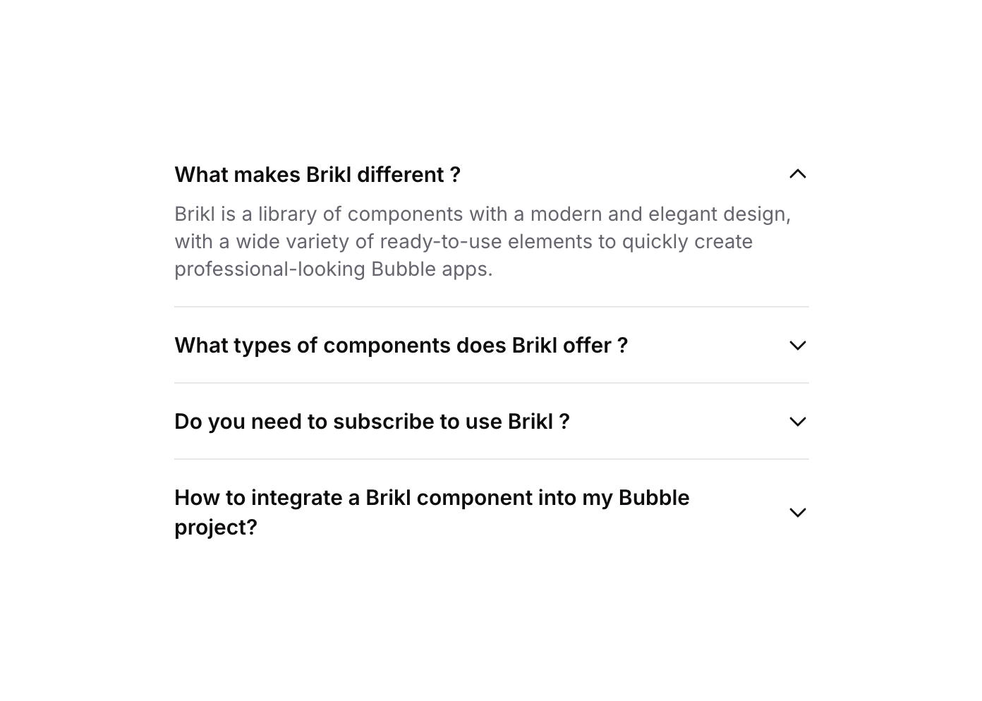
Accordion 01 is a FAQ-style accordion component featuring multiple collapsible items. Each item contains a title, a caret icon, and a hidden content panel that expands or collapses when clicked. It uses custom states to track which item is currently open, toggling visibility accordingly. Ideal for FAQ sections, feature explanations, or any content that benefits from progressive disclosure.How to use
1
Open the Brikl panel
Navigate to the Elements category in the Brikl panel.
2
Copy the component
Find Accordion 01 and click Copy.
3
Paste into your editor
Paste it into your Bubble canvas with
Cmd + V (Mac) or Ctrl + V (Windows), or right-click on the canvas and select Paste.States
This component includes conditional states that automatically change its appearance.These states are handled natively by Bubble and require no additional setup. They will work automatically once the component is pasted into your editor.
Responsive
This component adapts to mobile screens. Font sizes and layout automatically adjust on screens smaller than Bubble’s built-in mobile breakpoint.Workflows
This component includes pre-built workflows.These workflows are included when you use the Copy with Workflows option in the Brikl panel.
Requirements
Platforms
License
This component requires a Starter plan.