Overview
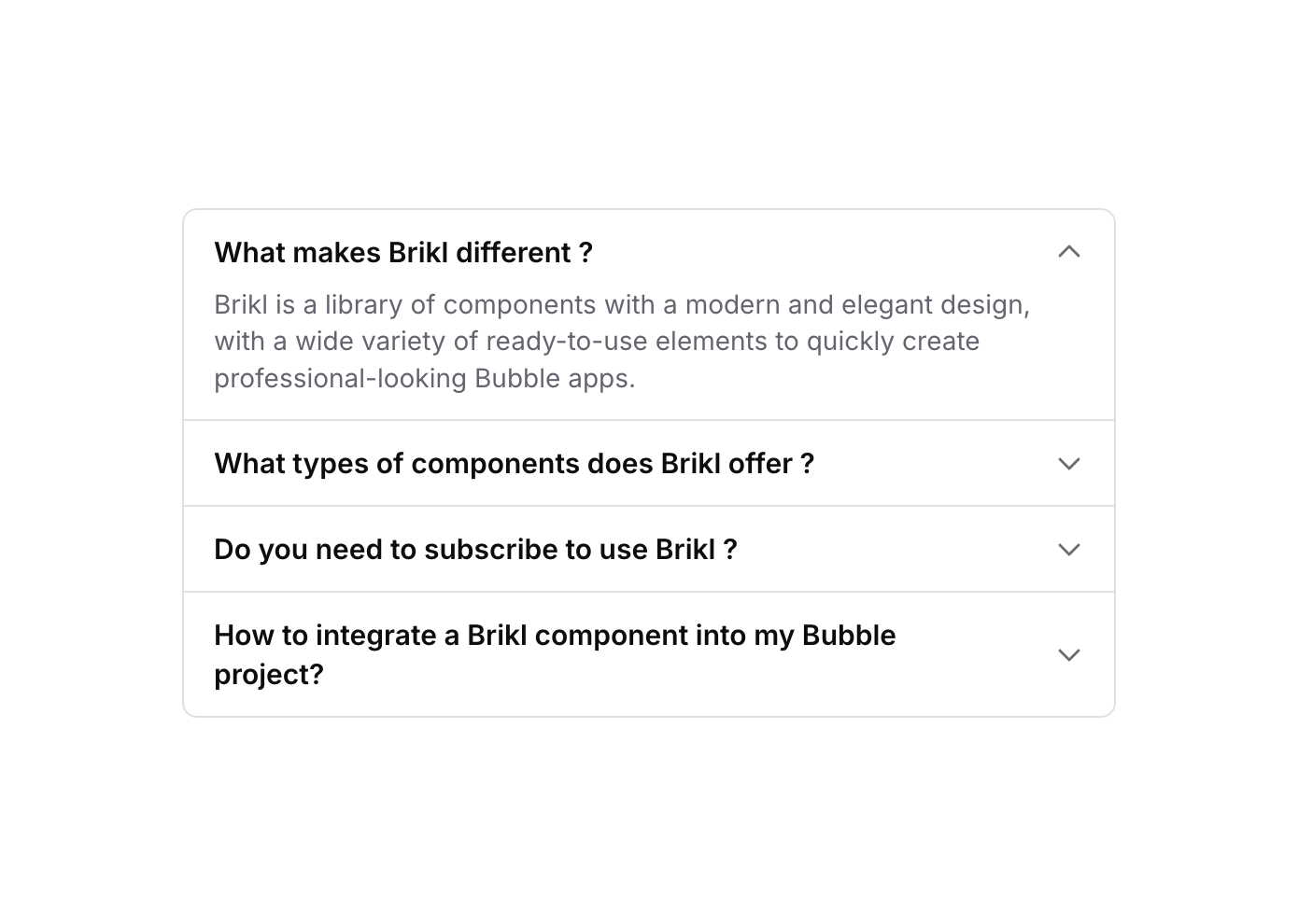
Accordion 11 is a vertical FAQ-style accordion component featuring multiple toggle items. Each item displays a question title with a caret-down icon and reveals an answer when clicked. The component uses custom states to track which accordion item is open, toggling visibility of content groups accordingly. It is suited for FAQ sections, help centers, or any collapsible content use case in both web and mobile Bubble apps.
How to use
Open the Brikl panel
Navigate to the Elements category in the Brikl panel.
Copy the component
Find Accordion 11 and click Copy.
Paste into your editor
Paste it into your Bubble canvas with Cmd + V (Mac) or Ctrl + V (Windows),
or right-click on the canvas and select Paste.
States
This component includes conditional states that automatically change its appearance.
| State | Trigger | Visual effect |
|---|
| Item 01 Open | User clicks the first accordion toggle button | The content group for item 01 becomes visible and expands; if already open, it collapses back to hidden |
| Item 02 Open | User clicks the second accordion toggle button | The content group for item 02 becomes visible and expands; if already open, it collapses back to hidden |
| Item 03 Open | User clicks the third accordion toggle button | The content group for item 03 becomes visible and expands; if already open, it collapses back to hidden |
| Item 04 Open | User clicks the fourth accordion toggle button | The content group for item 04 becomes visible and expands; if already open, it collapses back to hidden |
These states are handled natively by Bubble and require no additional setup.
They will work automatically once the component is pasted into your editor.
Responsive
This component adapts to mobile screens. Font sizes and layout automatically adjust on screens smaller than Bubble’s built-in mobile breakpoint.
Workflows
This component includes pre-built workflows.
| Trigger | Action |
|---|
| Toggle 01 group clicked | Sets a custom state on the container to toggle item 01 open or closed by comparing current state value and converting boolean to number |
| Toggle 02 group clicked | Sets a custom state on the container to toggle item 02 open or closed by comparing current state value and converting boolean to number |
| Toggle 03 group clicked | Sets a custom state on the container to toggle item 03 open or closed by comparing current state value and converting boolean to number |
| Toggle 04 group clicked | Sets a custom state on the container to toggle item 04 open or closed by comparing current state value and converting boolean to number |
These workflows are included when you use the Copy with Workflows option in the Brikl panel.
Requirements
| |
|---|
| License | Starter plan required |
| Plugins | None |
| Custom code | Not required |
| Platform | Supported |
|---|
| Web | ✅ |
| Mobile | ✅ |
License
This component requires a Starter plan.