Overview
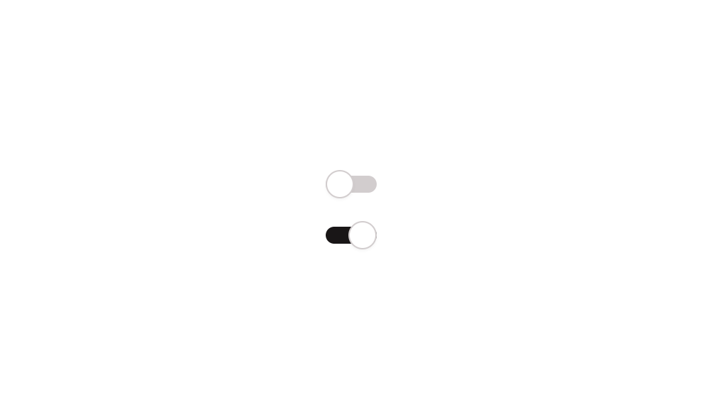
Switch 03 is a toggleable on/off switch component built with a Group container and a Shape element acting as the thumb. It manages its state using a custom boolean state called ‘active_’, visually repositioning the thumb to the right when active and left when inactive. It is suitable for settings, preferences, or any binary input interaction.
How to use
Open the Brikl panel
Navigate to the Elements category in the Brikl panel.
Copy the component
Find Switch 03 and click Copy.
Paste into your editor
Paste it into your Bubble canvas with Cmd + V (Mac) or Ctrl + V (Windows),
or right-click on the canvas and select Paste.
States
This component includes conditional states that automatically change its appearance.
| State | Trigger | Visual effect |
|---|
| Off (Default) | Initial load or when custom state ‘active_’ is false | Switch background is light gray (rgba(216,211,212,1)) and the thumb is aligned to the left (flex-start) |
| On (Active) | User clicks the switch when ‘active_’ is false | Switch background changes to dark (rgba(27,23,24,1)) and the thumb slides to the right (flex-end) |
These states are handled natively by Bubble and require no additional setup.
They will work automatically once the component is pasted into your editor.
Responsive
This component adapts to mobile screens. Font sizes and layout automatically adjust on screens smaller than Bubble’s built-in mobile breakpoint.
Workflows
This component includes pre-built workflows.
| Trigger | Action |
|---|
| Switch Group is clicked when ‘active_’ is false | Sets the custom state ‘active_’ to true, turning the switch on |
| Switch Group is clicked when ‘active_’ is true | Sets the custom state ‘active_’ to false, turning the switch off |
These workflows are included when you use the Copy with Workflows option in the Brikl panel.
Requirements
| |
|---|
| License | Starter plan required |
| Plugins | None |
| Custom code | Not required |
| Platform | Supported |
|---|
| Web | ✅ |
| Mobile | ✅ |
License
This component requires a Starter plan.