Overview
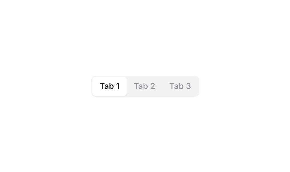
Tabs 01 is a navigational tab component featuring three tab buttons (Tab 1, Tab 2, Tab 3) arranged in a horizontal row. It uses a custom state on the parent group to track the currently active tab, visually highlighting the selected tab with a white background and shadow while inactive tabs appear as plain text. Clicking any tab updates the shared state, enabling conditional visibility or content switching elsewhere on the page.
How to use
Open the Brikl panel
Navigate to the Elements category in the Brikl panel.
Copy the component
Find Tabs 01 and click Copy.
Paste into your editor
Paste it into your Bubble canvas with Cmd + V (Mac) or Ctrl + V (Windows),
or right-click on the canvas and select Paste.
States
This component includes conditional states that automatically change its appearance.
| State | Trigger | Visual effect |
|---|
| Hovered | User hovers over any tab button | Tab button font color darkens to rgba(113,113,123,1) from its default muted color |
| Active / Selected | The parent group’s custom state ‘tabs_item_’ equals the button’s own ‘item_’ custom state value | Active tab gets a white background, dark font color rgba(27,23,24,1), and a subtle drop shadow, distinguishing it from inactive tabs |
These states are handled natively by Bubble and require no additional setup.
They will work automatically once the component is pasted into your editor.
Responsive
This component adapts to mobile screens. Font sizes and layout automatically adjust on screens smaller than Bubble’s built-in mobile breakpoint.
Workflows
This component includes pre-built workflows.
| Trigger | Action |
|---|
| BT - Tab 1 is clicked | Sets the parent group’s (GP - Tabs 01) custom state ‘tabs_item_’ to the value of Tab 1’s ‘item_’ custom state (1) |
| BT - Tab 2 is clicked | Sets the parent group’s (GP - Tabs 01) custom state ‘tabs_item_’ to the value of Tab 2’s ‘item_’ custom state (2) |
| BT - Tab 3 is clicked | Sets the parent group’s (GP - Tabs 01) custom state ‘tabs_item_’ to the value of Tab 3’s ‘item_’ custom state (3) |
These workflows are included when you use the Copy with Workflows option in the Brikl panel.
Requirements
| |
|---|
| License | Starter plan required |
| Plugins | None |
| Custom code | Not required |
| Platform | Supported |
|---|
| Web | ✅ |
| Mobile | ✅ |
License
This component requires a Starter plan.