Overview
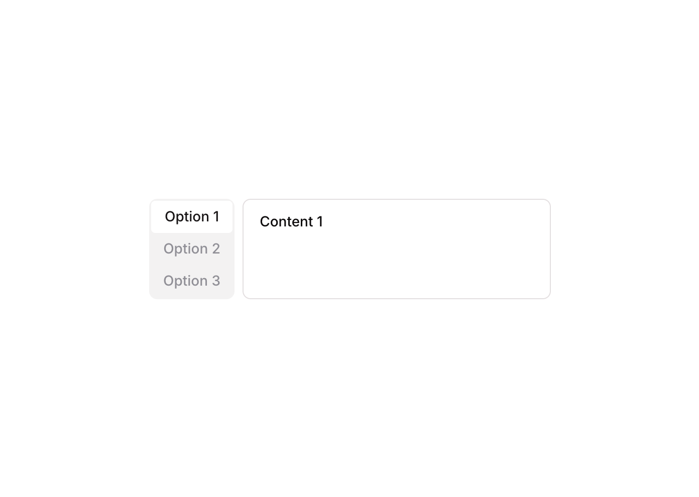
Tabs 11 is a vertical tab navigation component featuring three clickable tab buttons (Option 1, Option 2, Option 3) arranged in a column. Each tab has an icon and label, and selecting a tab updates a custom state that controls which content panel is visible. The active tab is visually highlighted with a white background and dark text, while inactive tabs appear muted. It is suitable for organizing content into switchable sections.
How to use
Open the Brikl panel
Navigate to the Elements category in the Brikl panel.
Copy the component
Find Tabs 11 and click Copy.
Paste into your editor
Paste it into your Bubble canvas with Cmd + V (Mac) or Ctrl + V (Windows),
or right-click on the canvas and select Paste.
States
This component includes conditional states that automatically change its appearance.
| State | Trigger | Visual effect |
|---|
| Hover State | User hovers over any tab button | Tab label text color changes to a more opaque gray (rgba(113,113,123,1)) |
| Active Tab State | The parent group’s custom state ‘tabs_item_’ equals the button’s own ‘item_’ custom state value | Active tab gets a white background and dark text (rgba(27,23,24,1)), inactive tabs remain transparent with muted text |
| Content Visibility State | The parent group’s custom state ‘tabs_item_’ matches the corresponding content element’s tab index | The matching content text element becomes visible; others remain hidden |
These states are handled natively by Bubble and require no additional setup.
They will work automatically once the component is pasted into your editor.
Responsive
This component adapts to mobile screens. Font sizes and layout automatically adjust on screens smaller than Bubble’s built-in mobile breakpoint.
Workflows
This component includes pre-built workflows.
| Trigger | Action |
|---|
| BT - Tab 1 (Tabs 11) is clicked | Sets the ‘tabs_item_’ custom state on the parent tabs group to the value of Tab 1’s ‘item_’ custom state (1), switching the active tab to Option 1 |
| BT - Tab 2 (Tabs 11) is clicked | Sets the ‘tabs_item_’ custom state on the parent tabs group to the value of Tab 2’s ‘item_’ custom state (2), switching the active tab to Option 2 |
| BT - Tab 3 (Tabs 11) is clicked | Sets the ‘tabs_item_’ custom state on the parent tabs group to the value of Tab 3’s ‘item_’ custom state (3), switching the active tab to Option 3 |
These workflows are included when you use the Copy with Workflows option in the Brikl panel.
Requirements
| |
|---|
| License | Starter plan required |
| Plugins | None |
| Custom code | Not required |
| Platform | Supported |
|---|
| Web | ✅ |
| Mobile | ✅ |
License
This component requires a Starter plan.