Overview
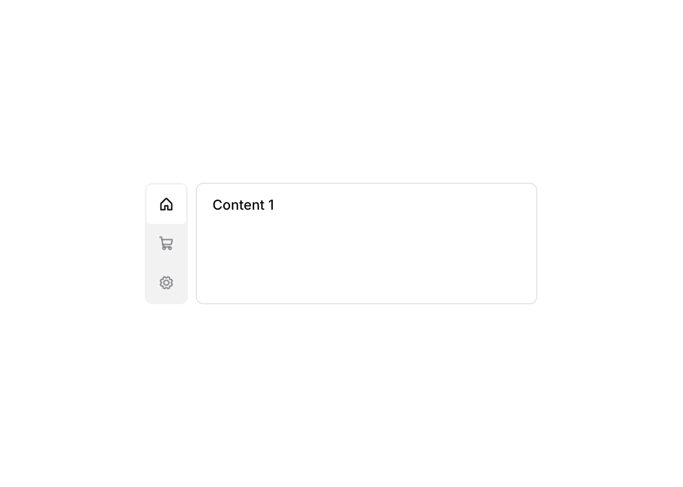
Tabs 10 is a vertical tab navigation component featuring three clickable tab buttons (Tab 1, Tab 2, Tab 3) each with an icon and label, arranged in a column layout. It uses a custom state to track the active tab and conditionally shows/hides corresponding content panels. The active tab highlights with a white background while inactive tabs remain muted, providing clear visual feedback for the selected section.
How to use
Open the Brikl panel
Navigate to the Elements category in the Brikl panel.
Copy the component
Find Tabs 10 and click Copy.
Paste into your editor
Paste it into your Bubble canvas with Cmd + V (Mac) or Ctrl + V (Windows),
or right-click on the canvas and select Paste.
States
This component includes conditional states that automatically change its appearance.
| State | Trigger | Visual effect |
|---|
| Hover State | User hovers over any tab button | Font color and icon color change to rgba(113,113,123,1), slightly more opaque |
| Active Tab State | The tabs group custom state ‘tabs_item’ equals the button’s custom state ‘item’ | Active tab button gets white background (rgba(255,255,255,1)) and dark icon color (rgba(27,23,24,1)) |
| Content Visibility State | The tabs group custom state ‘tabs_item’ equals the corresponding tab’s ‘item’ value | The matching content text element becomes visible; others remain hidden |
These states are handled natively by Bubble and require no additional setup.
They will work automatically once the component is pasted into your editor.
Responsive
This component adapts to mobile screens. Font sizes and layout automatically adjust on screens smaller than Bubble’s built-in mobile breakpoint.
Workflows
This component includes pre-built workflows.
| Trigger | Action |
|---|
| BT - Tab 1 (Tabs 10) is clicked | Sets the ‘tabs_item’ custom state on the tabs group to the value of Tab 1’s ‘item’ custom state (1) |
| BT - Tab 2 (Tabs 10) is clicked | Sets the ‘tabs_item’ custom state on the tabs group to the value of Tab 2’s ‘item’ custom state (2) |
| BT - Tab 3 (Tabs 10) is clicked | Sets the ‘tabs_item’ custom state on the tabs group to the value of Tab 3’s ‘item’ custom state (3) |
These workflows are included when you use the Copy with Workflows option in the Brikl panel.
Requirements
| |
|---|
| License | Starter plan required |
| Plugins | None |
| Custom code | Not required |
| Platform | Supported |
|---|
| Web | ✅ |
| Mobile | ✅ |
License
This component requires a Starter plan.