Overview
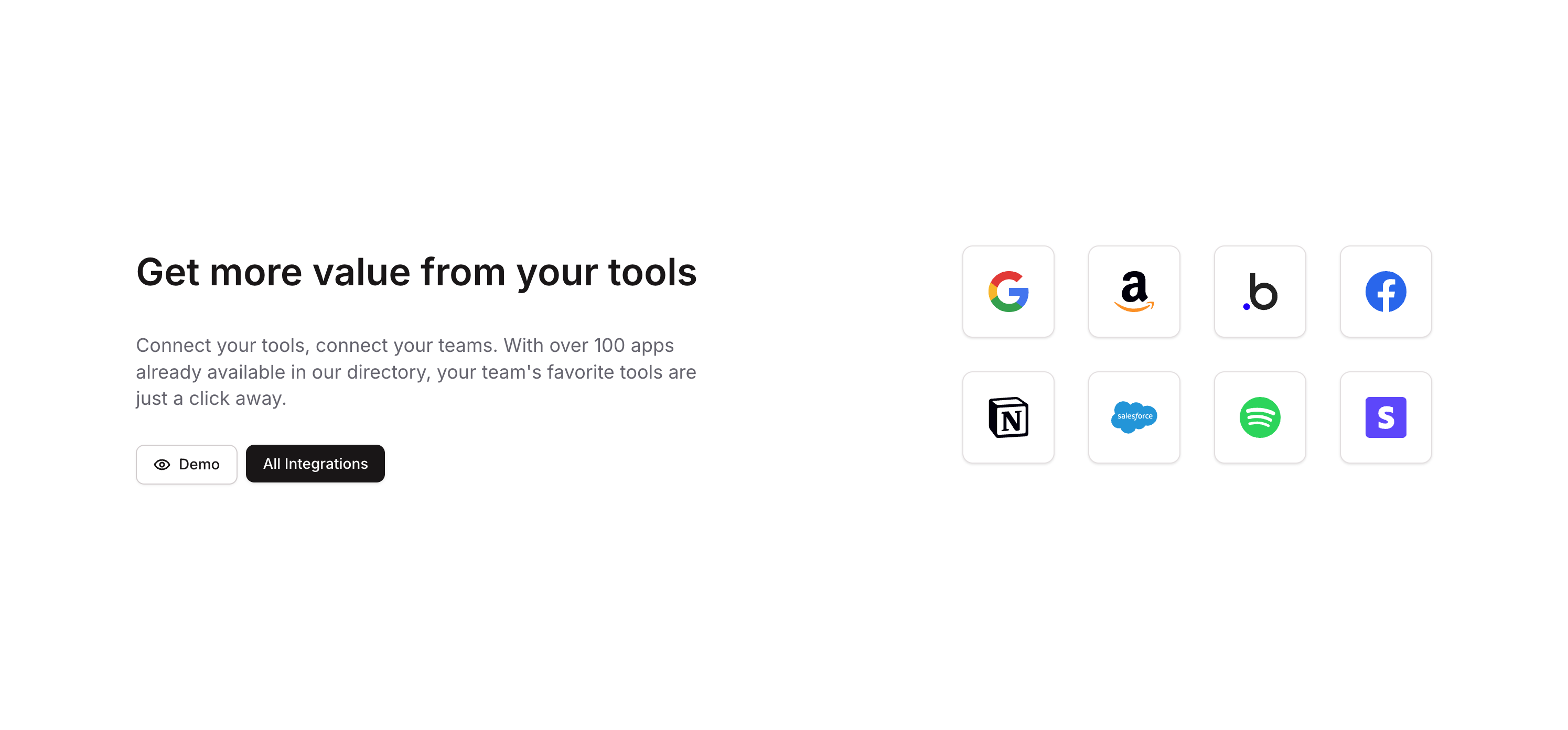
Integrations 05 is a marketing component designed to showcase a product’s integration ecosystem. It features a headline, descriptive text, and two call-to-action buttons (‘Demo’ and ‘All Integrations’) alongside a grid of platform/tool logos, encouraging users to explore available integrations.
How to use
Open the Brikl panel
Navigate to the Marketings category in the Brikl panel.
Copy the component
Find Integrations 05 and click Copy.
Paste into your editor
Paste it into your Bubble canvas with Cmd + V (Mac) or Ctrl + V (Windows),
or right-click on the canvas and select Paste.
States
This component includes conditional states that automatically change its appearance.
| State | Trigger | Visual effect |
|---|
| Tablet/Mobile Layout | Page width less than or equal to 1024px | Content group adjusts row and column gaps to 48px and CTA group expands to full width |
| Mobile Heading Size | Page width less than or equal to 768px | Heading font size reduces from 36px to 30px |
| Mobile Logo Size | Page width less than or equal to 768px | Logo wrapper minimum dimensions reduce to 64px and logo image minimum width reduces to 32px |
| Mobile List Gap | Page width less than or equal to 768px | Platform list row gap reduces to 16px |
| All Integrations Button Hovered | Button is hovered | Button opacity reduces to 90% |
| All Integrations Button Disabled | Button is not clickable | Button opacity reduces to 50% |
| Demo Button Hovered | Button is hovered | Background color changes to rgba(245, 244, 244, 1) |
| Demo Button Disabled | Button is not clickable | Button opacity reduces to 50% |
These states are handled natively by Bubble and require no additional setup.
They will work automatically once the component is pasted into your editor.
Responsive
This component adapts to mobile screens. Font sizes and layout automatically adjust on screens smaller than Bubble’s built-in mobile breakpoint.
Requirements
| |
|---|
| License | Starter plan required |
| Plugins | None |
| Custom code | Not required |
| Platform | Supported |
|---|
| Web | ✅ |
| Mobile | ❌ |
License
This component requires a Starter plan.