Overview
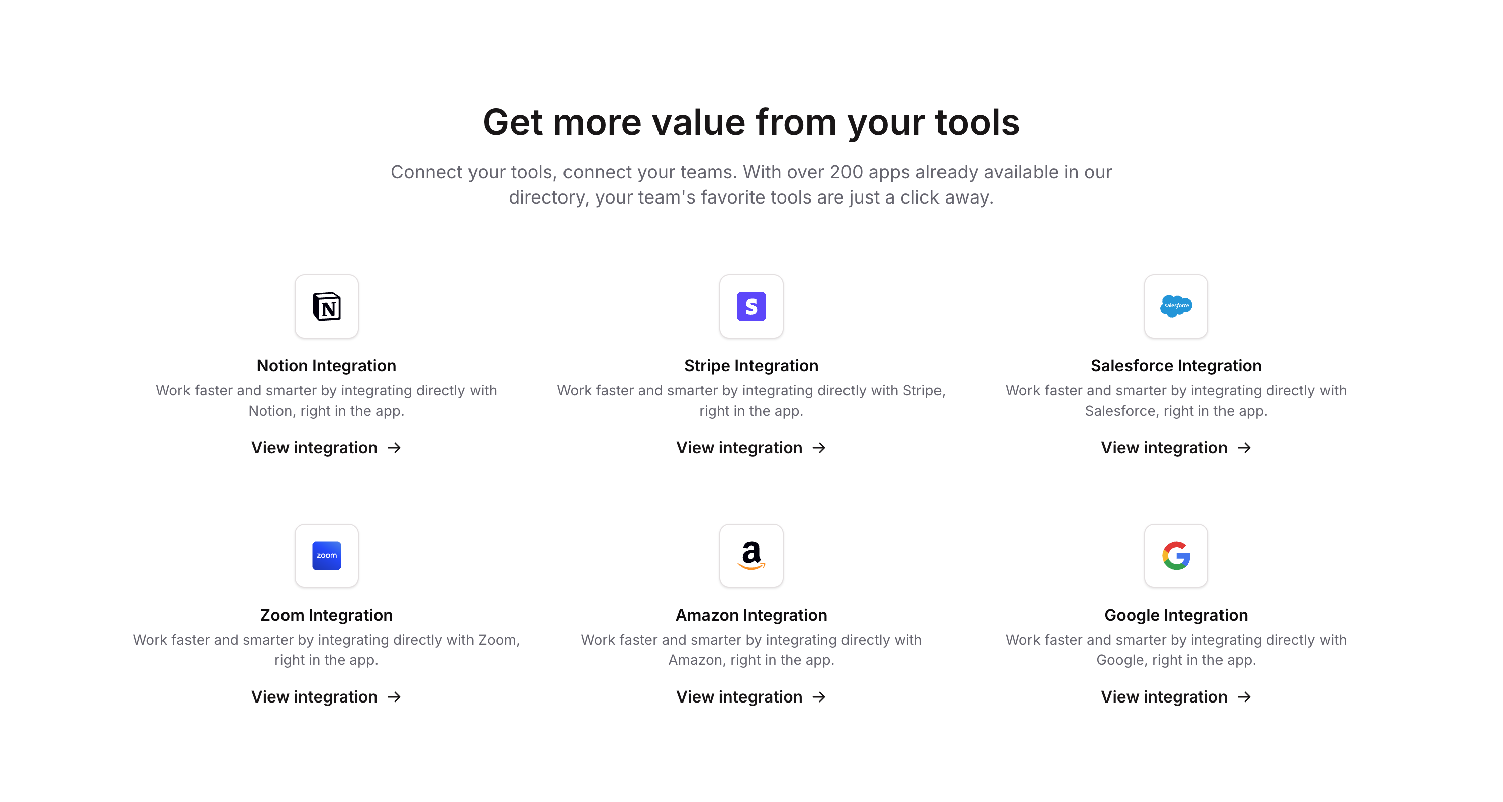
Integrations 06 is a marketing component designed to showcase available third-party integrations (e.g., Notion) within a product or landing page. It features a headline, a descriptive subtitle, and a list of integration cards, each containing a logo, title, description, and a call-to-action button. The component helps communicate the breadth of tool compatibility to potential users.
How to use
Open the Brikl panel
Navigate to the Marketings category in the Brikl panel.
Copy the component
Find Integrations 06 and click Copy.
Paste into your editor
Paste it into your Bubble canvas with Cmd + V (Mac) or Ctrl + V (Windows), or right-click on the canvas and select Paste.
States
This component includes conditional states that automatically change its appearance.
| State | Trigger | Visual effect |
|---|
| Mobile layout | Current Page Width is less than or equal to 768px | Font size reduces (e.g., heading from 36 to 30px), row and column gaps decrease, and minimum widths adjust for logo wrappers and title groups to fit smaller screens. |
| Button hovered | View integration button is hovered | Button text becomes underlined and font color changes to rgba(15,15,15,1). |
| Button not clickable | View integration button is not clickable | Button opacity reduces to 50%. |
These states are handled natively by Bubble and require no additional setup. They will work automatically once the component is pasted into your editor.
Responsive
This component adapts to mobile screens. Font sizes and layout automatically adjust on screens smaller than Bubble’s built-in mobile breakpoint.
Requirements
| |
|---|
| License | Starter plan required |
| Plugins | None |
| Custom code | Not required |
| Platform | Supported |
|---|
| Web | ✅ |
| Mobile | ❌ |
License
This component requires a Starter plan.