Overview
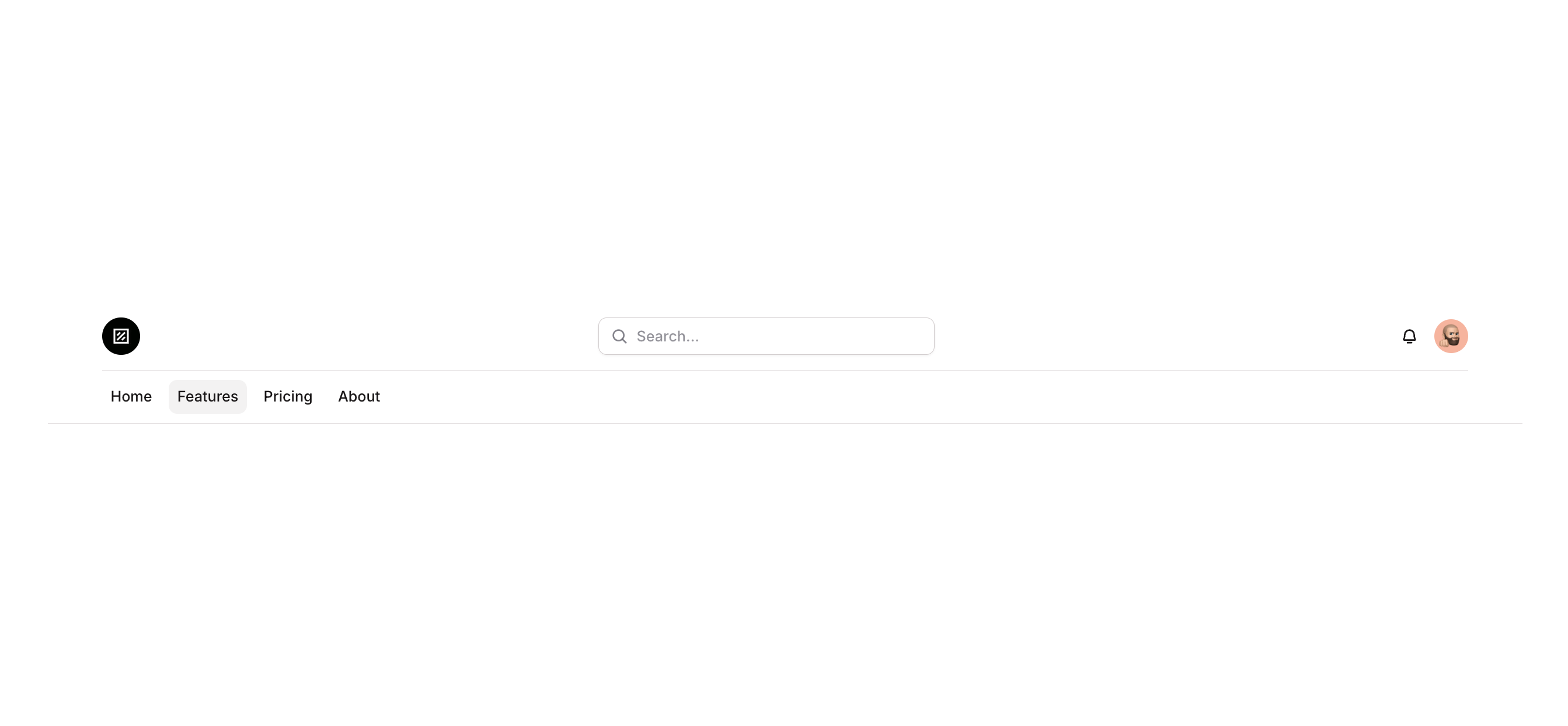
Navbar 05 is a marketing navigation bar component designed for web applications. It includes a logo group, a search input field with focus and validation states, icon buttons for notifications and account access, and a hamburger menu button that appears on smaller screens. The component adapts its layout based on page width, hiding or showing elements responsively.
How to use
Open the Brikl panel
Navigate to the Marketings category in the Brikl panel.
Copy the component
Find Navbar 05 and click Copy.
Paste into your editor
Paste it into your Bubble canvas with Cmd + V (Mac) or Ctrl + V (Windows),
or right-click on the canvas and select Paste.
States
This component includes conditional states that automatically change its appearance.
| State | Trigger | Visual effect |
|---|
| Mobile Menu Button Visible | Current Page Width is less than or equal to 768px | Hamburger menu button becomes visible and search bar border style changes to none |
| Button Hovered (Trigger Menus) | Mouse hover on hamburger menu button | Button background color changes to rgba(245, 244, 244, 1) |
| Button Not Clickable (Trigger Menus) | Button is not clickable | Button opacity reduces to 50% |
| Button Hovered (Trigger Notifications) | Mouse hover on notification bell button | Button background color changes to rgba(245, 244, 244, 1) with bgcolor style |
| Button Not Clickable (Trigger Notifications) | Button is not clickable | Button opacity reduces to 50% |
| Search Input Focused | Search input field gains focus | Input group gets a box shadow with color rgba(216,211,212,0.5) and spread of 3 |
| Search Input Invalid | Search input value is not valid | Input group border turns red rgba(251,44,54,1) with red box shadow |
| Search Input Not Clickable | Search input is not clickable | Input group opacity reduces to 50% |
These states are handled natively by Bubble and require no additional setup.
They will work automatically once the component is pasted into your editor.
Responsive
This component adapts to mobile screens. Font sizes and layout automatically adjust on screens smaller than Bubble’s built-in mobile breakpoint.
Requirements
| |
|---|
| License | Starter plan required |
| Plugins | None |
| Custom code | Not required |
| Platform | Supported |
|---|
| Web | ✅ |
| Mobile | ❌ |
License
This component requires a Starter plan.