Overview
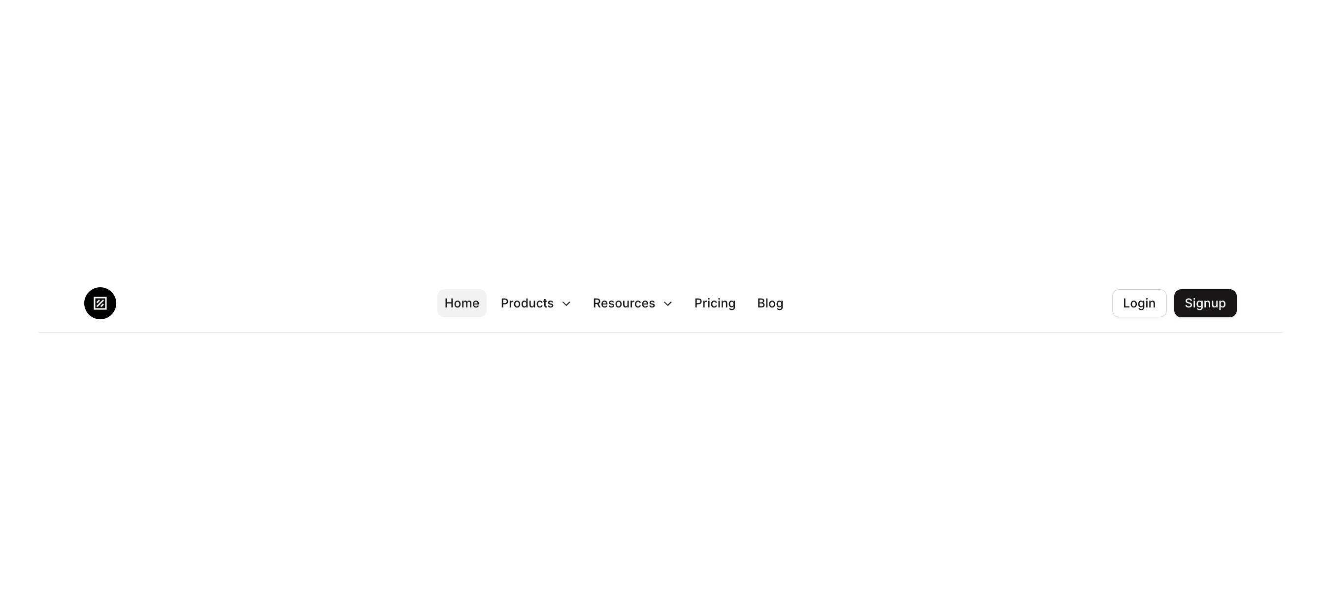
Navbar 08 is a responsive marketing navigation bar component featuring a logo area, horizontal menu links, and authentication buttons (Login and Signup). On mobile screens (width ≤ 768px), the desktop menu and auth buttons collapse and a hamburger/list icon button appears to trigger mobile navigation. It is designed for landing pages and marketing sites requiring a clean, professional top navigation.
How to use
Open the Brikl panel
Navigate to the Marketings category in the Brikl panel.
Copy the component
Find Navbar 08 and click Copy.
Paste into your editor
Paste it into your Bubble canvas with Cmd + V (Mac) or Ctrl + V (Windows),
or right-click on the canvas and select Paste.
States
This component includes conditional states that automatically change its appearance.
| State | Trigger | Visual effect |
|---|
| Hovered - Login Button | User hovers over the Login button | Login button background changes to rgba(245, 244, 244, 1) |
| Hovered - Signup Button | User hovers over the Signup button | Signup button opacity reduces to 90% |
| Hovered - Trigger Menus Button | User hovers over the hamburger menu button | Button background changes to rgba(245, 244, 244, 1) |
| Disabled - Login Button | Login button is not clickable | Login button opacity reduces to 50% |
| Disabled - Signup Button | Signup button is not clickable | Signup button opacity reduces to 50% |
| Mobile - Login Hidden | Current Page Width is less than or equal to 768px | Login button is hidden and collapsed |
| Mobile - Signup Hidden | Current Page Width is less than or equal to 768px | Signup button is hidden and collapsed |
| Mobile - Hamburger Visible | Current Page Width is less than or equal to 768px | Hamburger/list trigger button becomes visible |
| Mobile - Desktop Menu Hidden | Current Page Width is less than or equal to 768px | Desktop navigation menu group is hidden |
| Hovered - Home Menu Button | User hovers over the Home navigation button | Background changes to rgba(245, 244, 244, 1) with bgcolor style applied |
These states are handled natively by Bubble and require no additional setup.
They will work automatically once the component is pasted into your editor.
Responsive
This component adapts to mobile screens. Font sizes and layout automatically adjust on screens smaller than Bubble’s built-in mobile breakpoint.
Requirements
| |
|---|
| License | Starter plan required |
| Plugins | None |
| Custom code | Not required |
| Platform | Supported |
|---|
| Web | ✅ |
| Mobile | ✅ |
License
This component requires a Starter plan.