Overview
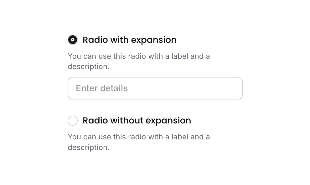
Radio 03 is a customizable radio button group component featuring two selectable options. Each option includes a circular radio icon, a label, and a description text. Option 1 additionally contains an expandable input field that appears when selected. The component tracks the selected item via a custom state and supports conditional styling to indicate the active selection.
How to use
Open the Brikl panel
Navigate to the Elements category in the Brikl panel.
Copy the component
Find Radio 03 and click Copy.
Paste into your editor
Paste it into your Bubble canvas with Cmd + V (Mac) or Ctrl + V (Windows),
or right-click on the canvas and select Paste.
States
This component includes conditional states that automatically change its appearance.
| State | Trigger | Visual effect |
|---|
| Radio Option Selected | When the parent group’s custom state ‘radio_item_’ equals the option’s ‘item_’ custom state value | The radio icon changes to a filled dot icon with a dark background, indicating the option is selected |
| Expansion Input Visible | When Option 1 is selected (radio_item_ equals item_ of Option 1) | The hidden input field beneath Option 1 becomes visible and receives focus |
| Input Focused | When the expansion input field is focused | A soft box shadow appears around the input field |
| Input Invalid | When the expansion input field fails validation | Border turns red and a red box shadow appears around the input |
| Input Disabled | When the expansion input field is not clickable | Input opacity is reduced to 50% |
These states are handled natively by Bubble and require no additional setup.
They will work automatically once the component is pasted into your editor.
Responsive
This component adapts to mobile screens. Font sizes and layout automatically adjust on screens smaller than Bubble’s built-in mobile breakpoint.
Workflows
This component includes pre-built workflows.
| Trigger | Action |
|---|
| GP - Button Option 1 (Radio 03) is clicked | Sets the parent group’s ‘radio_item_’ custom state to Option 1’s ‘item_’ value, then sets focus to the expansion input field |
| GP - Button Option 2 (Radio 03) is clicked | Sets the parent group’s ‘radio_item_’ custom state to Option 2’s ‘item_’ value |
These workflows are included when you use the Copy with Workflows option in the Brikl panel.
Requirements
| |
|---|
| License | Starter plan required |
| Plugins | None |
| Custom code | Not required |
| Platform | Supported |
|---|
| Web | ✅ |
| Mobile | ✅ |
License
This component requires a Starter plan.