Overview
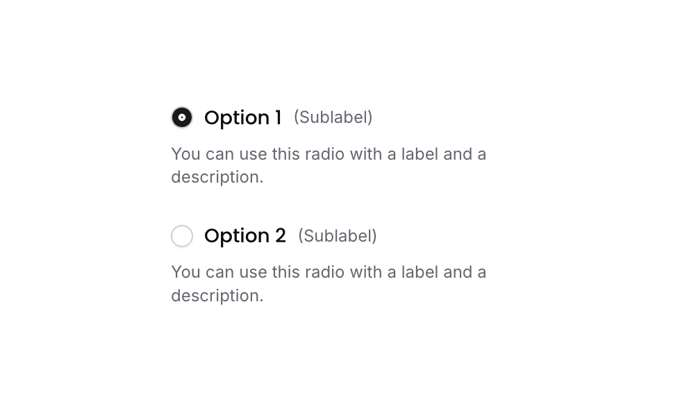
Radio 04 is a customizable radio button group component containing two selectable options. Each option includes a circular radio icon, a bold label, a sublabel, and a descriptive text below. Selection is managed via a custom state on the parent group, toggling the icon appearance to indicate the active choice. It is ideal for forms or preference selections requiring visual clarity.
How to use
Open the Brikl panel
Navigate to the Elements category in the Brikl panel.
Copy the component
Find Radio 04 and click Copy.
Paste into your editor
Paste it into your Bubble canvas with Cmd + V (Mac) or Ctrl + V (Windows),
or right-click on the canvas and select Paste.
States
This component includes conditional states that automatically change its appearance.
| State | Trigger | Visual effect |
|---|
| Option Selected | User clicks on GP - Button Option 1 or GP - Button Option 2 | The radio icon changes from an empty circle to a filled dot (phosphor fill dot) with a dark background, indicating the selected option |
These states are handled natively by Bubble and require no additional setup.
They will work automatically once the component is pasted into your editor.
Responsive
This component adapts to mobile screens. Font sizes and layout automatically adjust on screens smaller than Bubble’s built-in mobile breakpoint.
Workflows
This component includes pre-built workflows.
| Trigger | Action |
|---|
| GP - Button Option 1 (Radio 04) is clicked | Sets the custom state ‘radio_item_’ on the parent group (GP - Radio 04) to the ‘item_’ value of Option 1 (1), marking it as selected |
| GP - Button Option 2 (Radio 04) is clicked | Sets the custom state ‘radio_item_’ on the parent group (GP - Radio 04) to the ‘item_’ value of Option 2 (2), marking it as selected |
These workflows are included when you use the Copy with Workflows option in the Brikl panel.
Requirements
| |
|---|
| License | Starter plan required |
| Plugins | None |
| Custom code | Not required |
| Platform | Supported |
|---|
| Web | ✅ |
| Mobile | ✅ |
License
This component requires a Starter plan.